mirror of
https://github.com/supabase/supabase.git
synced 2026-09-10 03:51:51 +08:00
3c305148186c311db7ec03f2e17e91ff94de1200
1645 Commits
| Author | SHA1 | Message | Date | |
|---|---|---|---|---|
 Steven Eubank
|
bf5a729f2d |
docs(telemetry): rename section and restructure as Monitoring and Debugging (#48243)
## Summary - Renames the **Telemetry** nav section to **Monitoring and Debugging** (nav label + sidebar title) - Rewrites the section overview (`telemetry.mdx`) as a clean navigation page using `ContentListings` — three panels (Debugging / Monitoring / AI & automation) with no how-to prose - Adds new `telemetry.data.ts` content-listings data file with three groups registered in `index.ts` - Adds a new **Debugging** guide (`debugging.mdx`) — request-stack model, symptom-to-layer router with troubleshooting links for every service, logging guidance - Adds cross-links between `debugging.mdx`, `logs.mdx`, and `advanced-log-filtering.mdx` - Adds a new **AI agents and MCP** page (`ai-agents.mdx`) — MCP tools table, `get_logs` usage, debugging skill workflow - Restructures sidebar into three groups: **Debugging** / **Monitoring** / **AI & automation** ## Motivation - No central entry point existed for debugging — content was scattered across products with no index - The overview page had almost no links for agents to follow - The section name "Telemetry" caused confusion (also used for CLI usage telemetry) - Unblocks the `supabase` debugging skill, which routes agents to this section as its source of truth ## Test plan - [ ] `/docs/guides/telemetry` — three ContentListings panels render, no prose how-to text - [ ] `/docs/guides/telemetry.md` (markdown) — clean link list, navigable by LLMs - [ ] `/docs/guides/telemetry/debugging` — renders correctly, symptom table links resolve - [ ] `/docs/guides/telemetry/ai-agents` — new page renders correctly - [ ] Sidebar shows 3 groups: Debugging / Monitoring / AI & automation - [ ] All cross-links between debugging, logs, and advanced-log-filtering resolve <!-- This is an auto-generated comment: release notes by coderabbit.ai --> ## Summary by CodeRabbit ## Summary - **New Features** - Added new documentation coverage for AI agent–assisted monitoring and debugging, including an observability-driven troubleshooting workflow. - **Documentation** - Updated the “Telemetry” area to “Monitoring and Debugging” with a refreshed landing page and reorganized sections (Debugging, Monitoring, and AI). - Revised the debugging and logs guides to improve step-by-step guidance and highlight advanced log filtering. - **Navigation** - Renamed and restructured the top-level navigation entry to reflect the new Monitoring and Debugging content layout. <!-- end of auto-generated comment: release notes by coderabbit.ai --> --------- Co-authored-by: Claude Sonnet 4.6 <noreply@anthropic.com> Co-authored-by: Jeremias Menichelli <jmenichelli@gmail.com> |
||
|
Danny White
|
e74ccefbb9 |
fix(docs): add cursor-pointer to tabs and copy controls (#48380)
## I have read the [CONTRIBUTING.md](https://github.com/supabase/supabase/blob/master/CONTRIBUTING.md) file. YES ## What kind of change does this PR introduce? Bug fix / polish ## What is the current behavior? Some docs interactive controls (copy buttons, tab triggers) do not show a pointer cursor on hover, so they feel less clickable than surrounding links. Called out on https://github.com/supabase/supabase/pull/48318. ## What is the new behavior? Adds `cursor-pointer` in one sweep so related controls stay consistent: - Shared `TabsTrigger` in `packages/ui` (covers PromptPanel AI Prompt / CLI tabs, including the unselected tab) - PromptPanel copy button and Show more / Show less - Guides sidebar “Copy as Markdown” - Docs code block copy button ## To test Hover the controls below and confirm the cursor is `pointer` on both selected and unselected tabs, and on copy buttons. ### Docs Preview: https://docs-git-dnywh-docs-cursor-pointer-supabase.vercel.app/docs - Homepage setup prompt: [AI Prompt / CLI tabs + copy](https://docs-git-dnywh-docs-cursor-pointer-supabase.vercel.app/docs) - Quickstart prompt: [Show more / Show less + copy](https://docs-git-dnywh-docs-cursor-pointer-supabase.vercel.app/docs/guides/getting-started/quickstarts/nextjs) - Guide sidebar + code block: [Copy as Markdown + code copy](https://docs-git-dnywh-docs-cursor-pointer-supabase.vercel.app/docs/guides/database/tables) ### Design system Preview: https://design-system-git-dnywh-docs-cursor-pointer-supabase.vercel.app/design-system - Shared tabs demo: [Account / Password triggers](https://design-system-git-dnywh-docs-cursor-pointer-supabase.vercel.app/design-system/docs/components/tabs) ### UI library Preview: https://ui-library-git-dnywh-docs-cursor-pointer-supabase.vercel.app/ui - Install command package-manager tabs (npm / pnpm / yarn / bun) + copy: [Password-based auth](https://ui-library-git-dnywh-docs-cursor-pointer-supabase.vercel.app/ui/docs/nextjs/password-based-auth) ### Studio (staging) Preview: https://studio-staging-git-dnywh-docs-cursor-pointer-supabase.vercel.app - Auth user panel: open a project → Authentication → Users → select a user → hover Overview / Logs (and related) tabs - Connect sheet: open Connect on a project → hover the install method tabs ### Studio (self-hosted) Preview: https://studio-self-hosted-git-dnywh-docs-cursor-pointer-supabase.vercel.app - Same `TabsTrigger` callsites as Studio staging (user panel / Connect sheet) ### WWW Preview: https://zone-www-dot-com-git-dnywh-docs-cursor-pointer-supabase.vercel.app - Blog chart tabs (`PGChart` → shared `TabsTrigger`): [Latency / Number of results / Average latency / Raw data](https://zone-www-dot-com-git-dnywh-docs-cursor-pointer-supabase.vercel.app/blog/postgres-full-text-search-vs-the-rest) (scroll to the Results section) ## Additional context Split out from #48318 so the homepage prompt polish stays focused. Prefer fixing the shared tab trigger rather than only the PromptPanel copy button, otherwise the copy control would show pointer while an unselected CLI tab would not. <!-- This is an auto-generated comment: release notes by coderabbit.ai --> ## Summary by CodeRabbit * **Style** * Improved hover feedback across the docs UI by adding a pointer cursor to “Copy as Markdown,” code block copy and word-wrap controls, prompt copy buttons, and tab selectors. * Updated cursor styling consistently so interactive controls better communicate clickability. <!-- end of auto-generated comment: release notes by coderabbit.ai --> |
||
|
Miranda Limonczenko
|
0d465e7b5f |
chore(ui): Remove 'tip' from Admonition (#48419)
Closes FE-3966 ## I have read the [CONTRIBUTING.md](https://github.com/supabase/supabase/blob/master/CONTRIBUTING.md) file. YES ## Problem - The admonition uses both 'tip' and 'note', but the visual distinction has long-ago collapsed. - 'Note' is used far more frequently than 'tip' - The two are very similar and it is confusing to know which one to use when they are visually identical ## Solution Collapse 'tip' and 'note' into one by removing all places where there is 'tip' and updating all references to 'tip' into 'note'. **Note:** This PR also resolves new broken links flagged by the E2E docs checker. It may move to another PR since E2Es keep erroring. ### Specific changes See below for an AI-generated list of changes: - **Type system** — removed `'tip'` from `AdmonitionType`, its `TYPE_TO_VARIANT`/`TYPE_LABEL` entries, and the test case in [`packages/ui-patterns/src/Admonition/](packages/ui-patterns/src/Admonition/) - **Remark plugin** — [remarkAdmonition.ts](apps/docs/lib/mdx/plugins/remarkAdmonition.ts) now maps mkdocs `tip` → `note` - **Lint allowlist** — `tip` dropped from `supa-mdx-lint.config.toml` - **Content migration** — all 109 files with `type="tip"` (across `apps/docs`, `apps/www`, `apps/studio`) converted to `type="note"`; zero remaining hits confirmed by repo-wide grep - **Style guide** — `CONTRIBUTING.md` and `contributing/content.mdx` updated to describe 4 admonition types instead of 5 ### Usage before implementation See the usage table that points toward 'note' as being dominant across all apps: Here's the usage table: | Location | `note` | `tip` | |---|---|---| | apps/docs | ~480 | ~143 | | apps/studio | 34 | 6 | | apps/www (blog) | 19 | 3 | | packages/ui-patterns (tests) | 3 | 1 (parametrized) | | design-system / ui-library / packages/ui / packages/common | 0–1 (test fixture only) | 0 | ## Preview links | App | Page | Search text (Ctrl+F) | Verify | |---|---|---|---| | docs | [/docs/guides/ai-tools/byo-mcp](https://docs-git-admonition-collapse-note-tip-supabase.vercel.app/docs/guides/ai-tools/byo-mcp) | official MCP TypeScript SDK | callout's aria-label="Note" | | docs | [/docs/guides/ai-tools/mcp](https://docs-git-admonition-collapse-note-tip-supabase.vercel.app/docs/guides/ai-tools/mcp) | MCP server is available at | callout's aria-label="Note" | | docs | [/docs/guides/ai/python-clients](https://docs-git-admonition-collapse-note-tip-supabase.vercel.app/docs/guides/ai/python-clients) | Click Connect at the top of any project page | callout's aria-label="Note" | | docs | [/docs/guides/auth/audit-logs](https://docs-git-admonition-collapse-note-tip-supabase.vercel.app/docs/guides/auth/audit-logs) | Disabling Postgres storage reduces your database storage costs | callout's aria-label="Note" | | docs | [/docs/guides/database/tables](https://docs-git-admonition-collapse-note-tip-supabase.vercel.app/docs/guides/database/tables) | access a custom schema through the Supabase Data API | callout's aria-label="Note" | | docs | [/docs/guides/troubleshooting/edge-function-404-error-response](https://docs-git-admonition-collapse-note-tip-supabase.vercel.app/docs/guides/troubleshooting/edge-function-404-error-response) | Always configure an appropriate time frame | callout's aria-label="Note" (was single-quoted type='tip') | | www | [blog: cli-v2-config-as-code](https://zone-www-dot-com-git-admonition-collapse-note-tip-supabase.vercel.app/blog/cli-v2-config-as-code) | Detecting config drift | callout's aria-label="Note" | | www | [blog: cli-v2-config-as-code](https://zone-www-dot-com-git-admonition-collapse-note-tip-supabase.vercel.app/blog/cli-v2-config-as-code) | Setting Edge Function secrets | callout's aria-label="Note" | | www | [blog: nosql-mongodb-compatibility-with-ferretdb-and-flydotio](https://zone-www-dot-com-git-admonition-collapse-note-tip-supabase.vercel.app/blog/nosql-mongodb-compatibility-with-ferretdb-and-flydotio) | If your network supports IPv6 connections | callout's aria-label="Note" | Note: the `www` rows use the `zone-www-dot-com` preview host, not the `docs` one you gave — since blog pages are served from the www app, not docs. ## Manual testing 1. Open preview links for affected pages. 2. Inspect. Open console. 3. Paste the following in and see there is no 'Tip' on the page: ``` document.querySelectorAll('[role="alert"]').forEach(el => console.log(el.getAttribute('aria-label'), el.textContent.slice(0,60))) ``` <!-- This is an auto-generated comment: release notes by coderabbit.ai --> ## Summary by CodeRabbit * **Documentation** * Standardized informational callouts across docs and tutorials from **“Tip”** to **“Note”**, updating multiple examples and guidance blocks. * Updated a few related doc references/links and conditional “Next steps” content. * **UI Updates** * Switched various in-app banners and notices to the **“Note”** style variant. * **Bug Fixes / Improvements** * Removed support for the retired **“Tip”** callout type and aligned docs linting, component behavior, and aria labeling to the remaining admonition types. <!-- end of auto-generated comment: release notes by coderabbit.ai --> |
||
|
Andrey A.
|
0695579870 | docs(self-hosted): add a guide covering custom pg extensions (#48203) | ||
|
Danny White
|
5712eefe06 |
fix(docs): polish homepage AI setup prompt (#48318)
## What kind of change does this PR introduce? Bug fix / docs UI polish. ## What is the current behavior? The homepage AI Prompt panel: - Has an `expandable` feature but its overflow contents are ~1 line extra - Expanding it affects the cover height and causes layout shift - Below `xl`, the hero stacked and the logo sat alone above the title on small screens. ## What is the new behavior? - Shows the full AI setup prompt by default and removes the unused `expandable` machinery from `PromptPanel` - Keeps both tab panes in a shared grid cell so the panel height stays stable when switching tabs - Keeps logo + title in a row at all sizes, and starts the side-by-side hero (copy + prompt) at `lg` instead of `xl` | Before | After | | --- | --- | | <img width="1279" height="722" alt="15728" src="https://github.com/user-attachments/assets/c61fdbbc-706c-47cf-8b47-4245d4c96215" /> | <img width="1280" height="722" alt="Supabase Docs" src="https://github.com/user-attachments/assets/ab3a97a4-d725-4d9e-92bf-6f564a22f1bd" /> | | <img width="1279" height="722" alt="Supabase Docs" src="https://github.com/user-attachments/assets/42906c4b-4f82-4fbc-8bab-3f5d9530aa54" /> | <img width="1280" height="722" alt="Supabase Docs" src="https://github.com/user-attachments/assets/177a17d7-536c-4bd6-a8d0-1a2bc10f3ac9" /> | | <img width="1012" height="722" alt="96312" src="https://github.com/user-attachments/assets/032a3b43-078f-4d13-a67d-9a36c76a9be5" /> | <img width="1012" height="722" alt="Supabase Docs" src="https://github.com/user-attachments/assets/f3ff3c0a-6df8-4e61-bfcb-ab99e99cccea" /> | ## To test Play around with the docs homepage AI Prompt panel on the Vercel preview at various breakpoints: https://docs-git-dnywh-docs-ai-prompt-expanded-supabase.vercel.app/ <!-- This is an auto-generated comment: release notes by coderabbit.ai --> ## Summary by CodeRabbit - **New Features** - Improved prompt panel tab navigation with manual activation for more predictable switching and enhanced accessibility. - Inactive tab panels now remain mounted while reflecting active/inactive state for smoother transitions. - **Style** - Refined the documentation homepage cover layout, including responsive alignment, logo sizing behavior, and updated heading/paragraph spacing. - Updated setup prompt presentation and refined expandable prompt sizing and control styling. - **Bug Fixes** - Inactive prompt content is now hidden and non-interactive, preventing unintended interaction. <!-- end of auto-generated comment: release notes by coderabbit.ai --> |
||
|
Danny White
|
37dded67d1 |
feat: unify SkipToContent across studio, docs, www, and design-system (#48314)
## What kind of change does this PR introduce? Feature / a11y polish ## What is the current behavior? Studio and Docs each had their own skip-to-content link (different styling and behaviour). www and design-system had none. ## What is the new behavior? Shared `SkipToContent` in `ui-patterns`, adopted by Studio, Docs, www, and design-system. Documented as a fragment with a short note under Accessibility → Jumping ahead. Tab once to reveal the button (top-left), Enter to jump to a content-only `<main>`. | After | | --- | | <img width="836" height="324" alt="CleanShot 2026-07-24 at 14 08 47@2x" src="https://github.com/user-attachments/assets/6df29452-e53a-4eca-8f64-946f2b9f605d" /> | ## To test Shared steps for every app: enable Tab key navigation if needed, load the preview, press **Tab** once — skip button should slide in top-left. Press **Enter** — focus jumps to main content (no blue ring on `<main>`). Press **Tab** again — first interactive control in the page body, not the sidebar/nav. Hover the skip button — solid fill, clear hover state, no chrome showing through. - **Studio** — [preview](https://studio-staging-git-dnywh-featskip-to-content-supabase.vercel.app) → sign in → any project page - **Docs** — [preview](https://docs-git-dnywh-featskip-to-content-supabase.vercel.app) → any docs page with sidebar - **www** — [preview](https://zone-www-dot-com-git-dnywh-featskip-to-content-supabase.vercel.app) → homepage or any marketing page with the default nav - **Design system** — [preview](https://design-system-git-dnywh-featskip-to-content-supabase.vercel.app) → any docs page (confirm Tab from content does **not** walk the sidebar), plus [Skip to Content fragment](https://design-system-git-dnywh-featskip-to-content-supabase.vercel.app/docs/fragments/skip-to-content) ## Additional context Follow-up to #47694 / #48303 (Studio) and #47515 (Docs). <!-- This is an auto-generated comment: release notes by coderabbit.ai --> ## Summary by CodeRabbit - **New Features** - Added a reusable “Skip to content” accessibility link across key layouts and pages. - Updated main landmarks to support keyboard focus and skip-link navigation (`id="main"`). - **Accessibility** - Skip links now follow consistent landmark-target conventions and remain hidden until focused. - Improved documentation for skip links/jump shortcuts in persistent chrome layouts. - **Documentation** - Added a dedicated Skip to Content fragment, navigation entry, and expanded accessibility guidance. - Updated button description wording in component docs. - **Tests** - Added component tests for SkipToContent. - **Chores** - Exposed SkipToContent via additional public package entry points. <!-- end of auto-generated comment: release notes by coderabbit.ai --> |
||
|
Alaister Young
|
ca2b50a0a7 |
chore(ui-patterns): collapse the admonition shim into ui-patterns/Admonition (#48377)
Follow-up to #48344: collapses the two resolution paths for the Admonition module into one. `src/admonition.tsx` was a back-compat shim re-exporting `src/Admonition/`. Two ways to resolve one module is exactly what produced the macOS self-import bug fixed in #48344, and the local typecheck errors that #48374 worked around. This removes the shim and standardizes on the PascalCase subpath, matching every other export in the package. **Changed:** - Codemodded all 246 `ui-patterns/admonition` imports to `ui-patterns/Admonition` (240 `.tsx`, 5 `.mdx`, 1 `.ts` across studio, docs, www, design-system, and lite-studio) - Pointed the 5 internal `'../admonition'` imports back at the `'../Admonition'` directory **Removed:** - `packages/ui-patterns/src/admonition.tsx`, and its `./admonition` entry in the exports map (regenerated with `pnpm gen:exports`) ## To test - `grep -r "ui-patterns/admonition" --include='*.ts*'` → no hits - `pnpm test:case-hazards` → passes - `pnpm typecheck` → all 15 tasks green - `pnpm --filter studio run lint:ratchet` → passes - `pnpm --filter ui-patterns vitest run src/Admonition` → 11 tests pass <!-- This is an auto-generated comment: release notes by coderabbit.ai --> ## Summary by CodeRabbit * **Bug Fixes** * Standardized Admonition component imports across the application and documentation. * Improved compatibility with case-sensitive environments by using the canonical component path. * Removed the legacy Admonition import entry point. <!-- end of auto-generated comment: release notes by coderabbit.ai --> --------- Co-authored-by: Alaister Young <10985857+alaister@users.noreply.github.com> |
||
|
Danny White
|
4bda3bfe72 |
refactor(docs): unify homepage icon link tiles (#48317)
## I have read the [CONTRIBUTING.md](https://github.com/supabase/supabase/blob/master/CONTRIBUTING.md) file. YES ## What kind of change does this PR introduce? Docs UI refactor. ## What is the current behavior? Framework quickstarts and several other homepage grids used `IconPanel` / `IconPanelWithIconPicker`, which brought redundant tooltips (duplicating the visible title), inconsistent hover treatment, and circular icon tiles that didn't match the intended squarish look. | Before | | --- | | <img width="1744" height="626" alt="CleanShot 2026-07-24 at 14 29 44@2x" src="https://github.com/user-attachments/assets/1e145be2-19c9-4bd0-bf06-17516acbc774" /> | ## What is the new behavior? Introduces a shared `IconLink` used across the docs homepage (and reference index) so icon+label tiles share the same composition and hover: icon tile fill matches the surrounding surface (`surface-100`), with a stronger border on hover, and the row uses `hover:bg-accent`. Framework quickstarts keep the larger tile size; other sections keep the smaller size. Also aligns Explore more GlassPanels with Build your backend by using the same bordered background treatment. | After | | --- | | <img width="2478" height="906" alt="CleanShot 2026-07-24 at 15 09 48@2x" src="https://github.com/user-attachments/assets/dd516845-c162-47e4-8b86-9a7fa0e73290" /> | ## Additional context Removes the unused `IconPanelWithIconPicker` wrapper now that homepage/reference consumers go through `IconLink`. <!-- This is an auto-generated comment: release notes by coderabbit.ai --> ## Summary by CodeRabbit * **New Features** * Added reusable `IconLink` UI for consistent docs tiles, including `IconLinkList`, menu icon, and light/dark icon rendering. * Introduced `FrameworkQuickstarts` to generate quickstart links based on feature-flag-enabled SDKs. * **UI / Improvements** * Updated the docs home and API reference pages to use the new list-based icon-link layout. * Refreshed migration guides and “Explore more”/self-hosting sections (including accessibility and updated CTA text). * **Bug Fixes** * Migration guide items now omit entries missing required details. * **Chores / Cleanup** * Removed the older icon panel picker-based UI component and its usage. <!-- end of auto-generated comment: release notes by coderabbit.ai --> |
||
|
Miranda Limonczenko
|
b5cae478bc |
fix(docs) Add smoke test for local development without credentials (#48218)
Closes DOCS-1210 Closes DOCS-1209 #48226 needs to merge first for CI failure ## I have read the [CONTRIBUTING.md](https://github.com/supabase/supabase/blob/master/CONTRIBUTING.md) file. YES ## What kind of change does this PR introduce? Test coverage and several small bug fixes discovered during implementation. ## What is the current behavior? Nothing verified that `pnpm run dev:docs` keeps working without private credentials. We value this command working, especially for community contributors. However, this issue can go undetected by employees at Supabase since many of us have credentials in place. We do not want this to go a week before finding and fixing like in the previous instance. ## What is the new behavior? - **New Playwright test suite**: `e2e/docs/local-smoke/no-credentials.spec.ts` boots the docs dev server with zero GitHub App/Supabase secrets and checks 5 routes covering each known failure point. - **CI**: a new `local-dev-smoke` job in `docs-tests.yml` runs this suite with no credentials configured. ## Additional bugs resolved Setting up this test exposed other issues that are fixed in this PR: - **Troubleshooting.utils.ts crash** — Unguarded Supabase call pattern, crashing every troubleshooting article. Added the same guard as previous fixes. - **Missing manifest.json** — middleware.ts statically imports public/markdown/manifest.json, which is gitignored and only generated by a build step that's skipped in local dev. On a fresh checkout it doesn't exist, so middleware fails to compile and takes down every page. Fixed by committing a placeholder [] (real builds still regenerate the full file). - **Phantom @code-hike/mdx import** — apps/docs/app/layout.tsx imported @code-hike/mdx/styles.css, but only apps/www actually declares that dependency. Worked by accident whenever both apps were installed together; broke in CI's docs-only install. Turned out to be dead code (nothing in docs actually uses code-hike), so fixed by deleting the unused imports rather than adding the dependency. <!-- This is an auto-generated comment: release notes by coderabbit.ai --> ## Summary by CodeRabbit ## Summary by CodeRabbit * **New Features** * Added a credential-free “local smoke” end-to-end test suite for key documentation routes. * **Bug Fixes** * Improved troubleshooting behavior when required external service credentials are missing. * Updated federated “wrappers” documentation pages to gracefully show a fallback message when external content can’t be fetched. * **Tests** * Added a dedicated local-smoke Playwright runner and enhanced CI path-based triggering and reporting (failure-focused artifacts). * **Chores** * Refined docs workflow path filters and adjusted docs markdown manifest/ignore rules for generated content. <!-- end of auto-generated comment: release notes by coderabbit.ai --> |
||
|
Jeremias Menichelli
|
075caf314e | chore: refactor database advisors and database wrapper federated content (#48199) | ||
|
Nik Richers
|
e0ecaadc21 |
docs: make AI tools section agent-first (#48167)
## I have read the [CONTRIBUTING.md](https://github.com/supabase/supabase/blob/master/CONTRIBUTING.md) file. YES ## What kind of change does this PR introduce? This PR reworks the `/guides/ai-tools` docs section to be agent-first. The overview now leads with the fastest path to a working setup (the plugin install command), a "What's supported?" card grid showing which coding agents and IDEs work via Plugin and/or MCP (with each product's own tagline, not a generated sentence), and a concepts glossary — instead of a plain four-item list. The sidebar "AI Tools" widget, shown on every guides page, now links to this hub ("Connect your AI agent") instead of opening a ChatGPT/Claude chat frontend. Closes DOCS-1201. ## What is the current behavior? - The `/guides/ai-tools` overview is a plain four-item bullet list with no getting-started path, compatibility info, or concepts explanation. - The sidebar "AI Tools" widget offers "Copy as Markdown", "Ask ChatGPT", and "Ask Claude" — the latter two send you to a chat frontend instead of agent setup. ## What is the new behavior? - `ai-tools.mdx`: intro → plugin install callout → "What's supported?" card grid (`<ContentListings id="ai-tools-supported-agents" />`, icon + tagline + Plugin/MCP badge per agent) → "Key concepts" glossary → "Building AI into your app?" (also converted to `ContentListings`). - New `data/content-listings/ai-tools.data.ts` builds the card grid from the existing `PLUGIN_CLIENTS`/`MCP_CLIENT_DATA` client lists (no new hand-maintained data) — fixing two latent bugs found along the way: GitHub Copilot was keyed differently between the two sources (would have produced duplicate cards), and Windsurf has no upstream docs URL (would have been silently dropped). - New opt-in `badgePosition` field on `ContentListingItem` so the badge renders under the title for the agent grid, without changing the one other existing badge usage (self-hosting's "Official" tag, still inline). - `plugins.mdx`/`mcp.mdx`/`ai-skills.mdx` each get a one-line "Quick start" lead-in so they stand alone via the `.md` content-negotiation route. - `GuidesSidebar.tsx` + `telemetry-constants.ts`: Added "Connect your AI agent" → `/guides/ai-tools`, and the `ask_ai_clicked` event with `agent_setup_clicked`. - Accessibility fix (from review): the "Not supported" indicator now exposes an `sr-only` label instead of being fully `aria-hidden`. ## Additional context - Worktree: `~/GitHub/supabase/supabase-worktrees/nikrichers/docs-1201-make-guidesai-tools-agent-first-and-replace-chat-frontend` - **Open question — Windsurf card**: `windsurf.com` now redirects to a Devin Desktop page (Cognition acquired Windsurf in 2025), but Supabase's own `MCP_CLIENT_DATA` still targets Windsurf's distinct config path (`~/.codeium/windsurf/mcp_config.json`), so the card is still labeled "Windsurf" with its pre-acquisition tagline ("The first agentic IDE. Tomorrow's editor, today."). Needs a follow-up decision on whether to relabel/merge/drop this card once Devin Desktop's MCP support (if any) is confirmed. - Follow-up (not in this PR): deeper IA rework of the ai-tools section belongs to the broader agent-first audit; `content/guides/resources/glossary.mdx` has no MCP/Agent Skills/Plugin/Prompts entries yet — this PR's "Key concepts" is currently the only definition of these terms site-wide. - Verification: | Check | Result | | --- | --- | | Lint (`lint:mdx`, `eslint`), `typecheck`, `test:local lib/content-listings.test.ts` | Pass — 13/13 tests, 0 errors | | `build:guides-markdown` | Pass — card grid flattens cleanly to markdown | | Playwright: broken icon requests, light + dark theme, PR preview | Pass — 0 in either theme | | `/guides/self-hosting` "Official" badge (existing `ContentListings` usage) | Pass — unaffected by the new `badgePosition` opt-in | ### Before & After #### [`/guides/ai-tools`](https://supabase.com/docs/guides/ai-tools) Also shows the sidebar change (right rail): "Ask ChatGPT" / "Ask Claude" → "Connect your AI agent". | [Before](https://supabase.com/docs/guides/ai-tools) | [After](https://docs-git-nikrichers-docs-1201-make-guidesai-too-7c7493-supabase.vercel.app/docs/guides/ai-tools) | | --- | --- | | 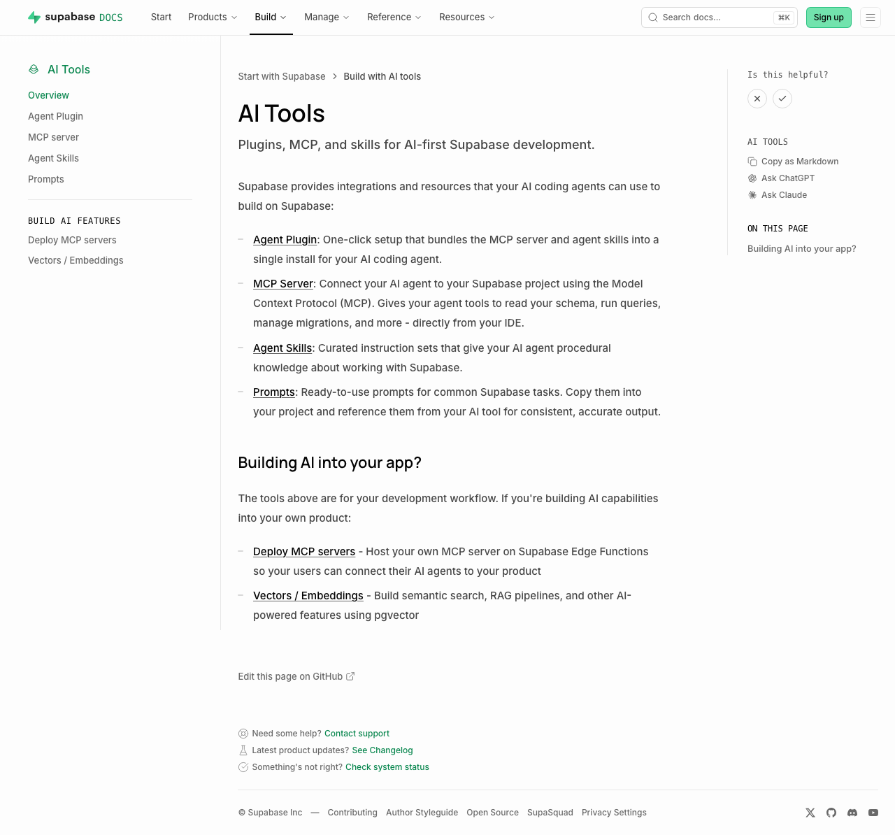 | 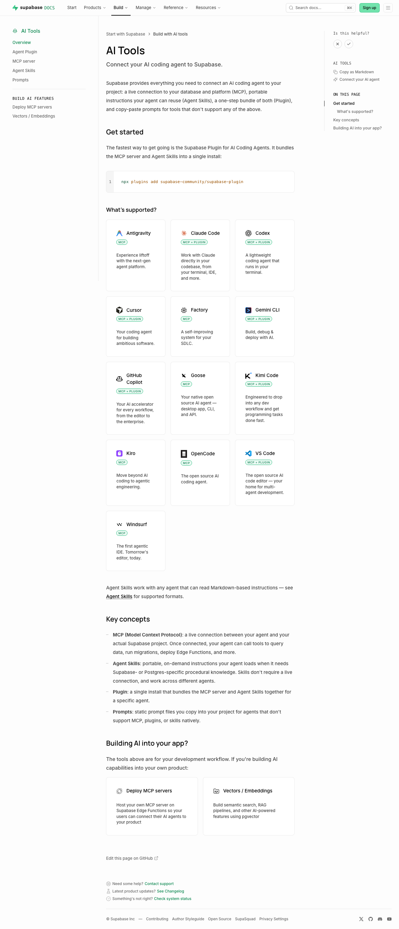 | Sub-pages each just add a one-line "Quick start" callout under the intro (no other layout change): [plugins](https://supabase.com/docs/guides/ai-tools/plugins) ([preview](https://docs-git-nikrichers-docs-1201-make-guidesai-too-7c7493-supabase.vercel.app/docs/guides/ai-tools/plugins)) · [mcp](https://supabase.com/docs/guides/ai-tools/mcp) ([preview](https://docs-git-nikrichers-docs-1201-make-guidesai-too-7c7493-supabase.vercel.app/docs/guides/ai-tools/mcp)) · [ai-skills](https://supabase.com/docs/guides/ai-tools/ai-skills) ([preview](https://docs-git-nikrichers-docs-1201-make-guidesai-too-7c7493-supabase.vercel.app/docs/guides/ai-tools/ai-skills)). ### Test plan - [x] `/guides/ai-tools` renders callout → card grid → concepts → Building AI into your app, in order - [x] Card grid: one card per agent (no duplicate Copilot), Windsurf present, icons clean in both themes, taglines shown, badges below title - [x] Sidebar shows "Connect your AI agent"; self-hosting's "Official" badge unaffected - [x] `.md` route still serves clean markdown; no lingering `ask_ai_clicked`, ChatGPT/Claude icon, or `SupportedAgentsTable` references --------- Co-authored-by: Nik Richers <nik@validmind.ai> |
||
|
Jeremias Menichelli
|
4272aba4b1 | fix: Update Grafana Cloud integration guides (#47776) | ||
|
Danny White
|
3bca21b3f8 |
chore(a11y): convert leftover focus recipes to focus-ring (#48219)
## What kind of change does this PR introduce? Accessibility cleanup (DEPR-628). ## What is the current behavior? Leftover call sites still use ad-hoc focus recipes (`ring-foreground-muted`, `outline-brand`, Dialog/Sheet `focus:` rings, etc.) instead of the shared utilities from #41575. ## What is the new behavior? Converts those leftovers across `packages/ui`, Studio, www, docs, and design-system to `focus-ring`, preferring `focus-visible`. Keeps documented exceptions (`group-focus-visible`, InputGroup `:has()`). ## To test Tab through controls (keyboard only). Expect a consistent offset ring on `:focus-visible`, not a green/brand/custom stack, and no ring animation. ### www (marketing) Preview: https://zone-www-dot-com-git-danny-depr-628-focus-ring-fbccf9-supabase.vercel.app - Global nav on `/`: Product, Developers, Solutions dropdowns; logo; hamburger + mobile menu - `/features`: view toggles and feature cards - `/company`: card links - `/changelog`: timeline / entry links - `/partners/catalog`: grid/list toggle and partner cards - `/pricing`: compute section expand control - Product / Modules / Solutions sticky navs on product pages (e.g. `/database`, `/storage`) - `/state-of-startups`: TwoOptionToggle if present ### docs Preview: https://docs-git-danny-depr-628-focus-ring-long-tail-supabase.vercel.app - Any guide page: top nav dropdowns and items - Narrow viewport: hamburger, then mobile menu links + close - Guide with PromptPanel / tabs: tab to prompt actions and tab list ### studio (dashboard) Preview: https://studio-staging-git-danny-depr-628-focus-ring-long-tail-supabase.vercel.app - Project home: Connect section tiles; drag-handle focus on sortable sections - Integrations marketplace (`/project/<ref>/integrations`): featured cards, list/grid toggle, list rows - Auth (`/project/<ref>/auth/oauth-apps`, `/project/<ref>/auth/providers`): open create/edit sheet, tab to close (X) - Database policies (`/project/<ref>/database/policies`): open policy editor sheet, tab to close - Storage policies (`/project/<ref>/storage/files/policies`): bucket section links; policy modal close - Query performance (`/project/<ref>/observability/query-performance`): info icon buttons on metrics - Replication pipeline detail (if available): slot lag / status info icons - Support (`/support/new`): attachment add/remove controls - Table editor: spreadsheet import preview checkboxes; row text/JSON editor TwoOptionToggle - Any Dialog/Sheet/toast close (X): ring on keyboard focus only, not mouse click ### design-system Preview: https://design-system-git-danny-depr-628-focus-ring-long-tail-supabase.vercel.app - Colour palette swatches (keyboard focus) - Form patterns sidepanel example: avatar / focusable control in the example ## Additional context - Linear: [DEPR-628](https://linear.app/supabase/issue/DEPR-628) - Follow-ups: form-group CSS (DEPR-629), Storage columns selection (DEPR-630), ESLint rule (DEPR-632) <!-- This is an auto-generated comment: release notes by coderabbit.ai --> ## Summary by CodeRabbit * **Accessibility & Usability** * Standardized keyboard focus indicators across navigation, dialogs, forms, buttons, toggles, links, and tooltips using a consolidated focus style. * Improved toggle controls to use proper button semantics (instead of clickable text), including `aria-pressed`/disabled handling and better keyboard navigation. * **Visual Updates** * Harmonized hover/focus ring visuals across the design system, Studio, documentation, and marketing pages while preserving existing layout and interaction behavior. <!-- end of auto-generated comment: release notes by coderabbit.ai --> |
||
|
Danny White
|
6f6badae51 |
fix(eslint): promote require-explicit-tabindex to error (#48170)
## What kind of change does this PR introduce? Accessibility / lint hardening (Safari keyboard focus). ## What is the current behavior? `supabase/require-explicit-tabindex` is `'warn'`. Studio’s ratchet was at 0 but the rule was still ratcheted; www / docs / design-system still had raw `<button>` / `role="button"` call sites without an explicit `tabIndex`. [DEPR-627](https://linear.app/supabase/issue/DEPR-627) · follow-up to #47984 / #48040 ## What is the new behavior? - Shared config: `'supabase/require-explicit-tabindex': 'error'` - Swept www / docs / design-system (+ Studio test fixtures the ratchet skipped) - Removed the rule from the Studio ratchet + baselines ## To test Prefer **Safari**. This PR only adds explicit `tabIndex` to raw `<button>` / `role="button"` call sites — not links, and not controls that already go through `Button` from `ui`. ### Marketing (`www`) ([staging link](https://zone-www-dot-com-git-danny-depr-627-promote-req-7ae43c-supabase.vercel.app/)) - [x] Homepage frameworks / dashboard feature tabs — Tab through each tab button - [x] Product pages (e.g. `/auth`, `/database`) — section tab switchers - [x] Narrow viewport — open the hamburger; Tab through menu buttons - [x] `/partners/catalog` — filter / view controls - [x] Blog view toggle (list ↔ grid) ### Docs ([staging link](https://docs-git-danny-depr-627-promote-require-explici-25e46d-supabase.vercel.app/)) - [x] **Desktop (≥ lg):** top-right **⋯ menu** (hamburger icon) — opens a dropdown that includes Theme. Not a separate theme button. - [x] **Mobile (< lg):** top-right **hamburger** opens the sheet; close (X) is the raw button we tagged. Theme inside the sheet uses `ThemeToggle` / `DropdownMenuTrigger` from `ui` (already supposed to set `tabIndex`). - [x] **Code blocks** — copy / language controls - [x] **Is this helpful?** — X / check are `Button` from `ui` (should already Tab). After voting **while signed in**, the follow-up “What went well?” / “How can we improve?” text button is the raw one we tagged. - [x] **AI Tools → Copy as Markdown** (right rail on a guide) — this is the only GuidesSidebar control this PR changed. “On this page” TOC items are **links**, not covered by this lint. - [x] **Reference docs** (e.g. JS client reference) — section headers that expand/collapse in the left nav (`Collapsible.Trigger`) - [x] **Troubleshooting index** — type in the search field, then Tab to the **clear (X)** control ### Dashboard (`studio`) No production UI changes in this PR (tests + lint config only). Quick Safari smoke that prior tabindex work still holds: - [x] Project sidebar — Tab through primary nav links - [x] Settings → General — Tab through inputs / buttons - [x] Storage → Files — Tab a bucket row / file actions |
||
|
Miranda Limonczenko
|
ca2a390a3d |
fix(docs): restore Supabase env vars to stop crash on every page load (#48213)
https://github.com/user-attachments/assets/0b9e4bd1-e2b6-4a58-b47e-803e2b34a32e ## I have read the [CONTRIBUTING.md](https://github.com/supabase/supabase/blob/master/CONTRIBUTING.md) file. YES ## What kind of change does this PR introduce? Bug fix. ## What is the current behavior? Every page in `apps/docs` crashes at runtime with `Error: supabaseUrl is required.` Regression from #46757, which flipped `NEXT_PUBLIC_IS_PLATFORM` to `"true"` in `apps/docs/.env.development` and, in the same diff, duplicated a `NEXT_PUBLIC_MARKETPLACE_API_URL`/`NEXT_PUBLIC_MARKETPLACE_PUBLISHABLE_KEY` block where `NEXT_PUBLIC_SUPABASE_URL`/`NEXT_PUBLIC_SUPABASE_ANON_KEY` should have been. With `IS_PLATFORM` now `true`, `Feedback.tsx` (rendered on every docs page) unconditionally calls `createClient()` with an undefined URL/key, throwing synchronously on every page load. Closes DOCS-1208 / FE-3980. ## What is the new behavior? - `apps/docs/.env.development`: renamed the mislabeled duplicate block back to `NEXT_PUBLIC_SUPABASE_URL`/`NEXT_PUBLIC_SUPABASE_ANON_KEY`. - `apps/docs/components/Feedback/Feedback.tsx`: widened the guard to `IS_PLATFORM && supabaseUrl && supabaseAnonKey`, mirroring the existing pattern in `app/api/ai/docs/route.ts`, so a future env misconfiguration degrades gracefully (feedback votes silently skipped) instead of crashing every page. Verified locally by running `pnpm dev:docs` with no GitHub credentials set: - No more `"supabaseUrl is required."` anywhere; the Feedback widget renders and fires its vote request instead of throwing. - A normal guide page renders fine. - `/guides/database/database-advisors` still shows its existing graceful fallback admonition. - `/guides/graphql` (federated content, absent on a clean checkout) returns a clean 404 rather than crashing — confirming the related goal of running docs dev locally without federated content already works (via #48205 + existing `notFound()` handling), no extra changes needed there. ## Additional context A related but separate gap was found in `apps/docs/app/guides/database/extensions/wrappers/[[...slug]]/page.tsx`. A new Linear issue is created: https://linear.app/supabase/issue/DOCS-1209/wrappers-guide-page-crashes-on-unhandled-github-fetch-failure-without ## Manual testing 1. Checkout branch locally and run `pnpm run dev:docs` with no GitHub credentials set. Confirm it starts without errors. 2. Open any guide page on docs locally and confirm no `supabaseUrl is required` error, and the Feedback widget renders and responds to clicks. 3. Open `/docs/guides/database/database-advisors`. Confirm it renders and does not crash. 4. Open `/docs/guides/graphql`. Confirm a clean 404, not a server error. <!-- This is an auto-generated comment: release notes by coderabbit.ai --> ## Summary by CodeRabbit * **Bug Fixes** * Improved feedback functionality by safely handling missing configuration. * Feedback votes and comments are skipped when the required service configuration is unavailable, preventing errors. * **Chores** * Updated documentation-site configuration to use the appropriate content service settings. <!-- end of auto-generated comment: release notes by coderabbit.ai --> Co-authored-by: Claude Sonnet 5 <noreply@anthropic.com> |
||
|
Steven Eubank
|
751dcecf86 |
docs(log-drains): overhaul page style and add missing Last9 + Syslog … (#48140)
## Summary Brings the Log Drains docs up to the same standard as the Metrics API page. - Replaces the plain destination table with a visual `LogDrainDestinationCards` component — a 3-column card grid that mirrors the product UI destination picker. Cards link to anchors on the same page (no sub-pages needed since setup is simpler than Metrics). - Adds a "What you can do" intro section and a consistent "Required configuration + Steps" structure for every destination. - Adds two destinations that were missing from the docs entirely: **Last9** and **Syslog** (both are live in the product). Config fields sourced from `LogDrainDestinationSheetForm.tsx`. - Cleans up raw `<ul><li>` HTML to markdown lists. - Adds an "Additional resources" footer (pricing, Metrics API, JS SDK tracing). ## Files changed - `apps/docs/content/guides/telemetry/log-drains.mdx` — core of the changes - `apps/docs/components/LogDrainDestinationCards.tsx` — new card grid component - `apps/docs/components/LogDrainDestinationCards.data.ts` — destination data (9 entries) - `apps/docs/internals/markdown-schema/LogDrainDestinationCards.ts` — markdown fallback renderer - `apps/docs/features/docs/MdxBase.shared.tsx` — register new component - `apps/docs/internals/generate-guides-markdown.ts` — register new component ## I have read the [CONTRIBUTING.md](https://github.com/supabase/supabase/blob/master/CONTRIBUTING.md) file. YES ## What kind of change does this PR introduce? docs update ## What is the current behavior? not supanice, also missing syslog and last9 <img width="619" height="687" alt="image" src="https://github.com/user-attachments/assets/58e8f07c-eb40-4d30-a5e2-3988d1af87c2" /> ## What is the new behavior? hopefully more supanice, also added syslog and last9 <img width="568" height="667" alt="image" src="https://github.com/user-attachments/assets/be61e67f-58aa-4e8c-be0d-44206f1b16de" /> ## Additional context <!-- This is an auto-generated comment: release notes by coderabbit.ai --> ## Summary by CodeRabbit * **Documentation** * Reorganized the Log Drains guide with destination-specific sections and a new destination chooser. * Added support and setup guidance for Last9 and Syslog destinations. * Clarified HTTP batching, JSON delivery, compression, authentication, and endpoint requirements. * Updated OpenTelemetry, Datadog, Loki, Amazon S3, Sentry, and Axiom instructions. * Added Edge Function examples covering compressed and uncompressed payloads. * Added links to pricing, Metrics API, and JavaScript tracing resources. * **UI Improvements** * Updated destination listings with clearer, consistent icons and presentation. <!-- end of auto-generated comment: release notes by coderabbit.ai --> --------- Co-authored-by: github-actions[bot] <41898282+github-actions[bot]@users.noreply.github.com> Co-authored-by: Nik Richers <nik@validmind.ai> |
||
|
Jeremias Menichelli
|
77818b814e | feat: Add terraform federated content and data (#48010) | ||
|
Saxon Fletcher
|
2d745edfb4 | Landing page agent focus (#47989) | ||
|
Riccardo Busetti
|
f19cb09b43 | feat(pipelines): Update product docs and UI copy (#47997) | ||
|
Katerina Skroumpelou
|
dac5756295 |
docs(auth): add server-side package disambiguation guide (#47966)
Adds a docs guide, "Choosing a server-side package", that explains when to use `supabase-js`, `@supabase/ssr`, or `@supabase/server` when working with Supabase from JavaScript on the server. It includes a decision table and a short code example for each, with one rule up front: cookie-based sessions in SSR frameworks use `@supabase/ssr`, per-request header auth in Edge Functions and other backend runtimes uses `@supabase/server`, and `supabase-js` is the base client both wrap. The guide is surfaced from the Auth overview page and the sidebar, and is cross-linked from the `supabase-js` and `@supabase/server` reference introductions so it is reachable from where developers start. It also states that the packages coexist and are not replacements for each other, and keeps combining `@supabase/server` with `@supabase/ssr` as an advanced section. <!-- This is an auto-generated comment: release notes by coderabbit.ai --> ## Summary by CodeRabbit - **New Features** - Added a guide explaining how to choose between Supabase server-side JavaScript packages. - Added the guide to Auth navigation and the getting-started content listings. - Added links to the new guidance throughout relevant JavaScript and server documentation. - **Documentation** - Clarified when to use cookie-based sessions versus header-based authentication. - Added package comparisons, usage examples, advanced guidance, and related next steps. - Updated spelling support for framework names used in the documentation. <!-- end of auto-generated comment: release notes by coderabbit.ai --> --------- Co-authored-by: github-actions[bot] <41898282+github-actions[bot]@users.noreply.github.com> |
||
|
Nik Richers
|
963182f58e |
fix: add hasLightIcon field to ContentListings; revert getting-started-overview to GlassPanel (#47467)
## I have read the [CONTRIBUTING.md](https://github.com/supabase/supabase/blob/master/CONTRIBUTING.md) file. YES ## What kind of change does this PR introduce? Bug fix + partial revert. ## What is the current behavior? 1. `ContentListings.client.tsx` unconditionally derives `hasLightIcon` from `Boolean(item.icon)`. `GlassPanel` appends `-light.svg` to the icon path in light mode whenever `hasLightIcon` is true. Framework icons (react, nuxt, hono, redwood, flutter, swift, kotlin, svelte, solidjs, vue, refine, angular, ionic) have no `-light.svg` variants, causing broken image requests in light mode for any ContentListings card that uses them. 2. `getting-started.mdx` uses `<ContentListings id="getting-started-overview" />` (added in #47097) for the top three-card grid (Build with AI tools, API Keys, Local Development). ## What is the new behavior? 1. `hasLightIcon` is now an optional field in the item schema (defaults to `Boolean(item.icon)` for backward compatibility). The component reads `item.hasLightIcon ?? Boolean(item.icon)`, so data files can opt specific icons out of the light-mode variant. 2. `<ContentListings id="getting-started-overview" />` is removed and the original hand-authored GlassPanel grid is restored. The `gettingStartedGetStarted` data entry and its registry import are also removed. ContentListings has no mandate to cover every section of every page: the goal was for hub and overview pages to have a reasonable, standardized link section that tooling can lint for. This page doesn't fit that pattern. ## Additional context | Check | Result | |-------|--------| | `pnpm vitest run lib/content-listings.test.ts` | ✅ 12/12 passed | | `pnpm lint:mdx` (getting-started.mdx) | ✅ No warnings | <!-- This is an auto-generated comment: release notes by coderabbit.ai --> ## Summary by CodeRabbit * **New Features** * Updated the Getting Started guide with dedicated tiles for Build with AI Tools, API Keys, and Local Development. * Expanded the available Getting Started content listings. * **Bug Fixes** * Improved icon styling in content listings so light icon treatment reflects each item’s configuration. <!-- end of auto-generated comment: release notes by coderabbit.ai --> --------- Co-authored-by: Nik Richers <nik@validmind.ai> |
||
|
Andrey A.
|
7cffbcc47f | docs(cli): add local-dev workflow guide and restructure CLI docs (#47932) | ||
|
Francesco Sansalvadore
|
d23f86021a |
feat(www): Partner Catalog update (#46757)
## Info architecture change around "Partners" The www "integrations" now become more partner-driven. `/partners/integrations` -> now Partner Catalog under `/partners/catalog` (old links redirect to new paths) Moved them close together in the nav dropdown and in the footer <img width="494" height="336" alt="Screenshot 2026-07-09 at 11 06 41" src="https://github.com/user-attachments/assets/a875fef0-0ab8-47ca-8756-d658b27c4892" /> <img width="1149" height="665" alt="Screenshot 2026-07-09 at 11 09 48" src="https://github.com/user-attachments/assets/9631bb72-fe25-4fb4-b1af-9f14a37d02e7" /> ## /partners This page remains untouched in this PR, updates to layout, content and intake form are delegated to #47874 ## /partners/catalog Listed in the [catalog](https://zone-www-dot-com-git-feat-www-partners-pages-supabase.vercel.app/partners/catalog) are now partners. Some partners match with a listing. <img width="1207" height="866" alt="Screenshot 2026-07-09 at 11 14 17" src="https://github.com/user-attachments/assets/b65216be-976f-4ef5-91f8-1ad49da87b45" /> ## /partners/catalog/[partner] Each partner can have one or more "listings" which are either - simple guides - foreign data wrappers - dashboard integrations Integrations available in the dashboard now all have a prominent "Install integration" cta to open it in the dashboard [integrations page](https://supabase.com/dashboard/project/_/integrations). <img width="1269" height="776" alt="Screenshot 2026-07-09 at 11 16 51" src="https://github.com/user-attachments/assets/3c7bb715-ffce-4d0a-905f-9a660c3b1f5a" /> ## Docs Update docs → [Preview](https://docs-git-feat-www-partners-pages-supabase.vercel.app/docs/guides/integrations) - remove "Supabase marketplace" - use "Dashboard Integrations and Partner Catalog - update integrations in sidenav to link to updated /partners/catalog/** listings <img width="1520" height="696" alt="Screenshot 2026-07-15 at 12 54 47" src="https://github.com/user-attachments/assets/9f5a2794-4536-4299-97df-9732d3d75b4c" /> <!-- This is an auto-generated comment: release notes by coderabbit.ai --> ## Summary by CodeRabbit * **New Features** * Added a Partner Catalog experience with search, category filters, official-partner toggle, responsive filtering (sidebar + bottom sheet), grid/list views, and featured partners. * Added Partner Catalog detail pages with tabbed listings, MDX-rendered content, image gallery with zoom overlay, and “add/install” actions. * **Improvements** * Updated “Become a Partner” layout and form support for prefilled values and checkbox-group fields (including validation). * Updated navigation/footer/docs and partner tile links to use Partner Catalog routes; expanded redirects from legacy integrations paths. * Added public agent-skills discovery manifest. <!-- end of auto-generated comment: release notes by coderabbit.ai --> --------- Co-authored-by: Alan Daniel <stylesshjs@gmail.com> Co-authored-by: Alex Hall <alex.hall@supabase.io> Co-authored-by: Miranda Limonczenko <miranda.limonczenko@supabase.io> |
||
|
K-Dog (Kevin)
|
00ecb53059 |
feat(etl): ETL usage insights+pricing docs (#47873)
Adds pipeline usage insights to summary and daily breakdowns + usage billing docs |
||
|
Nik Richers
|
6418820b0b |
docs: convert self-hosting overview to ContentListings and restructure the page (#47469)
## I have read the [CONTRIBUTING.md](https://github.com/supabase/supabase/blob/master/CONTRIBUTING.md) file. YES ## What kind of change does this PR introduce? This PR converts link sections in the self-hosting overview page to the `ContentListings` component, puts conceptual guidance before deployment options, and adds badge support for the Docker card (minor). Relates to DOCS-1137 ## Current behavior `self-hosting.mdx` uses hand-authored `<GlassPanel>` / `<Link>` JSX for two sections: - **Get started**: Docker card with a JSX title containing a `<Badge>` element (was previously deferred for this reason). - **Community-driven projects**: Two cards with trivial `<span>`-wrapped string titles. Get started and Community cards appear at the top of the page, before the conceptual overview. The Support and community section uses hand-authored bullet lists for GitHub, Discord, and Reddit links. ## New behavior - The self-hosting overview page now uses data-driven `ContentListings` instead of hand-written cards and bullet lists. - Conceptual content (how self-hosting differs, your responsibilities, telemetry) comes first; deployment options and community resources follow. - Section intro text lives in listing data rather than inline MDX. - Brand icons added to all listing cards (Docker, Kubernetes, Traefik, GitHub, Discord, Reddit). - Minor: Added support for badges to content listings, such as "Official" in the Docker tile Data lives in `self-hosting.data.ts` (5 groups, 8 links) and is registered in `content-listings/index.ts`. ## Additional context ### Icon usage rights New brand icons (Kubernetes, Traefik, Reddit) are sourced from [Simple Icons](https://simpleicons.org) (CC0 1.0). Existing icons (Docker, GitHub, Discord) reuse assets already in `apps/docs/public/img/icons/`. Use is non-commercial documentation only — consistent with existing docs icon usage and trademark fair-use for identifying linked third-party services. ### To do: - [ ] Check with @aantti if he's on board with switching the page to content listings we can lint for and the content restructure to match other overview pages ## Verification | Gate | Result | |------|--------| | `pnpm vitest run lib/content-listings.test.ts` | ✅ 12/12 passed | | `pnpm build:guides-markdown` | ✅ 744 files generated | | `pnpm lint:mdx` (self-hosting.mdx) | ✅ No warnings on changed file | ### Proof: restructured self-hosting page with ContentListings and icons | [Before (production)](https://supabase.com/docs/guides/self-hosting) | [After (PR preview)](https://docs-git-nikrichers-docs-1137-self-hosting-supabase.vercel.app/docs/guides/self-hosting) | |---|---| |  |  | <!-- This is an auto-generated comment: release notes by coderabbit.ai --> ## Summary by CodeRabbit * **New Features** * Updated the self-hosting guide to use dynamic content listings for “Get started,” community resources, support options, and sharing experiences. * Added richer listing cards with optional badges and improved icon handling. * Expanded self-hosting resource groups to surface more relevant links in docs navigation. <!-- end of auto-generated comment: release notes by coderabbit.ai --> --------- Co-authored-by: Nik Richers <nik@validmind.ai> |
||
|
Jordi Enric
|
ac7e66f215 |
docs(telemetry): add a Debugging guide and log-query best practices (#47762)
Two related docs changes for debugging Supabase, consolidated into one PR. ## 1. New "Debugging" guide (`guides/telemetry/debugging`) A methodology and entry page for debugging any Supabase issue, added next to Logging in the Telemetry nav. It covers: - **The debugging loop** — read the exact error, isolate the failing layer, gather evidence, fix, verify. - **The Supabase request stack** — the gateway fans out to PostgREST, GoTrue, Storage, and Realtime as parallel services (not a chain), with Postgres underneath. Explains why an API-layer permission or empty-result error is usually a Postgres RLS/privilege issue. - **Reading logs** — the narrow-query discipline (one source, bounded window, widen along an anchor), linking the Logs Explorer guide rather than duplicating query syntax. - **Symptom to guide routing table** — maps each symptom to its layer and the specific troubleshooting guide, acting as a front door to the troubleshooting collection. All 47 links verified live. This puts the debugging methodology in docs (owned and updatable) instead of only in the agent skill. ## 2. Log-query best practices (`guides/telemetry/logs`) Adds the three practices the existing Best practices list was missing, all engine-agnostic: query one source at a time, follow a request across sources with an anchor, and reference only confirmed field names. ## Follow-up (not in this PR) The Logs Explorer now defaults to **ClickHouse** (single `logs` table, `log_attributes` map), but `guides/telemetry/logs.mdx` and the two logs troubleshooting guides still document the legacy **BigQuery** dialect (`cross join unnest(metadata)`). They need a coordinated BigQuery to ClickHouse migration pass: - `guides/telemetry/logs.mdx` - `troubleshooting/how-to-interpret-and-explore-the-postgres-logs-OuCIOj.mdx` - `troubleshooting/discovering-and-interpreting-api-errors-in-the-logs-7xREI9.mdx` <!-- This is an auto-generated comment: release notes by coderabbit.ai --> ## Summary by CodeRabbit * **New Features** * Added a new “Debugging” guide with a step-by-step workflow for identifying where issues originate versus where they appear. * Added a symptom-to-layer troubleshooting mapping and linked it from Telemetry navigation. * **Documentation** * Updated Logs Explorer guidance to note its ClickHouse default and that examples use legacy BigQuery syntax. * Expanded Logs Explorer best practices, including querying one source at a time, correlating with anchors, and using only confirmed field names. <!-- end of auto-generated comment: release notes by coderabbit.ai --> --------- Co-authored-by: github-actions[bot] <41898282+github-actions[bot]@users.noreply.github.com> Co-authored-by: Jeremias Menichelli <jmenichelli@gmail.com> |
||
|
Katerina Skroumpelou
|
f77e8e75b6 |
docs: wire @supabase/server v1 into the reference pipeline (#47570)
## I have read the [CONTRIBUTING.md](https://github.com/supabase/supabase/blob/master/CONTRIBUTING.md) file. YES ## What kind of change does this PR introduce? Docs update. * https://docs-git-docs-wire-server-v1-reference-supabase.vercel.app/docs/reference/server/introduction * <img width="417" height="628" alt="Screenshot 2026-07-06 at 6 13 33 PM" src="https://github.com/user-attachments/assets/9fc27b04-038b-4434-8855-94051f898b5d" /> ## What is the current behavior? `@supabase/server` has no reference documentation page in the Supabase docs. The library publishes a TypeDoc spec to GitHub Pages but the docs pipeline was not wired up to consume it. ## What is the new behavior? - Adds `spec/reference/server/v1/` with a `config.json` (category order: Middleware, Primitives, Adapters, Errors, Types) and `partials/` for the introduction and installing pages. - Adds a `download.server.v1` Makefile target that fetches `https://supabase.github.io/server/spec.json` into `spec/reference/server/v1/server.json`, and wires it into the top-level `download` target so it runs with the rest. - Registers `server-v1` in `SUPPORTS_NEW_REFERENCE_PROCESS` so the build pipeline picks up the new spec directory and generates `content/reference/server/v1/` at build time. - Seeds the generated `docs/ref/server/` partials (introduction and installing) that the reference router serves. ## Additional context The TypeDoc spec is produced by `@supabase/server`'s `docs.yml` workflow on every push to `main`, so `make download.server.v1` will always pull the latest published API surface. The companion PR in the server repo ([supabase/server#95](https://github.com/supabase/server/pull/95)) adds the `@category` tags that the pipeline requires for symbols to appear in navigation. <!-- This is an auto-generated comment: release notes by coderabbit.ai --> ## Summary by CodeRabbit * **New Features** * Added a new **Server SDK** item under **Reference**, linking to `/reference/server` and marked with a **New** badge. * Published **Server Reference v1** documentation for `@supabase/server`, including **Introduction** and **Installing** pages. * **Chores / Improvements** * Enhanced the reference documentation generation to include Server v1 content. * Improved reference detail handling (including clearer TypeDoc output such as **Deprecated** notes). <!-- end of auto-generated comment: release notes by coderabbit.ai --> --------- Co-authored-by: Chris Chinchilla <chris.ward@supabase.io> |
||
|
Saxon Fletcher
|
0ae4f32ad9 |
docs: kaizen fixes to QuickStarts (#47481)
https://github.com/user-attachments/assets/fba86c42-a122-4eb5-8531-db663d022100 Makes a few style and content changes focused on our quickstarts, starting with - docs/guides/getting-started/quickstarts/reactjs - docs/guides/getting-started/quickstarts/nextjs. Changes - Reduced container size and increased x padding for more breathing room - Adjusted header padding and spacing - Stripped non critical content from guides - Merged steps where possible e.g. one sql blocks to run instead of multiple - Moved shadcn/supabase ui components into a next step - Introduced a step for installing agent skills (in future can be plugin) <!-- This is an auto-generated comment: release notes by coderabbit.ai --> ## Summary by CodeRabbit * **Documentation** * Updated multiple quickstarts to add an **“Open Connect panel”** primary action for environment-variable setup. * Removed extra UI CTA partials from several “Query” sections. * Added **Next steps** links to drop-in UI components and extended the database flow with an optional **agent skills** step. * **UI / Guide Layout** * Refreshed guide spacing/typography (breadcrumb spacing, header margins, and removed subtitle divider). * Adjusted guide/table-of-contents sizing and tightened step/details and code section alignment. * Updated main layout width and padding for docs pages. <!-- end of auto-generated comment: release notes by coderabbit.ai --> --------- Co-authored-by: Chris Chinchilla <chris.ward@supabase.io> Co-authored-by: github-actions[bot] <41898282+github-actions[bot]@users.noreply.github.com> |
||
|
Chris Chinchilla
|
30b02aa0b7 |
docs: Allow for custom MCP server URLs (#47218)
## I have read the [CONTRIBUTING.md](https://github.com/supabase/supabase/blob/master/CONTRIBUTING.md) file. YES <!-- This is an auto-generated comment: release notes by coderabbit.ai --> ## Summary by CodeRabbit * **New Features** * Added new public MCP base URL environment variables for hosted and self-hosted setups. * Introduced reusable MDX components to render custom MCP configuration content. * **Documentation** * Updated the MCP guide to reference shared MCP server template values for examples. * Swapped the CI configuration example for a component-rendered snippet for consistency. * **Bug Fixes** * Improved self-hosted MCP base URL fallback so it prefers the new non-platform URL when no custom API URL is provided. <!-- end of auto-generated comment: release notes by coderabbit.ai --> --------- Co-authored-by: Copilot Autofix powered by AI <175728472+Copilot@users.noreply.github.com> |
||
|
Filipe Cabaço
|
0a9a0eec92 |
chore: update pg changes documentation (#47593)
## I have read the [CONTRIBUTING.md](https://github.com/supabase/supabase/blob/master/CONTRIBUTING.md) file. YES ## What kind of change does this PR introduce? update pg changes documentation <!-- This is an auto-generated comment: release notes by coderabbit.ai --> ## Summary by CodeRabbit * **Documentation** * Updated the Realtime Postgres Changes guide with a new, generalized “Listening to specific events” section (including INSERT/UPDATE/DELETE/* examples) and standardized `event` usage. * Refreshed “Available filters” with a unified filter builder approach, expanded operator reference, consistent Filter-string/tab patterns, `not.` and `AND` guidance, and clearer limitations (including delete-event filtering). * Updated “Selecting specific columns” examples to match the latest payload/subscription guidance. * **Refactor** * Simplified the Realtime limits estimator by removing filter-based throughput inputs and related UI/table columns; throughput is now based on compute add-on, RLS, and concurrency. <!-- end of auto-generated comment: release notes by coderabbit.ai --> --------- Co-authored-by: github-actions[bot] <41898282+github-actions[bot]@users.noreply.github.com> |
||
|
Paul Ibeabuchi C.
|
66cf4318df | Added Project Deletion docs (#46703) | ||
|
Bo Lu
|
5a9e33bfab |
docs(wrappers): add doc link for MongoDB wrapper (#47552)
## I have read the [CONTRIBUTING.md](https://github.com/supabase/supabase/blob/master/CONTRIBUTING.md) file. YES ## What kind of change does this PR introduce? This PR is to add doc links for the new [MongoDB FDW](https://fdw.dev/catalog/mongodb/), which was released in [Wrappers v0.6.2](https://github.com/supabase/wrappers/releases/tag/v0.6.2). ## What is the current behavior? There is no docs for MongoDB FDW. ## What is the new behavior? MongoDB FDW doc links are added. ## Additional context N/A <!-- This is an auto-generated comment: release notes by coderabbit.ai --> ## Summary by CodeRabbit * **New Features** * Added MongoDB to the Foreign Data Wrappers documentation, including a dedicated page and navigation entry. * The documentation menu now includes a direct link to the MongoDB wrapper guide under Sources. <!-- end of auto-generated comment: release notes by coderabbit.ai --> |
||
|
Saxon Fletcher
|
fb02182e86 |
Color system (#47288)
## I have read the [CONTRIBUTING.md](https://github.com/supabase/supabase/blob/master/CONTRIBUTING.md) file. YES/NO ## What kind of change does this PR introduce? Bug fix, feature, docs update, ... ## What is the current behavior? Please link any relevant issues here. ## What is the new behavior? Feel free to include screenshots if it includes visual changes. ## Additional context Add any other context or screenshots. <!-- This is an auto-generated comment: release notes by coderabbit.ai --> ## Summary by CodeRabbit * **New Features** * Refreshed theming across the UI to use modern color expressions and shared theme variables (including OKLCH-based gradients), improving consistency for charts, code blocks, overlays, icons, and decorative backgrounds. * **Bug Fixes** * Improved light/dark color and gradient consistency across axis/grid styling, reference lines, buttons/badges, sidebar accents, loaders, and other visual components. * **Documentation** * Updated styling/theming guidance to align with the revised semantic token system and the updated theme variable usage patterns. <!-- end of auto-generated comment: release notes by coderabbit.ai --> --------- Co-authored-by: Claude Opus 4.8 <noreply@anthropic.com> |
||
|
Miranda Limonczenko
|
4f05124ce7 |
feat(docs): add keyboard-accessible skip to content link (#47515)
https://github.com/user-attachments/assets/30438e3c-b9aa-411b-be38-3fdcd50f7dc6 Closes DOCS-92 ## I have read the [CONTRIBUTING.md](https://github.com/supabase/supabase/blob/master/CONTRIBUTING.md) file. YES ## Problem Screenreaders have to navigate our main menu on every page. This comes from a very old request. 2024. 😱 ## Solution A 'Skip to Content' button is standard a11y practice. This PR improves keyboard navigation by letting users bypass the top nav and sidebar to jump directly to main content. ## Tophatting 1. Go to any page in our docs. Try a sample of different layouts. 2. Use TAB to navigate. See 'Skip to Content' appear. **Note:** You may need to SHIFT + TAB if your keyboard focus is past the main navigation. Mouse clicks can shift focus. 3. Press ENTER. 4. Continue to TAB and see the next links focused are in the main body. <!-- This is an auto-generated comment: release notes by coderabbit.ai --> ## Summary by CodeRabbit * **New Features** * Added a “skip to content” button in the docs to improve keyboard navigation. * **Accessibility / UX** * Made the main content area programmatically focusable and adjusted scroll positioning for smoother jumps. * **Style** * Removed the prior global skip-link styles in favor of component-based skip-to-content behavior. <!-- end of auto-generated comment: release notes by coderabbit.ai --> --------- Co-authored-by: Cursor <cursoragent@cursor.com> |
||
|
Gildas Garcia
|
c41e2835e3 |
chore: UI theme cleanup (#47519)
## Problem - We still use/maintain the legacy theming even though we moved to Shadcn - We have two themes list with similar code ## Solution - Migrate some components to `cva` and `cn` instead of `styleHandler` - Remove redundant `themes` in favor of `singleThemes` <!-- This is an auto-generated comment: release notes by coderabbit.ai --> ## Summary by CodeRabbit * **Bug Fixes** * Standardized theme selection across the app so theme menus consistently offer the same light/dark/system options, including dropdowns, navigation menus, and command menus. * **Refactor** * Refreshed styling for multiple shared UI components (menus, tabs, side panels, loading indicators, icons, and modal dialogs) to improve consistency while preserving visual behavior. * **Chores** * Improved the UI patterns CI “validate exports” check for clearer failure output when exports change unexpectedly. <!-- end of auto-generated comment: release notes by coderabbit.ai --> |
||
|
Danny White
|
6246f7359f |
fix(docs): restore spacing between wordmark and DOCS label (#47517)
## What kind of change does this PR introduce? Bug fix ## What is the current behavior? The docs header wordmark renders the Supabase SVG and the "DOCS" suffix flush against each other with no gap. `HeaderLogo` used `buttonVariants`, which applies `space-x-2` for spacing, but the logo images use `m-0!` which cancels that margin-based spacing. The `buttonVariants` call also pulled in button styles that were immediately overridden (`bg-transparent!`, `border-none!`, `shadow-none!`). ## What is the new behavior? `HeaderLogo` is a plain flex link with explicit `gap-1.5`, giving reliable spacing between the wordmark and "DOCS" without the dead `space-x-2` or button style overrides. | Before | After | | --- | --- | | <img width="368" height="126" alt="CleanShot 2026-07-01 at 18 54 20@2x" src="https://github.com/user-attachments/assets/29186264-6fa7-44b1-bf37-7757ff35d740" /> | <img width="370" height="160" alt="CleanShot 2026-07-01 at 18 53 00@2x" src="https://github.com/user-attachments/assets/888e5973-c0ce-480c-acf0-520b26cfa007" /> | <!-- This is an auto-generated comment: release notes by coderabbit.ai --> ## Summary by CodeRabbit * **Style** * Updated the top navigation logo link styling, slightly adjusting spacing and simplifying its appearance. <!-- end of auto-generated comment: release notes by coderabbit.ai --> |
||
|
Jeremias Menichelli
|
f5c0074a47 | fix: visual tweaks and telemetry added to projectConfigVariables (#47532) | ||
|
Lenny
|
3ab88d8344 |
docs(storage): add guide for manually purging cdn cache (#47348)
## I have read the [CONTRIBUTING.md](https://github.com/supabase/supabase/blob/master/CONTRIBUTING.md) file. YES ## What kind of change does this PR introduce? docs update ## What is the current behavior? No documentation for purging cdn cache (new feature) ## What is the new behavior? Add documentation outlining how to manually purge the storage cdn cache using the new feature <!-- This is an auto-generated comment: release notes by coderabbit.ai --> ## Summary by CodeRabbit * **New Features** * Added a new guide for manually purging Storage CDN cache when auto-invalidation isn’t sufficient. * Added a navigation link under **Storage → CDN** to the new purge guide. * **Documentation** * Documented queued CDN edge invalidation, with propagation taking up to **60 seconds** (varies by edge routing). * Clarified access requirements: purging uses a secret key and must not be exposed client-side. * Included manual purge flows for a single object (exact path) and an entire bucket, with JavaScript (supabase-js) and cURL examples. <!-- end of auto-generated comment: release notes by coderabbit.ai --> --------- Co-authored-by: Chris Chinchilla <chris.ward@supabase.io> |
||
|
Francesco Sansalvadore
|
acbb19a69a |
feat: www & docs fonts (#47227)
Update marketing website and docs with new sans-serif fonts: - `Inter` - sans-serif for all body text - `Manrope` - sans-serif for headings PR breakdown of #43455 Related: #47226 #47228 #47236 |
||
|
Gildas Garcia
|
b30db91d71 |
chore: cleanup UI patterns exports (#47406)
## Problem We now export components under a subpath in ui-patterns to avoid barrel files as they slow down every tools (from IDE to linters, etc.) and may also affect bundles our users have to download. ## Solution - Remove the UI patterns index file - Fix invalid impors |
||
|
Nik Richers
|
635b2d6050 |
docs: standardise next steps on overview pages with content listings (#47097)
## I have read the CONTRIBUTING.md file. YES ## What kind of change does this PR introduce? This PR helps standardise link sections which is useful for overview pages that frequently use similar sections such as "Next steps", "Get started", or "Examples". Six high-traffic overview pages are migrated as a pilot, with a skill in the new [supabase/docs-agent-skills](https://github.com/supabase/docs-agent-skills) repo to audit and convert the rest in a follow-on PR. Refactored from an initial YAML front matter approach per review feedback from @jeremenichelli. Now implemented as a React component and using existing linting & Markdown export functionality. A second round of review feedback further simplified the architecture: the per-listing component registry was removed in favor of a single `<ContentListings id="..." />` component backed by an ID-keyed data lookup, the listing data moved out of `apps/docs/components/` into `apps/docs/data/content-listings/`, the listing-specific link wrapper was replaced with the existing `<Link>` + `<GlassPanel>` pattern from the rest of the docs, and the headings now defer to the shared `<Heading>` from `MdxBase.shared.tsx` (no parallel marker-to-tag mapping, no typography overrides). Great feedback, thank you! 🙏 Relates to DOCS-1032. ## What is the current behavior? Authors implement these sections however they wish. As a result, overview and index pages use inconsistent patterns for orientation links: some use hand-rolled Markdown lists, some use custom panel/grid components, some use buttons, and some have no guidance about where to go next at all. There is no shared component for these sections and no analytics on those clicks. ## What is the new behavior? Authors add orientation sections in two steps: 1. Define listing data in a `.data.ts` file under `apps/docs/data/content-listings/` (for example, `storage.data.ts`). Each `ContentListingGroup` has a globally-unique `id` like `storage-get-started`. 2. Place a single `<ContentListings id="..." />` component inline in guide MDX. The ID is also the telemetry `listingId`, so the same value disambiguates the section in PostHog dashboards. Grid and list layouts, optional icons (such as `/docs/img/icons/github-icon` with `-light.svg` variants for dark mode), and external URLs are supported. Conditionals that use `$Show` around inline components are also supported, for example for auth pricing. ### Usage example from "Storage" overview page `apps/docs/data/content-listings/storage.data.ts`: ```ts export const storageGetStarted: ContentListingGroup = { id: 'storage-get-started', heading: 'Get started', description: 'Choose the bucket type that fits your use case:', type: 'grid', items: [ { title: 'Files buckets', href: '/guides/storage/quickstart', description: 'Store and serve images, videos, documents, and general-purpose files with direct URL access and row-level security.', }, { title: 'Analytics buckets', href: '/guides/storage/analytics/introduction', description: 'Store data in Apache Iceberg tables for data lakes, logs, and ETL. Query from Postgres via foreign tables with partitioning.', }, { title: 'Vector buckets', href: '/guides/storage/vector/introduction', description: 'Store embeddings and run similarity search for semantic matching, AI, and RAG. Use HNSW indexing, distance metrics, and metadata filtering.', }, ], } ``` `apps/docs/content/guides/storage.mdx`: ```mdx <ContentListings id="storage-get-started" /> ``` Renders as: <img width="689" alt="Storage Get started listing — Files, Analytics, and Vector buckets" src="https://github.com/user-attachments/assets/0d1b9531-962f-40ae-891e-b1e93ff1c939" /> <br>Exported in Markdown as: ```md ## Get started Choose the bucket type that fits your use case: - **[Files buckets](/docs/guides/storage/quickstart):** Store and serve images, videos, documents, and general-purpose files with direct URL access and row-level security. - **[Analytics buckets](/docs/guides/storage/analytics/introduction):** Store data in Apache Iceberg tables for data lakes, logs, and ETL. Query from Postgres via foreign tables with partitioning. - **[Vector buckets](/docs/guides/storage/vector/introduction):** Store embeddings and run similarity search for semantic matching, AI, and RAG. Use HNSW indexing, distance metrics, and metadata filtering. ``` Click tracking fires via PostHog (`docs_content_listing_clicked`): ```json { "action": "docs_content_listing_clicked", "custom_properties": { "targetPath": "/guides/storage/quickstart", "linkTitle": "Files buckets", "groupTitle": "Get started", "listingId": "storage-get-started" } } ``` Still finding my way around PostHog, but I verified on preview deploy that clicking a content listing on `/docs/guides/auth` sends `docs_content_listing_clicked` to `https://api.supabase.green/platform/telemetry/event` and receives HTTP 201. ### Authoring experience Three ways to add or convert content listings: copy the agent prompt first, use snippets for manual edits, or invoke the audit skill for batch follow-on work. Refer to `CONTRIBUTING.md` for the full authoring guide. #### 1. Agent prompt Copy into Cursor or another AI assistant: ```text Add a content listing block for [TOPIC] / [SECTION] (for example, Storage / Examples). Follow CONTRIBUTING § Content listings in apps/docs. - Add data to apps/docs/data/content-listings/[topic].data.ts - Use a globally-unique kebab-case id like `[topic]-[section]` - Place inline in the guide MDX with <ContentListings id="..." /> - Copy structure from storageGetStarted in apps/docs/data/content-listings/storage.data.ts - Run pnpm test:local lib/content-listings.test.ts from apps/docs ``` #### 2. VS Code / Cursor snippets Type these prefixes in the docs workspace (`.vscode/content-listing.code-snippets`): | Prefix | Inserts | | ----------- | -------------------------------------------------------- | | `cl-data` | `ContentListingGroup` export skeleton with namespaced id | | `cl-inline` | `<ContentListings id="…" />` in guide MDX | <img width="658" height="274" alt="image" src="https://github.com/user-attachments/assets/5ef20954-7aee-4925-887d-79a5ae766b37" /> #### 3. Batch audit skill For follow-on overview page conversion or maintenance, use the [`audit-content-listings`](https://github.com/supabase/docs-agent-skills/blob/main/.claude/skills/audit-content-listings/SKILL.md) skill in `docs-agent-skills` (skill, `conversion-manifest.json`, and validation script). Example: ```text Use audit-content-listings. Audit getting-started.mdx, update conversion-manifest.json, then convert the next unconverted section only. ``` ## Additional context The implementation includes a presentational `<ContentListings />` component (grid/list layouts, GlassPanel, telemetry) backed by ID-keyed data modules, and a single markdown export handler that reads the same `id` prop from the JSX and looks up data via the shared registry. Key files: - **Data:** `apps/docs/data/content-listings/` (one `.data.ts` file per guide topic, plus `index.ts` exporting `CONTENT_LISTINGS` and `getContentListingById`) - **Renderer:** `apps/docs/components/ContentListings/` (single `<ContentListings id="…" />` component); registered in `apps/docs/features/docs/MdxBase.shared.tsx` - **Types/helpers:** `apps/docs/lib/content-listings.schema.ts` (zod schemas, type aliases, grid/heading/href helpers) - **Markdown export:** `apps/docs/internals/markdown-schema/Listings.ts` (single ID-driven handler) wired into `apps/docs/internals/generate-guides-markdown.ts` - **Telemetry:** `docs_content_listing_clicked` defined in `packages/common/telemetry-constants.ts`, fired from `ContentListings.client.tsx` - **Authoring guide:** `apps/docs/CONTRIBUTING.md` (Components and elements → Content listings) - **VS Code snippets:** `.vscode/content-listing.code-snippets` (`cl-data`, `cl-inline`) ### Before & After #### Auth | [Before (production)](https://supabase.com/docs/guides/auth) | [After (preview)](https://docs-git-fork-nrichers-nikrichers-docs-1032-sta-e2a8cb-supabase.vercel.app/docs/guides/auth) | | --------------------------------------------------------------------------------------------------------------------------- | --------------------------------------------------------------------------------------------------------------------------- | |  |  | #### Database overview | [Before (production)](https://supabase.com/docs/guides/database/overview) | [After (preview)](https://docs-git-fork-nrichers-nikrichers-docs-1032-sta-e2a8cb-supabase.vercel.app/docs/guides/database/overview) | | -------------------------------------------------------------------------------------------------------------------------------------------------- | -------------------------------------------------------------------------------------------------------------------------------------------------- | | 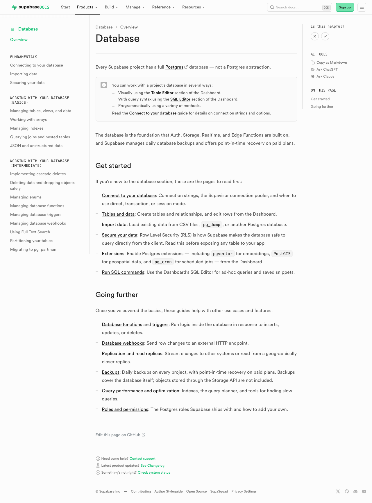 | 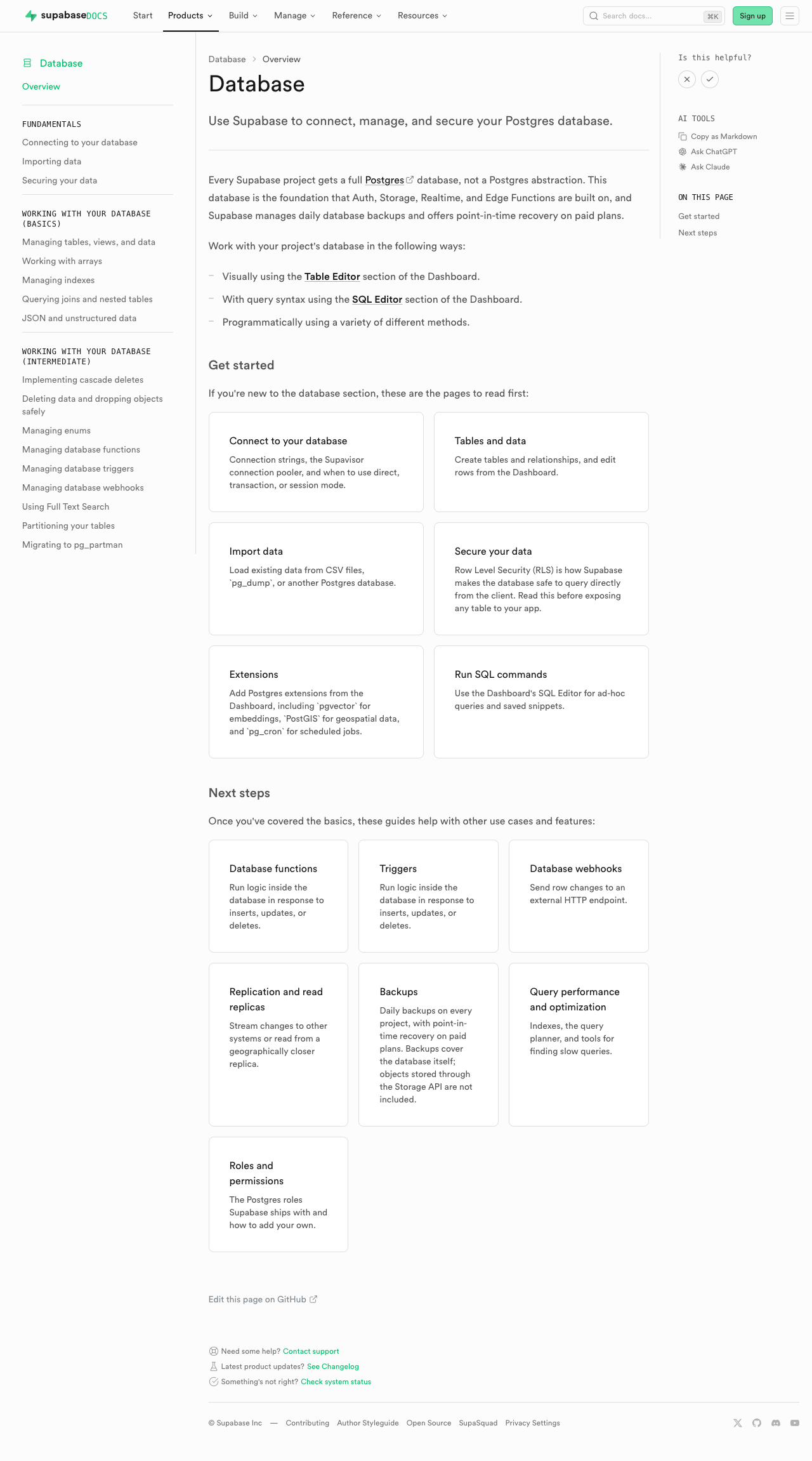 | #### Edge Functions | [Before (production)](https://supabase.com/docs/guides/functions) | [After (preview)](https://docs-git-fork-nrichers-nikrichers-docs-1032-sta-e2a8cb-supabase.vercel.app/docs/guides/functions) | | -------------------------------------------------------------------------------------------------------------------------------------------- | -------------------------------------------------------------------------------------------------------------------------------------------- | | 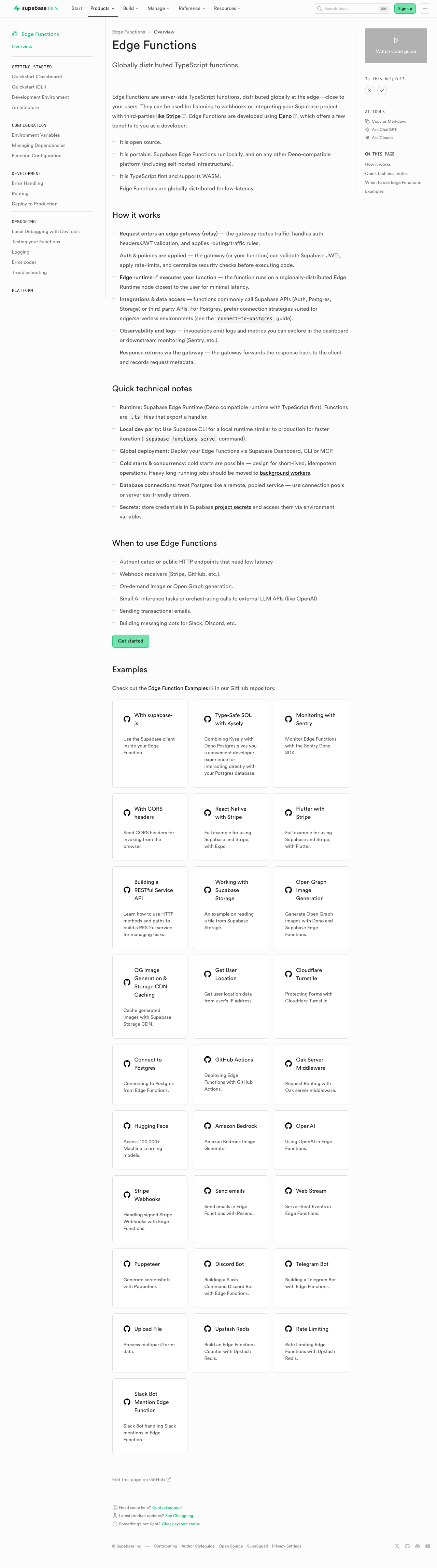 | 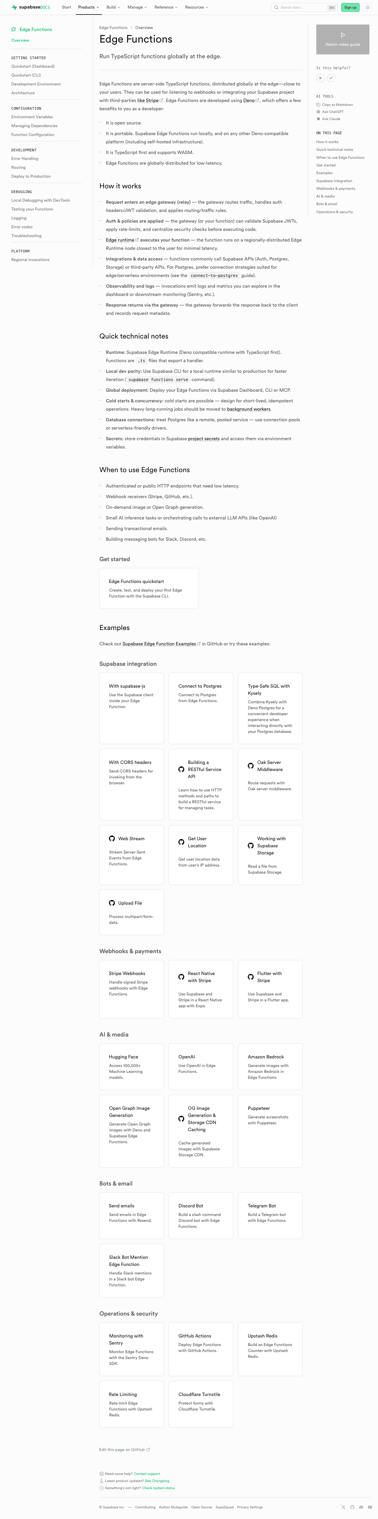 | #### Storage | [Before (production)](https://supabase.com/docs/guides/storage) | [After (preview)](https://docs-git-fork-nrichers-nikrichers-docs-1032-sta-e2a8cb-supabase.vercel.app/docs/guides/storage) | | ---------------------------------------------------------------------------------------------------------------------------------------- | ---------------------------------------------------------------------------------------------------------------------------------------- | |  |  | #### Realtime | [Before (production)](https://supabase.com/docs/guides/realtime) | [After (preview)](https://docs-git-fork-nrichers-nikrichers-docs-1032-sta-e2a8cb-supabase.vercel.app/docs/guides/realtime) | | ------------------------------------------------------------------------------------------------------------------------------------------- | ------------------------------------------------------------------------------------------------------------------------------------------- | |  |  | #### Getting Started (partial migration for demoing) | [Before (production)](https://supabase.com/docs/guides/getting-started) | [After (preview)](https://docs-git-fork-nrichers-nikrichers-docs-1032-sta-e2a8cb-supabase.vercel.app/docs/guides/getting-started) | | ------------------------------------------------------------------------------------------------------------------------------------------------------ | ------------------------------------------------------------------------------------------------------------------------------------------------------ | |  |  | ### Test plan - [ ] Visually verify migrated pages render correctly: - [ ] `/guides/auth` — grid "Get started", conditional pricing list, grid "Next steps" - [ ] `/guides/database/overview` — get started + next steps listings - [ ] `/guides/getting-started` — top 3-column grid - [ ] `/guides/functions` — get started + example listings - [ ] `/guides/storage` — get started, examples, resources listings - [ ] `/guides/realtime` — get started, examples, resources listings - [ ] Confirm listings render at explicit page positions - [ ] Click a content listing link and verify `docs_content_listing_clicked` fires in PostHog with expected properties (the new `listingId` is the namespaced kebab-case id, e.g. `storage-get-started`) - [ ] Build docs and confirm `.md` alternate output includes listing sections at component placement (e.g. `public/markdown/guides/storage.md`) - [ ] Run unit tests: `pnpm test:local lib/content-listings.test.ts` in `apps/docs` ## Summary by CodeRabbit ## Release Notes * **New Features** * Introduced a standardized content listings system for organizing related guides and resources. * Content listings now support both grid and list layouts for consistent presentation. * Added click telemetry for content listing interactions. * **Documentation** * Updated authentication, database, functions, getting started, realtime, and storage guide pages to use the new content listing components. * Improved MDX structure examples and listing markup formatting in contributor documentation. <!-- end of auto-generated comment: release notes by coderabbit.ai --> <!-- This is an auto-generated comment: release notes by coderabbit.ai --> ## Summary by CodeRabbit ## Release Notes * **New Features** * Introduced a new content listings component for displaying guide content in list and grid layouts across documentation pages. * Added telemetry tracking for content listing interactions to measure user engagement. * **Documentation** * Updated guide pages (Authentication, Database, Functions, Storage, Realtime, Getting Started) to use the new listings layout. * Added contribution guidelines for creating and managing content listings in documentation. * **Tests** * Added comprehensive test coverage for content listings validation, serialization, and rendering. <!-- end of auto-generated comment: release notes by coderabbit.ai --> --------- Co-authored-by: Nik Richers <nik@validmind.ai> Co-authored-by: Jeremias Menichelli <jmenichelli@gmail.com> |
||
|
Taryn King
|
f2f346dfde |
feat(docs): add page documenting free project pausing behavior (#47279)
## I have read the [CONTRIBUTING.md](https://github.com/supabase/supabase/blob/master/CONTRIBUTING.md) file. YES ## What kind of change does this PR introduce? Docs update ## What is the new behavior? Adds a page to Platform > Project & Account Management subsection to covers project pausing behavior for the Free plan. <!-- This is an auto-generated comment: release notes by coderabbit.ai --> ## Summary by CodeRabbit * **New Features** * Added a new “Project Pausing” guide link under **Platform → Project & Account Management**. * Published a new guide explaining Free Plan automatic project pausing, the 7-day inactivity determination, the warning/confirmation email flow, how to prevent pausing via activity, restoration within 90 days, and how to avoid future pauses by upgrading. <!-- end of auto-generated comment: release notes by coderabbit.ai --> --------- Co-authored-by: Chris Chinchilla <chris.ward@supabase.io> Co-authored-by: Chris Chinchilla <chris@chrischinchilla.com> |
||
|
Riccardo Busetti
|
df7a0ca3f7 | feat(replication): Evaluate new product name (#47066) | ||
|
Nik Richers
|
d1f71464f1 |
docs(security): document log_connections=off default and re-enable path (#47199)
## I have read the CONTRIBUTING.md file. YES ## What kind of change does this PR introduce? - docs update Closes DOCS-1080. ## What is the current behavior? - Linear item: [DOCS-1080](https://linear.app/supabase/issue/DOCS-1080/update-hipaa-and-security-docs-to-reflect-the-log-connectionsoff) (parent: PSQL-1307) - Docs do not mention that Postgres `log_connections` defaults to off for new projects, or how customers re-enable it for HIPAA/SOC 2 audit needs. - No customer-facing how-to for the Management API `log_connections` setting. ## What is the new behavior? - New guide: "Postgres connection logging" — default behavior, dashboard instructions, Management API curl examples, compliance notes. - HIPAA shared-responsibility, HIPAA projects, SOC 2, HIPAA compliance FAQ, logs guide, custom-postgres-config, and product-security updated with cross-links. - Platform nav entry added under **Platform → Postgres Connection Logging**. ### Proof: new guide and cross-links render **Verified:** `pnpm lint:mdx` (pass) · local dev (all changed pages 200) · Vercel preview (new page 200) | Check | Result | |-------|--------| | `pnpm lint:mdx` | pass (exit 0) | | Preview new guide | [200](https://docs-git-nikrichers-docs-1080-update-hipaa-and-e3b13d-supabase.vercel.app/docs/guides/platform/postgres-connection-logging) | | Preview HIPAA bullet | [shared-responsibility-model#managing-healthcare-data](https://docs-git-nikrichers-docs-1080-update-hipaa-and-e3b13d-supabase.vercel.app/docs/guides/deployment/shared-responsibility-model#managing-healthcare-data) | **Quick review links:** - [Postgres connection logging — New guide for the `log_connections=off` default and re-enabling via dashboard and Management API](https://docs-git-nikrichers-docs-1080-update-hipaa-and-e3b13d-supabase.vercel.app/docs/guides/platform/postgres-connection-logging) - [Shared Responsibility Model — Managing healthcare data — Added customer responsibility to keep connection logging enabled](https://docs-git-nikrichers-docs-1080-update-hipaa-and-e3b13d-supabase.vercel.app/docs/guides/deployment/shared-responsibility-model#managing-healthcare-data) - [HIPAA Projects — Added connection logging to required project configuration](https://docs-git-nikrichers-docs-1080-update-hipaa-and-e3b13d-supabase.vercel.app/docs/guides/platform/hipaa-projects) ## Additional context - **Before ready for review:** add dashboard screenshots once FE-3666 merges; add changelog cross-link when PSQL-1307 entry is published. - CLI does not expose `log_connections`; how-to documents Management API only until dashboard screenshots are added. ### Test plan - [ ] Open [preview guide](https://docs-git-nikrichers-docs-1080-update-hipaa-and-e3b13d-supabase.vercel.app/docs/guides/platform/postgres-connection-logging) — default behavior, API examples, compliance sections present - [ ] Confirm [HIPAA shared-responsibility bullet](https://docs-git-nikrichers-docs-1080-update-hipaa-and-e3b13d-supabase.vercel.app/docs/guides/deployment/shared-responsibility-model#managing-healthcare-data) links to the new guide - [ ] Confirm Platform nav includes **Postgres Connection Logging** - [ ] Spot-check Management API paths against `/docs/reference/api/v1-update-postgres-config` - [ ] After FE-3666: add Database Settings screenshots to the guide and PR proof section <!-- This is an auto-generated comment: release notes by coderabbit.ai --> ## Summary by CodeRabbit ## Summary by CodeRabbit * **Documentation** * Added a full guide for enabling/disabling Postgres connection logging (dashboard + Management API), including verification steps and examples. * Clarified which Postgres parameters are Management API–only (CLI limitations), with `log_connections` as an example. * Updated HIPAA, SOC 2, and shared responsibility guidance to recommend keeping Postgres connection logging enabled, plus added related FAQ/resources. * Expanded telemetry logs documentation with “Logging Postgres connections” and Logs Explorer visibility notes. * **UI / Navigation** * Added the new “Postgres Connection Logging” entry to the Platform configuration navigation. <!-- end of auto-generated comment: release notes by coderabbit.ai --> --------- Co-authored-by: Nik Richers <nik@validmind.ai> Co-authored-by: Chris Chinchilla <chris.ward@supabase.io> Co-authored-by: Chris Chinchilla <chris@chrischinchilla.com> |
||
|
Jeremias Menichelli
|
3a25a86874 | chore: Handle RealtimeLimitsEstimator component for md output (#47134) | ||
|
Jeremias Menichelli
|
88e669ae84 | chore: Handle SharedData component for md output (#47092) | ||
|
Jeremias Menichelli
|
d8c5ac723c | chore: Handle metric cards component for md output (#46999) | ||
|
Taha Le Bras
|
acbec2949d |
feat(docs): route docs page feedback comments to Postgres (#47041)
## Details of change Re-lands DATAENG-1468 (docs page feedback to Postgres) with an **insert-only** design that avoids the cross-project auth issue that caused the prior revert. - New insert-only `feedback_comments` table: anon `insert` policy only (no select/update/delete). Columns: `page`, `vote`, `title`, `comment`, `user_id`, `metadata`. - The docs widget writes the free-text comment to `feedback_comments` via the **anon key**. The votes `feedback` table is untouched (one row per vote). - No user token is sent to the content project anymore (that was the cause of the previous failure): the feedback client uses the anon key only. - The commenter's account user id (gotrue UUID) is read client-side from the session and stored as a plain `user_id` column for attribution (comments are logged-in-only). Org/project association is derived downstream in BigQuery via that id; docs pages aren't project-scoped, so there's no project_ref/org to capture here. - Removed the previous update-by-id approach, the per-user RLS policies, and the obsolete unit test. ## Why the previous version was reverted It authenticated feedback writes with the supabase.com account session token, but the requests target the docs content project (`xguihxuzqibwxjnimxev`), which cannot verify that token. Logged-in users got `PGRST301 / JWSInvalidSignature`. This version removes the user token entirely, so writes succeed for everyone. ## Verification Insert-only RLS means a row can be written but not read/updated/deleted by `anon`. Comments retrievable with `where comment is not null` is not needed (separate table); just query `feedback_comments`. <!-- This is an auto-generated comment: release notes by coderabbit.ai --> ## Summary by CodeRabbit * **New Features** * The feedback form now captures a vote rating along with an optional title and detailed comments, saving richer context for review. * **Refactor** * Feedback submission has been streamlined to write directly to the database for both vote and comment submissions. * **Maintenance** * Updated the feedback data typings to support the new title, comment, user, page, and vote fields via the new feedback comments storage. <!-- end of auto-generated comment: release notes by coderabbit.ai --> |
||
|
Chris Chinchilla
|
309f4b2612 |
docs: Track 404 recommendation clicked (#46990)
## I have read the [CONTRIBUTING.md](https://github.com/supabase/supabase/blob/master/CONTRIBUTING.md) file. YES <!-- This is an auto-generated comment: release notes by coderabbit.ai --> ## Summary by CodeRabbit * **New Features** * Added analytics telemetry for documentation 404 recommendation clicks, recording the clicked destination and the originating page. * **Improvements** * Enhanced the ButtonCard component to optionally handle click actions via an `onClick` callback and forward it to the underlying link element. <!-- end of auto-generated comment: release notes by coderabbit.ai --> |
||
|
Jeremias Menichelli
|
90b15736aa | chore: Repurpose CostWarning component as partial only (#46996) |















