mirror of
https://github.com/supabase/supabase.git
synced 2026-09-06 18:11:51 +08:00
create-pull-request/patch
6 Commits
| Author | SHA1 | Message | Date | |
|---|---|---|---|---|
 Danny White
|
e74ccefbb9 |
fix(docs): add cursor-pointer to tabs and copy controls (#48380)
## I have read the [CONTRIBUTING.md](https://github.com/supabase/supabase/blob/master/CONTRIBUTING.md) file. YES ## What kind of change does this PR introduce? Bug fix / polish ## What is the current behavior? Some docs interactive controls (copy buttons, tab triggers) do not show a pointer cursor on hover, so they feel less clickable than surrounding links. Called out on https://github.com/supabase/supabase/pull/48318. ## What is the new behavior? Adds `cursor-pointer` in one sweep so related controls stay consistent: - Shared `TabsTrigger` in `packages/ui` (covers PromptPanel AI Prompt / CLI tabs, including the unselected tab) - PromptPanel copy button and Show more / Show less - Guides sidebar “Copy as Markdown” - Docs code block copy button ## To test Hover the controls below and confirm the cursor is `pointer` on both selected and unselected tabs, and on copy buttons. ### Docs Preview: https://docs-git-dnywh-docs-cursor-pointer-supabase.vercel.app/docs - Homepage setup prompt: [AI Prompt / CLI tabs + copy](https://docs-git-dnywh-docs-cursor-pointer-supabase.vercel.app/docs) - Quickstart prompt: [Show more / Show less + copy](https://docs-git-dnywh-docs-cursor-pointer-supabase.vercel.app/docs/guides/getting-started/quickstarts/nextjs) - Guide sidebar + code block: [Copy as Markdown + code copy](https://docs-git-dnywh-docs-cursor-pointer-supabase.vercel.app/docs/guides/database/tables) ### Design system Preview: https://design-system-git-dnywh-docs-cursor-pointer-supabase.vercel.app/design-system - Shared tabs demo: [Account / Password triggers](https://design-system-git-dnywh-docs-cursor-pointer-supabase.vercel.app/design-system/docs/components/tabs) ### UI library Preview: https://ui-library-git-dnywh-docs-cursor-pointer-supabase.vercel.app/ui - Install command package-manager tabs (npm / pnpm / yarn / bun) + copy: [Password-based auth](https://ui-library-git-dnywh-docs-cursor-pointer-supabase.vercel.app/ui/docs/nextjs/password-based-auth) ### Studio (staging) Preview: https://studio-staging-git-dnywh-docs-cursor-pointer-supabase.vercel.app - Auth user panel: open a project → Authentication → Users → select a user → hover Overview / Logs (and related) tabs - Connect sheet: open Connect on a project → hover the install method tabs ### Studio (self-hosted) Preview: https://studio-self-hosted-git-dnywh-docs-cursor-pointer-supabase.vercel.app - Same `TabsTrigger` callsites as Studio staging (user panel / Connect sheet) ### WWW Preview: https://zone-www-dot-com-git-dnywh-docs-cursor-pointer-supabase.vercel.app - Blog chart tabs (`PGChart` → shared `TabsTrigger`): [Latency / Number of results / Average latency / Raw data](https://zone-www-dot-com-git-dnywh-docs-cursor-pointer-supabase.vercel.app/blog/postgres-full-text-search-vs-the-rest) (scroll to the Results section) ## Additional context Split out from #48318 so the homepage prompt polish stays focused. Prefer fixing the shared tab trigger rather than only the PromptPanel copy button, otherwise the copy control would show pointer while an unselected CLI tab would not. <!-- This is an auto-generated comment: release notes by coderabbit.ai --> ## Summary by CodeRabbit * **Style** * Improved hover feedback across the docs UI by adding a pointer cursor to “Copy as Markdown,” code block copy and word-wrap controls, prompt copy buttons, and tab selectors. * Updated cursor styling consistently so interactive controls better communicate clickability. <!-- end of auto-generated comment: release notes by coderabbit.ai --> |
||
|
Danny White
|
5712eefe06 |
fix(docs): polish homepage AI setup prompt (#48318)
## What kind of change does this PR introduce? Bug fix / docs UI polish. ## What is the current behavior? The homepage AI Prompt panel: - Has an `expandable` feature but its overflow contents are ~1 line extra - Expanding it affects the cover height and causes layout shift - Below `xl`, the hero stacked and the logo sat alone above the title on small screens. ## What is the new behavior? - Shows the full AI setup prompt by default and removes the unused `expandable` machinery from `PromptPanel` - Keeps both tab panes in a shared grid cell so the panel height stays stable when switching tabs - Keeps logo + title in a row at all sizes, and starts the side-by-side hero (copy + prompt) at `lg` instead of `xl` | Before | After | | --- | --- | | <img width="1279" height="722" alt="15728" src="https://github.com/user-attachments/assets/c61fdbbc-706c-47cf-8b47-4245d4c96215" /> | <img width="1280" height="722" alt="Supabase Docs" src="https://github.com/user-attachments/assets/ab3a97a4-d725-4d9e-92bf-6f564a22f1bd" /> | | <img width="1279" height="722" alt="Supabase Docs" src="https://github.com/user-attachments/assets/42906c4b-4f82-4fbc-8bab-3f5d9530aa54" /> | <img width="1280" height="722" alt="Supabase Docs" src="https://github.com/user-attachments/assets/177a17d7-536c-4bd6-a8d0-1a2bc10f3ac9" /> | | <img width="1012" height="722" alt="96312" src="https://github.com/user-attachments/assets/032a3b43-078f-4d13-a67d-9a36c76a9be5" /> | <img width="1012" height="722" alt="Supabase Docs" src="https://github.com/user-attachments/assets/f3ff3c0a-6df8-4e61-bfcb-ab99e99cccea" /> | ## To test Play around with the docs homepage AI Prompt panel on the Vercel preview at various breakpoints: https://docs-git-dnywh-docs-ai-prompt-expanded-supabase.vercel.app/ <!-- This is an auto-generated comment: release notes by coderabbit.ai --> ## Summary by CodeRabbit - **New Features** - Improved prompt panel tab navigation with manual activation for more predictable switching and enhanced accessibility. - Inactive tab panels now remain mounted while reflecting active/inactive state for smoother transitions. - **Style** - Refined the documentation homepage cover layout, including responsive alignment, logo sizing behavior, and updated heading/paragraph spacing. - Updated setup prompt presentation and refined expandable prompt sizing and control styling. - **Bug Fixes** - Inactive prompt content is now hidden and non-interactive, preventing unintended interaction. <!-- end of auto-generated comment: release notes by coderabbit.ai --> |
||
|
Nik Richers
|
d46cc88f09 |
docs: add agent prompts to all 18 framework quickstarts (#47543)
## I have read the [CONTRIBUTING.md](https://github.com/supabase/supabase/blob/master/CONTRIBUTING.md) file. YES ## What kind of change does this PR introduce? Docs enhancement: Agent-ready prompt blocks on all 18 framework quickstart pages. ## What is the current behavior? Framework quickstarts do not surface a copyable AI prompt. Readers have to assemble context themselves when asking an AI coding assistant to follow the guide. ## What is the new behavior? - Partials at `apps/docs/content/_partials/ai/quickstart_prompt_{framework}.mdx` contain `<AiPrompt prompt={...} />` (Prettier multiline single-quoted JS string with `\n` escapes). - Each quickstart includes `<$Partial path="ai/quickstart_prompt_{framework}.mdx" />`. - Runtime: `AiPrompt` → `PromptPanel` (Copy AI Prompt, expandable). - Markdown export: `apps/docs/internals/markdown-schema/AiPrompt.ts` decodes Prettier single-quoted prompt expressions so exported markdown includes an **AI Prompt** section without quote leak. - Shared `$Partial` helpers live in `lib/partials.utils.ts`. - Closes DOCS-1144. ### Example before/after | | Production | Preview | | --- | --- | --- | | Next.js quickstart | [production](https://supabase.com/docs/guides/getting-started/quickstarts/nextjs) | [preview](https://docs-git-nikrichers-docs-1144-add-ai-prompt-blo-5af4d8-supabase.vercel.app/docs/guides/getting-started/quickstarts/nextjs) | **Light** | Before | After | | --- | --- | |  |  | **Dark** | Before | After | | --- | --- | |  | 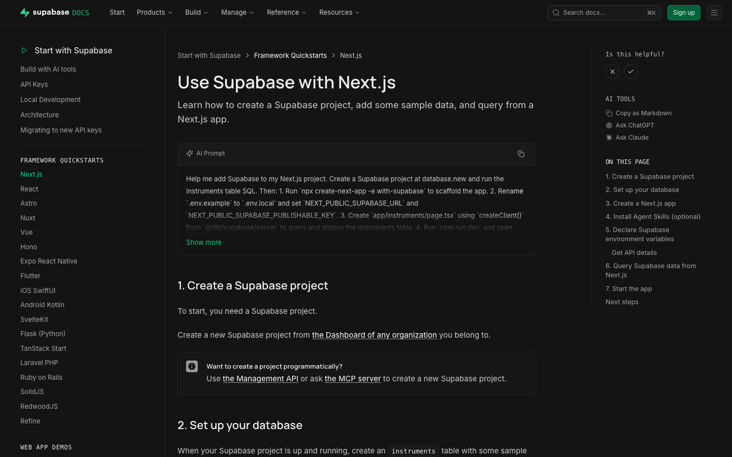 | ### Test plan - [x] Preview renders AI Prompt panel with copy - [x] Spot-check Next.js, Flutter, Expo, Vue - [x] `test-quickstart-prompts` structural - [x] Markdown export includes **AI Prompt** without quote leak - [x] Format CI green after prettier/single-quote decode fix ## Additional context - Worktree: `~/GitHub/supabase/supabase-worktrees/nikrichers/docs-1144-add-ai-prompt-blocks-to-all-18-framework-quickstarts` - Skills: `generate-quickstart-prompts` / `test-quickstart-prompts`; librarian update https://github.com/supabase/docs-agent-skills/pull/21 - `PromptPanel` replaced the older GlassPanel experiment for the expandable copy UI --------- Co-authored-by: Nik Richers <nik@validmind.ai> Co-authored-by: jeremenichelli <jeremenichelli@users.noreply.github.com> |
||
|
Danny White
|
3bca21b3f8 |
chore(a11y): convert leftover focus recipes to focus-ring (#48219)
## What kind of change does this PR introduce? Accessibility cleanup (DEPR-628). ## What is the current behavior? Leftover call sites still use ad-hoc focus recipes (`ring-foreground-muted`, `outline-brand`, Dialog/Sheet `focus:` rings, etc.) instead of the shared utilities from #41575. ## What is the new behavior? Converts those leftovers across `packages/ui`, Studio, www, docs, and design-system to `focus-ring`, preferring `focus-visible`. Keeps documented exceptions (`group-focus-visible`, InputGroup `:has()`). ## To test Tab through controls (keyboard only). Expect a consistent offset ring on `:focus-visible`, not a green/brand/custom stack, and no ring animation. ### www (marketing) Preview: https://zone-www-dot-com-git-danny-depr-628-focus-ring-fbccf9-supabase.vercel.app - Global nav on `/`: Product, Developers, Solutions dropdowns; logo; hamburger + mobile menu - `/features`: view toggles and feature cards - `/company`: card links - `/changelog`: timeline / entry links - `/partners/catalog`: grid/list toggle and partner cards - `/pricing`: compute section expand control - Product / Modules / Solutions sticky navs on product pages (e.g. `/database`, `/storage`) - `/state-of-startups`: TwoOptionToggle if present ### docs Preview: https://docs-git-danny-depr-628-focus-ring-long-tail-supabase.vercel.app - Any guide page: top nav dropdowns and items - Narrow viewport: hamburger, then mobile menu links + close - Guide with PromptPanel / tabs: tab to prompt actions and tab list ### studio (dashboard) Preview: https://studio-staging-git-danny-depr-628-focus-ring-long-tail-supabase.vercel.app - Project home: Connect section tiles; drag-handle focus on sortable sections - Integrations marketplace (`/project/<ref>/integrations`): featured cards, list/grid toggle, list rows - Auth (`/project/<ref>/auth/oauth-apps`, `/project/<ref>/auth/providers`): open create/edit sheet, tab to close (X) - Database policies (`/project/<ref>/database/policies`): open policy editor sheet, tab to close - Storage policies (`/project/<ref>/storage/files/policies`): bucket section links; policy modal close - Query performance (`/project/<ref>/observability/query-performance`): info icon buttons on metrics - Replication pipeline detail (if available): slot lag / status info icons - Support (`/support/new`): attachment add/remove controls - Table editor: spreadsheet import preview checkboxes; row text/JSON editor TwoOptionToggle - Any Dialog/Sheet/toast close (X): ring on keyboard focus only, not mouse click ### design-system Preview: https://design-system-git-danny-depr-628-focus-ring-long-tail-supabase.vercel.app - Colour palette swatches (keyboard focus) - Form patterns sidepanel example: avatar / focusable control in the example ## Additional context - Linear: [DEPR-628](https://linear.app/supabase/issue/DEPR-628) - Follow-ups: form-group CSS (DEPR-629), Storage columns selection (DEPR-630), ESLint rule (DEPR-632) <!-- This is an auto-generated comment: release notes by coderabbit.ai --> ## Summary by CodeRabbit * **Accessibility & Usability** * Standardized keyboard focus indicators across navigation, dialogs, forms, buttons, toggles, links, and tooltips using a consolidated focus style. * Improved toggle controls to use proper button semantics (instead of clickable text), including `aria-pressed`/disabled handling and better keyboard navigation. * **Visual Updates** * Harmonized hover/focus ring visuals across the design system, Studio, documentation, and marketing pages while preserving existing layout and interaction behavior. <!-- end of auto-generated comment: release notes by coderabbit.ai --> |
||
|
Danny White
|
6f6badae51 |
fix(eslint): promote require-explicit-tabindex to error (#48170)
## What kind of change does this PR introduce? Accessibility / lint hardening (Safari keyboard focus). ## What is the current behavior? `supabase/require-explicit-tabindex` is `'warn'`. Studio’s ratchet was at 0 but the rule was still ratcheted; www / docs / design-system still had raw `<button>` / `role="button"` call sites without an explicit `tabIndex`. [DEPR-627](https://linear.app/supabase/issue/DEPR-627) · follow-up to #47984 / #48040 ## What is the new behavior? - Shared config: `'supabase/require-explicit-tabindex': 'error'` - Swept www / docs / design-system (+ Studio test fixtures the ratchet skipped) - Removed the rule from the Studio ratchet + baselines ## To test Prefer **Safari**. This PR only adds explicit `tabIndex` to raw `<button>` / `role="button"` call sites — not links, and not controls that already go through `Button` from `ui`. ### Marketing (`www`) ([staging link](https://zone-www-dot-com-git-danny-depr-627-promote-req-7ae43c-supabase.vercel.app/)) - [x] Homepage frameworks / dashboard feature tabs — Tab through each tab button - [x] Product pages (e.g. `/auth`, `/database`) — section tab switchers - [x] Narrow viewport — open the hamburger; Tab through menu buttons - [x] `/partners/catalog` — filter / view controls - [x] Blog view toggle (list ↔ grid) ### Docs ([staging link](https://docs-git-danny-depr-627-promote-require-explici-25e46d-supabase.vercel.app/)) - [x] **Desktop (≥ lg):** top-right **⋯ menu** (hamburger icon) — opens a dropdown that includes Theme. Not a separate theme button. - [x] **Mobile (< lg):** top-right **hamburger** opens the sheet; close (X) is the raw button we tagged. Theme inside the sheet uses `ThemeToggle` / `DropdownMenuTrigger` from `ui` (already supposed to set `tabIndex`). - [x] **Code blocks** — copy / language controls - [x] **Is this helpful?** — X / check are `Button` from `ui` (should already Tab). After voting **while signed in**, the follow-up “What went well?” / “How can we improve?” text button is the raw one we tagged. - [x] **AI Tools → Copy as Markdown** (right rail on a guide) — this is the only GuidesSidebar control this PR changed. “On this page” TOC items are **links**, not covered by this lint. - [x] **Reference docs** (e.g. JS client reference) — section headers that expand/collapse in the left nav (`Collapsible.Trigger`) - [x] **Troubleshooting index** — type in the search field, then Tab to the **clear (X)** control ### Dashboard (`studio`) No production UI changes in this PR (tests + lint config only). Quick Safari smoke that prior tabindex work still holds: - [x] Project sidebar — Tab through primary nav links - [x] Settings → General — Tab through inputs / buttons - [x] Storage → Files — Tab a bucket row / file actions |
||
|
Saxon Fletcher
|
2d745edfb4 | Landing page agent focus (#47989) |


