mirror of
https://github.com/supabase/supabase.git
synced 2026-09-07 18:38:50 +08:00
create-pull-request/patch
10 Commits
| Author | SHA1 | Message | Date | |
|---|---|---|---|---|
 Saxon Fletcher
|
36d2982af4 |
docs: add reusable monitoring agent setup components (#49506)
<!-- CURSOR_AGENT_PR_BODY_BEGIN --> ## Stack Draft stack extracted from `docs/monitoring`. Merge bottom-up. Troubleshooting / debugging-guide rewrite is out of scope. 1. #49503 move inspect and advisors 2. #49501 split Studio logs from ClickHouse queries 3. #49500 treat reports as signal dashboards 4. #49502 add Observe the data hub 5. **#49506** add agent setup components ← **this PR** 6. #49504 add hire-an-agent templates 7. #49505 restructure observability nav and overview ## I have read the [CONTRIBUTING.md](https://github.com/supabase/supabase/blob/master/CONTRIBUTING.md) file. YES ## What kind of change does this PR introduce? Docs app feature (MDX components + markdown export). Fifth layer in the observability stack. ## What is the current behavior? There is no shared way to render a monitoring agent prompt, schedule, and Claude/Codex/Cursor setup instructions in both HTML and generated markdown. ## What is the new behavior? - `AgentSetup` and `AgentWatchSchedule` MDX components, registered for HTML and markdown export - Shared `monitoring-agents` data (cadence, prompt ids, harness steps) - Opt-in `AiPrompt` markdown export (`includeInMarkdown`) so quickstarts stay HTML-only - Optional content-listing `subtitle` for schedule labels on cards No agent guide pages yet — those land in #49504 so this PR stays a reviewable code change. ## Additional context Markdown schema handlers share the same data module as the React components. <!-- CURSOR_AGENT_PR_BODY_END --> <div><a href="https://cursor.com/agents/bc-a3cb5ece-925b-4046-b58a-5d69e9a9d794?cursor_ref=pr_footer&cursor_cta=open_in_web"><picture><source media="(prefers-color-scheme: dark)" srcset="https://cursor.com/assets/images/open-in-web-dark.png"><source media="(prefers-color-scheme: light)" srcset="https://cursor.com/assets/images/open-in-web-light.png"><img alt="Open in Web" width="114" height="28" src="https://cursor.com/assets/images/open-in-web-dark.png"></picture></a> <a href="https://cursor.com/background-agent?bcId=bc-a3cb5ece-925b-4046-b58a-5d69e9a9d794&cursor_ref=pr_footer&cursor_cta=open_in_cursor"><picture><source media="(prefers-color-scheme: dark)" srcset="https://cursor.com/assets/images/open-in-cursor-dark.png"><source media="(prefers-color-scheme: light)" srcset="https://cursor.com/assets/images/open-in-cursor-light.png"><img alt="Open in Cursor" width="131" height="28" src="https://cursor.com/assets/images/open-in-cursor-dark.png"></picture></a> </div> --------- Co-authored-by: Cursor Agent <cursoragent@cursor.com> Co-authored-by: Saxon Fletcher <SaxonF@users.noreply.github.com> |
||
|
Ivan Vasilov
|
02cf09212e |
chore: Remove tsconfig paths (#49770)
This PR removes all `paths` in `tsconfig.json` for all apps and packages. They were added previosly because some of the components had a `_Shadcn` suffix because of an ongoing migration. How that the migration is done, the paths can be removed. <!-- This is an auto-generated comment: release notes by coderabbit.ai --> ## Summary by CodeRabbit * **Refactor** * Standardized shared UI component, utility, and icon imports across design-system examples and application screens. * Simplified shared component access and project configuration. * Added shared access to anchor-link helpers and animation styles. * **Compatibility** * Updated component exports and imports without changing existing behavior. * No changes to user-facing workflows, screens, or functionality. <!-- end of auto-generated comment: release notes by coderabbit.ai --> |
||
|
Nik Richers
|
08867f94ff |
docs: lead self-hosting overview with what/why/CTA, restructure secondary content (#48415)
## I have read the [CONTRIBUTING.md](https://github.com/supabase/supabase/blob/master/CONTRIBUTING.md) file. YES ## What kind of change does this PR introduce? Docs restructure of the self-hosting overview: short fit intro, Get started / community listings above the fold, parallel h2 sections for how self-hosting differs (including local development), responsibilities, and telemetry, plus a streamlined support listing with better card content. Closes DOCS-1251. ## What is the current behavior? - Linear item: Explore two PR approaches for the self-hosting page - The self-hosting overview page (`/guides/self-hosting`) is the top search hit for "supabase self-hosting," but reads as a wall of text: three full prose/bullet sections (differs / responsibilities / telemetry) come before the getting-started CTA, which is buried as one small card partway down the page. ## What is the new behavior? - Short fit intro; `self-hosting-get-started` and `self-hosting-community` listings sit directly under the intro. - Top-level h2s for how self-hosting differs, responsibilities, telemetry, and support (no "More about self-hosting" wrapper). - Under differs: rewritten single-project + platform-gap copy, plus `### Not the same as local development` (CLI stack is not a production self-host; points to Docker / community options). - Telemetry clarifies CLI local-dev telemetry vs Docker Compose (no phone-home). - Merged support into a single `self-hosting-support` listing; Enterprise subsection unchanged. - Minor a11y: `aria-hidden` on GlassPanel decorative icon background. ## Additional context - Worktree: `~/GitHub/supabase/supabase-worktrees/nikrichers/docs-1251-self-hosting-inform` - Review: removed the "More about self-hosting" grouping after feedback that it undersold differs / responsibilities. - Companion prototype PR 48416 is closed; this branch is the direction under review. - Verification: | Check | Result | | ----------------------------------------------- | ------------------------------------------------------------------ | | `pnpm lint:mdx content/guides/self-hosting.mdx` | Pass — no errors/warnings on this file | | Vercel docs preview | Pass — full-page after screenshot captured from the preview deploy | ### Proof: intro and get-started above the fold; parallel h2s for differs, responsibilities, and telemetry **Verified:** `pnpm lint:mdx content/guides/self-hosting.mdx` (pass) · Vercel docs preview (pass) ### Before & After | [Before (production)](https://supabase.com/docs/guides/self-hosting) | [After (PR preview)](https://docs-git-nikrichers-docs-1251-self-hosting-inform-supabase.vercel.app/docs/guides/self-hosting) | | ------------------------------------------------------------------------------------------------------------------------------------------------ | ---------------------------------------------------------------------------------------------------------------------------------------------- | |  |  | ### Test plan - [ ] Visit the preview link and confirm the page opens with intro above the Get started listings - [ ] Confirm parallel h2s for differs / responsibilities / telemetry / support (no "More about self-hosting") - [ ] Confirm "Not the same as local development" distinguishes the CLI stack from self-hosting - [ ] Confirm Support and community is one card grid - [ ] Check mobile width — layout should still be usable - [ ] Confirm `/guides/self-hosting/docker` link still works <!-- This is an auto-generated comment: release notes by coderabbit.ai --> ## Summary by CodeRabbit - **Documentation** - Reorganized the self-hosting guide with clearer getting-started resources and community links. - Added dedicated guidance for local development, managed Supabase, telemetry, and self-hosting responsibilities. - Consolidated support resources into one section covering discussions, issues, chat, Reddit, and sharing experiences. - **Accessibility** - Marked decorative icon backgrounds as hidden from assistive technologies. <!-- end of auto-generated comment: release notes by coderabbit.ai --> --------- Co-authored-by: Nik Richers <nik@validmind.ai> Co-authored-by: Claude <noreply@anthropic.com> |
||
|
Danny White
|
c0f1ef51fb |
feat(docs): migrate resources and getting-started to ContentListings (#48517)
## What kind of change does this PR introduce? Docs update / follow-up to #48379. ## What is the current behavior? `/guides/resources` and `/guides/getting-started` hand-roll `GlassPanel` grids in MDX. They look like ContentListings cards after the chrome PR, but they do not use the shared data files, so they miss PostHog `docs_content_listing_clicked` telemetry and the CONTRIBUTING contribution path. ## What is the new behavior? Those pages use `<ContentListings id="…" />` backed by `resources.data.ts` and `getting-started.data.ts`, same pattern as storage. - Section-level `$Show` wrappers stay for framework / web / mobile blocks - Nimbus stays a `$Partial` behind `$Show` - New optional per-item `feature` field gates SDK links (e.g. Flutter / Swift / Kotlin) without splitting whole sections - CONTRIBUTING notes when to use `feature` vs a partial-level `$Show` ## To test Compare the following against `master`: - [Resources](https://docs-git-dnywh-docs-content-listings-resources-239158-supabase.vercel.app/docs/guides/resources): overview, migrate, and postgres grids; icons in light/dark - [Getting started](https://docs-git-dnywh-docs-content-listings-resources-239158-supabase.vercel.app/docs/guides/getting-started): overview, use cases, framework quickstarts, web demos, mobile tutorials; nimbus partial when enabled - Click a card and confirm `docs_content_listing_clicked` fires with the expected `listingId` Everything should look and feel the same. It’s just that we’re using `ContentListings` instead of `GlassPanel` grids. <!-- This is an auto-generated comment: release notes by coderabbit.ai --> ## Summary by CodeRabbit - **New Features** - Added centralized Getting Started and Resources content listings, including quickstarts, demos, tutorials, migration guides, and Postgres resources. - Added feature-based visibility controls for individual content listing items. - **Improvements** - Disabled content is now automatically hidden from documentation pages and generated Markdown. - Pages and sections with no available content are omitted entirely. - External documentation links are more secure. - Updated contribution guidance with instructions and examples for feature flags. <!-- end of auto-generated comment: release notes by coderabbit.ai --> |
||
|
Danny White
|
3b06c6c7cc |
fix(docs): unify docs card hover and retire IconPanel (#48379)
## What kind of change does this PR introduce?

Bug fix / docs UI polish.

## What is the current behavior?

- Many docs `GlassPanel`s use `background={false}`, so hover only tweaks
the border and reads as having no hover state
- Compact icon+label grids still use `IconPanel`, which has a broken
`-z-10` hover fill and overlaps with the newer `IconLink` pattern
- Description card grids jump to 3-up too early on medium widths

## What is the new behavior?

**GlassPanel**
- Removes the `background` prop; cards always use the filled surface
with stronger border hover
- Tightens icon→description gap (`gap-6` → `gap-3`)
- Decorative icons/logos use empty `alt` so screen readers don’t hear
the title twice

**Icon tiles**
- Retires `IconPanel` from docs and deletes it from `ui-patterns`
- Uses `IconLink` / `IconLinkList` for compact navigation tiles (auth
providers, social login, etc.)
- Adds `IconLinkButton` for SMS provider pickers (same chrome, opens a
dialog)
- Adds focus styles, list labelling, and dialog-trigger ARIA where
needed

**Layout / content**
- Migrate-to-Supabase description cards on resources use `GlassPanel`
(not slim icon tiles)
- Grid spans use `md:… xl:…` so cards stay 2-up until ~1280px
- Fixes migrate links to `/guides/platform/migrating-to-supabase/…` and
SSR quickstarts to `creating-a-client` with framework query params
- Moves the Extensions list `key` onto the outer `Link`

| Before | After |
| --- | --- |
| <img width="1185" height="1323" alt="Resources Supabase Docs"
src="https://github.com/user-attachments/assets/1677bf65-d3a3-4202-8c70-e758f7c3bcce"
/> | <img width="1185" height="1323" alt="Resources Supabase Docs"
src="https://github.com/user-attachments/assets/51760f0f-62b6-4010-9841-de26039f37b4"
/> |

## Additional context

Homepage compact sections already use `IconLinkList` from #48317; this
PR finishes that pattern for remaining docs `IconPanel` callsites and
cleans up GlassPanel hover.

`www/customers` only drops the removed `background` prop; those cards
already use the filled surface via `logo`.

## Test plan

- [ ] `/guides/getting-started`: GlassPanels show filled surface and
clearer border hover
- [ ] `/guides/resources`: migrate cards are GlassPanels with working
`/platform/…` links; 2-up until xl
- [ ] `/guides/auth/social-login` and auth providers partial: IconLink
tiles hover/focus correctly
- [ ] `/guides/auth/phone-login`: SMS provider buttons open dialogs;
keyboard focus works
- [ ] Docs homepage: migrate / self-host IconLinkLists unchanged in
behaviour
- [ ] `/guides/auth/server-side`: Next.js / SvelteKit cards resolve on
docs preview

<!-- This is an auto-generated comment: release notes by coderabbit.ai
-->

## Summary by CodeRabbit

* **Improved Layouts**
* Made “GlassPanel” card grids more responsive and consistent; refined
card and success badge spacing for a cleaner presentation.
* **Updated Documentation**
* Refreshed multiple guide and resource pages (including quickstarts and
migration content) with standardized card layouts and updated link
destinations.
* **Component Updates**
* Standardized “GlassPanel” styling (background toggle removed) and
simplified icon-based panels; added an `IconLinkButton` for action
tiles; updated authentication provider grids to use the shared tile UI.

<!-- end of auto-generated comment: release notes by coderabbit.ai -->
|
||
|
Nik Richers
|
e0ecaadc21 |
docs: make AI tools section agent-first (#48167)
## I have read the [CONTRIBUTING.md](https://github.com/supabase/supabase/blob/master/CONTRIBUTING.md) file. YES ## What kind of change does this PR introduce? This PR reworks the `/guides/ai-tools` docs section to be agent-first. The overview now leads with the fastest path to a working setup (the plugin install command), a "What's supported?" card grid showing which coding agents and IDEs work via Plugin and/or MCP (with each product's own tagline, not a generated sentence), and a concepts glossary — instead of a plain four-item list. The sidebar "AI Tools" widget, shown on every guides page, now links to this hub ("Connect your AI agent") instead of opening a ChatGPT/Claude chat frontend. Closes DOCS-1201. ## What is the current behavior? - The `/guides/ai-tools` overview is a plain four-item bullet list with no getting-started path, compatibility info, or concepts explanation. - The sidebar "AI Tools" widget offers "Copy as Markdown", "Ask ChatGPT", and "Ask Claude" — the latter two send you to a chat frontend instead of agent setup. ## What is the new behavior? - `ai-tools.mdx`: intro → plugin install callout → "What's supported?" card grid (`<ContentListings id="ai-tools-supported-agents" />`, icon + tagline + Plugin/MCP badge per agent) → "Key concepts" glossary → "Building AI into your app?" (also converted to `ContentListings`). - New `data/content-listings/ai-tools.data.ts` builds the card grid from the existing `PLUGIN_CLIENTS`/`MCP_CLIENT_DATA` client lists (no new hand-maintained data) — fixing two latent bugs found along the way: GitHub Copilot was keyed differently between the two sources (would have produced duplicate cards), and Windsurf has no upstream docs URL (would have been silently dropped). - New opt-in `badgePosition` field on `ContentListingItem` so the badge renders under the title for the agent grid, without changing the one other existing badge usage (self-hosting's "Official" tag, still inline). - `plugins.mdx`/`mcp.mdx`/`ai-skills.mdx` each get a one-line "Quick start" lead-in so they stand alone via the `.md` content-negotiation route. - `GuidesSidebar.tsx` + `telemetry-constants.ts`: Added "Connect your AI agent" → `/guides/ai-tools`, and the `ask_ai_clicked` event with `agent_setup_clicked`. - Accessibility fix (from review): the "Not supported" indicator now exposes an `sr-only` label instead of being fully `aria-hidden`. ## Additional context - Worktree: `~/GitHub/supabase/supabase-worktrees/nikrichers/docs-1201-make-guidesai-tools-agent-first-and-replace-chat-frontend` - **Open question — Windsurf card**: `windsurf.com` now redirects to a Devin Desktop page (Cognition acquired Windsurf in 2025), but Supabase's own `MCP_CLIENT_DATA` still targets Windsurf's distinct config path (`~/.codeium/windsurf/mcp_config.json`), so the card is still labeled "Windsurf" with its pre-acquisition tagline ("The first agentic IDE. Tomorrow's editor, today."). Needs a follow-up decision on whether to relabel/merge/drop this card once Devin Desktop's MCP support (if any) is confirmed. - Follow-up (not in this PR): deeper IA rework of the ai-tools section belongs to the broader agent-first audit; `content/guides/resources/glossary.mdx` has no MCP/Agent Skills/Plugin/Prompts entries yet — this PR's "Key concepts" is currently the only definition of these terms site-wide. - Verification: | Check | Result | | --- | --- | | Lint (`lint:mdx`, `eslint`), `typecheck`, `test:local lib/content-listings.test.ts` | Pass — 13/13 tests, 0 errors | | `build:guides-markdown` | Pass — card grid flattens cleanly to markdown | | Playwright: broken icon requests, light + dark theme, PR preview | Pass — 0 in either theme | | `/guides/self-hosting` "Official" badge (existing `ContentListings` usage) | Pass — unaffected by the new `badgePosition` opt-in | ### Before & After #### [`/guides/ai-tools`](https://supabase.com/docs/guides/ai-tools) Also shows the sidebar change (right rail): "Ask ChatGPT" / "Ask Claude" → "Connect your AI agent". | [Before](https://supabase.com/docs/guides/ai-tools) | [After](https://docs-git-nikrichers-docs-1201-make-guidesai-too-7c7493-supabase.vercel.app/docs/guides/ai-tools) | | --- | --- | | 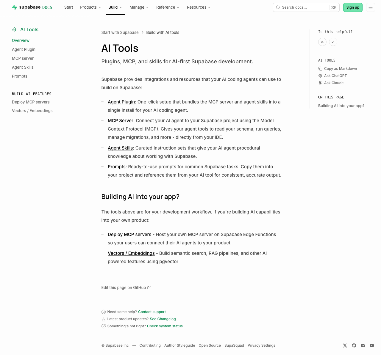 | 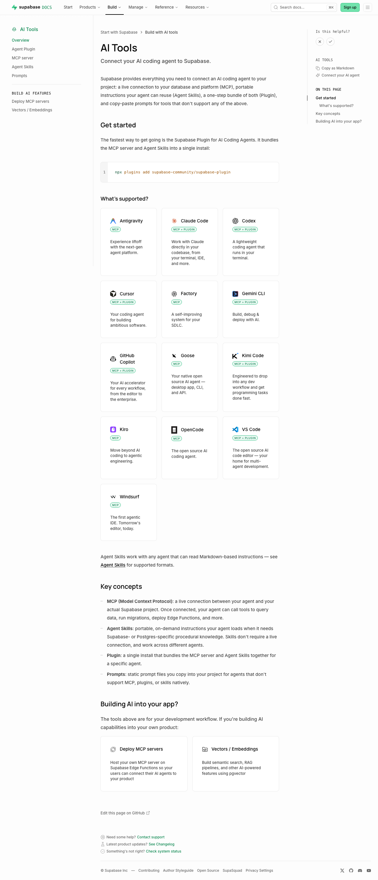 | Sub-pages each just add a one-line "Quick start" callout under the intro (no other layout change): [plugins](https://supabase.com/docs/guides/ai-tools/plugins) ([preview](https://docs-git-nikrichers-docs-1201-make-guidesai-too-7c7493-supabase.vercel.app/docs/guides/ai-tools/plugins)) · [mcp](https://supabase.com/docs/guides/ai-tools/mcp) ([preview](https://docs-git-nikrichers-docs-1201-make-guidesai-too-7c7493-supabase.vercel.app/docs/guides/ai-tools/mcp)) · [ai-skills](https://supabase.com/docs/guides/ai-tools/ai-skills) ([preview](https://docs-git-nikrichers-docs-1201-make-guidesai-too-7c7493-supabase.vercel.app/docs/guides/ai-tools/ai-skills)). ### Test plan - [x] `/guides/ai-tools` renders callout → card grid → concepts → Building AI into your app, in order - [x] Card grid: one card per agent (no duplicate Copilot), Windsurf present, icons clean in both themes, taglines shown, badges below title - [x] Sidebar shows "Connect your AI agent"; self-hosting's "Official" badge unaffected - [x] `.md` route still serves clean markdown; no lingering `ask_ai_clicked`, ChatGPT/Claude icon, or `SupportedAgentsTable` references --------- Co-authored-by: Nik Richers <nik@validmind.ai> |
||
|
Steven Eubank
|
751dcecf86 |
docs(log-drains): overhaul page style and add missing Last9 + Syslog … (#48140)
## Summary Brings the Log Drains docs up to the same standard as the Metrics API page. - Replaces the plain destination table with a visual `LogDrainDestinationCards` component — a 3-column card grid that mirrors the product UI destination picker. Cards link to anchors on the same page (no sub-pages needed since setup is simpler than Metrics). - Adds a "What you can do" intro section and a consistent "Required configuration + Steps" structure for every destination. - Adds two destinations that were missing from the docs entirely: **Last9** and **Syslog** (both are live in the product). Config fields sourced from `LogDrainDestinationSheetForm.tsx`. - Cleans up raw `<ul><li>` HTML to markdown lists. - Adds an "Additional resources" footer (pricing, Metrics API, JS SDK tracing). ## Files changed - `apps/docs/content/guides/telemetry/log-drains.mdx` — core of the changes - `apps/docs/components/LogDrainDestinationCards.tsx` — new card grid component - `apps/docs/components/LogDrainDestinationCards.data.ts` — destination data (9 entries) - `apps/docs/internals/markdown-schema/LogDrainDestinationCards.ts` — markdown fallback renderer - `apps/docs/features/docs/MdxBase.shared.tsx` — register new component - `apps/docs/internals/generate-guides-markdown.ts` — register new component ## I have read the [CONTRIBUTING.md](https://github.com/supabase/supabase/blob/master/CONTRIBUTING.md) file. YES ## What kind of change does this PR introduce? docs update ## What is the current behavior? not supanice, also missing syslog and last9 <img width="619" height="687" alt="image" src="https://github.com/user-attachments/assets/58e8f07c-eb40-4d30-a5e2-3988d1af87c2" /> ## What is the new behavior? hopefully more supanice, also added syslog and last9 <img width="568" height="667" alt="image" src="https://github.com/user-attachments/assets/be61e67f-58aa-4e8c-be0d-44206f1b16de" /> ## Additional context <!-- This is an auto-generated comment: release notes by coderabbit.ai --> ## Summary by CodeRabbit * **Documentation** * Reorganized the Log Drains guide with destination-specific sections and a new destination chooser. * Added support and setup guidance for Last9 and Syslog destinations. * Clarified HTTP batching, JSON delivery, compression, authentication, and endpoint requirements. * Updated OpenTelemetry, Datadog, Loki, Amazon S3, Sentry, and Axiom instructions. * Added Edge Function examples covering compressed and uncompressed payloads. * Added links to pricing, Metrics API, and JavaScript tracing resources. * **UI Improvements** * Updated destination listings with clearer, consistent icons and presentation. <!-- end of auto-generated comment: release notes by coderabbit.ai --> --------- Co-authored-by: github-actions[bot] <41898282+github-actions[bot]@users.noreply.github.com> Co-authored-by: Nik Richers <nik@validmind.ai> |
||
|
Nik Richers
|
963182f58e |
fix: add hasLightIcon field to ContentListings; revert getting-started-overview to GlassPanel (#47467)
## I have read the [CONTRIBUTING.md](https://github.com/supabase/supabase/blob/master/CONTRIBUTING.md) file. YES ## What kind of change does this PR introduce? Bug fix + partial revert. ## What is the current behavior? 1. `ContentListings.client.tsx` unconditionally derives `hasLightIcon` from `Boolean(item.icon)`. `GlassPanel` appends `-light.svg` to the icon path in light mode whenever `hasLightIcon` is true. Framework icons (react, nuxt, hono, redwood, flutter, swift, kotlin, svelte, solidjs, vue, refine, angular, ionic) have no `-light.svg` variants, causing broken image requests in light mode for any ContentListings card that uses them. 2. `getting-started.mdx` uses `<ContentListings id="getting-started-overview" />` (added in #47097) for the top three-card grid (Build with AI tools, API Keys, Local Development). ## What is the new behavior? 1. `hasLightIcon` is now an optional field in the item schema (defaults to `Boolean(item.icon)` for backward compatibility). The component reads `item.hasLightIcon ?? Boolean(item.icon)`, so data files can opt specific icons out of the light-mode variant. 2. `<ContentListings id="getting-started-overview" />` is removed and the original hand-authored GlassPanel grid is restored. The `gettingStartedGetStarted` data entry and its registry import are also removed. ContentListings has no mandate to cover every section of every page: the goal was for hub and overview pages to have a reasonable, standardized link section that tooling can lint for. This page doesn't fit that pattern. ## Additional context | Check | Result | |-------|--------| | `pnpm vitest run lib/content-listings.test.ts` | ✅ 12/12 passed | | `pnpm lint:mdx` (getting-started.mdx) | ✅ No warnings | <!-- This is an auto-generated comment: release notes by coderabbit.ai --> ## Summary by CodeRabbit * **New Features** * Updated the Getting Started guide with dedicated tiles for Build with AI Tools, API Keys, and Local Development. * Expanded the available Getting Started content listings. * **Bug Fixes** * Improved icon styling in content listings so light icon treatment reflects each item’s configuration. <!-- end of auto-generated comment: release notes by coderabbit.ai --> --------- Co-authored-by: Nik Richers <nik@validmind.ai> |
||
|
Nik Richers
|
6418820b0b |
docs: convert self-hosting overview to ContentListings and restructure the page (#47469)
## I have read the [CONTRIBUTING.md](https://github.com/supabase/supabase/blob/master/CONTRIBUTING.md) file. YES ## What kind of change does this PR introduce? This PR converts link sections in the self-hosting overview page to the `ContentListings` component, puts conceptual guidance before deployment options, and adds badge support for the Docker card (minor). Relates to DOCS-1137 ## Current behavior `self-hosting.mdx` uses hand-authored `<GlassPanel>` / `<Link>` JSX for two sections: - **Get started**: Docker card with a JSX title containing a `<Badge>` element (was previously deferred for this reason). - **Community-driven projects**: Two cards with trivial `<span>`-wrapped string titles. Get started and Community cards appear at the top of the page, before the conceptual overview. The Support and community section uses hand-authored bullet lists for GitHub, Discord, and Reddit links. ## New behavior - The self-hosting overview page now uses data-driven `ContentListings` instead of hand-written cards and bullet lists. - Conceptual content (how self-hosting differs, your responsibilities, telemetry) comes first; deployment options and community resources follow. - Section intro text lives in listing data rather than inline MDX. - Brand icons added to all listing cards (Docker, Kubernetes, Traefik, GitHub, Discord, Reddit). - Minor: Added support for badges to content listings, such as "Official" in the Docker tile Data lives in `self-hosting.data.ts` (5 groups, 8 links) and is registered in `content-listings/index.ts`. ## Additional context ### Icon usage rights New brand icons (Kubernetes, Traefik, Reddit) are sourced from [Simple Icons](https://simpleicons.org) (CC0 1.0). Existing icons (Docker, GitHub, Discord) reuse assets already in `apps/docs/public/img/icons/`. Use is non-commercial documentation only — consistent with existing docs icon usage and trademark fair-use for identifying linked third-party services. ### To do: - [ ] Check with @aantti if he's on board with switching the page to content listings we can lint for and the content restructure to match other overview pages ## Verification | Gate | Result | |------|--------| | `pnpm vitest run lib/content-listings.test.ts` | ✅ 12/12 passed | | `pnpm build:guides-markdown` | ✅ 744 files generated | | `pnpm lint:mdx` (self-hosting.mdx) | ✅ No warnings on changed file | ### Proof: restructured self-hosting page with ContentListings and icons | [Before (production)](https://supabase.com/docs/guides/self-hosting) | [After (PR preview)](https://docs-git-nikrichers-docs-1137-self-hosting-supabase.vercel.app/docs/guides/self-hosting) | |---|---| |  |  | <!-- This is an auto-generated comment: release notes by coderabbit.ai --> ## Summary by CodeRabbit * **New Features** * Updated the self-hosting guide to use dynamic content listings for “Get started,” community resources, support options, and sharing experiences. * Added richer listing cards with optional badges and improved icon handling. * Expanded self-hosting resource groups to surface more relevant links in docs navigation. <!-- end of auto-generated comment: release notes by coderabbit.ai --> --------- Co-authored-by: Nik Richers <nik@validmind.ai> |
||
|
Nik Richers
|
635b2d6050 |
docs: standardise next steps on overview pages with content listings (#47097)
## I have read the CONTRIBUTING.md file. YES ## What kind of change does this PR introduce? This PR helps standardise link sections which is useful for overview pages that frequently use similar sections such as "Next steps", "Get started", or "Examples". Six high-traffic overview pages are migrated as a pilot, with a skill in the new [supabase/docs-agent-skills](https://github.com/supabase/docs-agent-skills) repo to audit and convert the rest in a follow-on PR. Refactored from an initial YAML front matter approach per review feedback from @jeremenichelli. Now implemented as a React component and using existing linting & Markdown export functionality. A second round of review feedback further simplified the architecture: the per-listing component registry was removed in favor of a single `<ContentListings id="..." />` component backed by an ID-keyed data lookup, the listing data moved out of `apps/docs/components/` into `apps/docs/data/content-listings/`, the listing-specific link wrapper was replaced with the existing `<Link>` + `<GlassPanel>` pattern from the rest of the docs, and the headings now defer to the shared `<Heading>` from `MdxBase.shared.tsx` (no parallel marker-to-tag mapping, no typography overrides). Great feedback, thank you! 🙏 Relates to DOCS-1032. ## What is the current behavior? Authors implement these sections however they wish. As a result, overview and index pages use inconsistent patterns for orientation links: some use hand-rolled Markdown lists, some use custom panel/grid components, some use buttons, and some have no guidance about where to go next at all. There is no shared component for these sections and no analytics on those clicks. ## What is the new behavior? Authors add orientation sections in two steps: 1. Define listing data in a `.data.ts` file under `apps/docs/data/content-listings/` (for example, `storage.data.ts`). Each `ContentListingGroup` has a globally-unique `id` like `storage-get-started`. 2. Place a single `<ContentListings id="..." />` component inline in guide MDX. The ID is also the telemetry `listingId`, so the same value disambiguates the section in PostHog dashboards. Grid and list layouts, optional icons (such as `/docs/img/icons/github-icon` with `-light.svg` variants for dark mode), and external URLs are supported. Conditionals that use `$Show` around inline components are also supported, for example for auth pricing. ### Usage example from "Storage" overview page `apps/docs/data/content-listings/storage.data.ts`: ```ts export const storageGetStarted: ContentListingGroup = { id: 'storage-get-started', heading: 'Get started', description: 'Choose the bucket type that fits your use case:', type: 'grid', items: [ { title: 'Files buckets', href: '/guides/storage/quickstart', description: 'Store and serve images, videos, documents, and general-purpose files with direct URL access and row-level security.', }, { title: 'Analytics buckets', href: '/guides/storage/analytics/introduction', description: 'Store data in Apache Iceberg tables for data lakes, logs, and ETL. Query from Postgres via foreign tables with partitioning.', }, { title: 'Vector buckets', href: '/guides/storage/vector/introduction', description: 'Store embeddings and run similarity search for semantic matching, AI, and RAG. Use HNSW indexing, distance metrics, and metadata filtering.', }, ], } ``` `apps/docs/content/guides/storage.mdx`: ```mdx <ContentListings id="storage-get-started" /> ``` Renders as: <img width="689" alt="Storage Get started listing — Files, Analytics, and Vector buckets" src="https://github.com/user-attachments/assets/0d1b9531-962f-40ae-891e-b1e93ff1c939" /> <br>Exported in Markdown as: ```md ## Get started Choose the bucket type that fits your use case: - **[Files buckets](/docs/guides/storage/quickstart):** Store and serve images, videos, documents, and general-purpose files with direct URL access and row-level security. - **[Analytics buckets](/docs/guides/storage/analytics/introduction):** Store data in Apache Iceberg tables for data lakes, logs, and ETL. Query from Postgres via foreign tables with partitioning. - **[Vector buckets](/docs/guides/storage/vector/introduction):** Store embeddings and run similarity search for semantic matching, AI, and RAG. Use HNSW indexing, distance metrics, and metadata filtering. ``` Click tracking fires via PostHog (`docs_content_listing_clicked`): ```json { "action": "docs_content_listing_clicked", "custom_properties": { "targetPath": "/guides/storage/quickstart", "linkTitle": "Files buckets", "groupTitle": "Get started", "listingId": "storage-get-started" } } ``` Still finding my way around PostHog, but I verified on preview deploy that clicking a content listing on `/docs/guides/auth` sends `docs_content_listing_clicked` to `https://api.supabase.green/platform/telemetry/event` and receives HTTP 201. ### Authoring experience Three ways to add or convert content listings: copy the agent prompt first, use snippets for manual edits, or invoke the audit skill for batch follow-on work. Refer to `CONTRIBUTING.md` for the full authoring guide. #### 1. Agent prompt Copy into Cursor or another AI assistant: ```text Add a content listing block for [TOPIC] / [SECTION] (for example, Storage / Examples). Follow CONTRIBUTING § Content listings in apps/docs. - Add data to apps/docs/data/content-listings/[topic].data.ts - Use a globally-unique kebab-case id like `[topic]-[section]` - Place inline in the guide MDX with <ContentListings id="..." /> - Copy structure from storageGetStarted in apps/docs/data/content-listings/storage.data.ts - Run pnpm test:local lib/content-listings.test.ts from apps/docs ``` #### 2. VS Code / Cursor snippets Type these prefixes in the docs workspace (`.vscode/content-listing.code-snippets`): | Prefix | Inserts | | ----------- | -------------------------------------------------------- | | `cl-data` | `ContentListingGroup` export skeleton with namespaced id | | `cl-inline` | `<ContentListings id="…" />` in guide MDX | <img width="658" height="274" alt="image" src="https://github.com/user-attachments/assets/5ef20954-7aee-4925-887d-79a5ae766b37" /> #### 3. Batch audit skill For follow-on overview page conversion or maintenance, use the [`audit-content-listings`](https://github.com/supabase/docs-agent-skills/blob/main/.claude/skills/audit-content-listings/SKILL.md) skill in `docs-agent-skills` (skill, `conversion-manifest.json`, and validation script). Example: ```text Use audit-content-listings. Audit getting-started.mdx, update conversion-manifest.json, then convert the next unconverted section only. ``` ## Additional context The implementation includes a presentational `<ContentListings />` component (grid/list layouts, GlassPanel, telemetry) backed by ID-keyed data modules, and a single markdown export handler that reads the same `id` prop from the JSX and looks up data via the shared registry. Key files: - **Data:** `apps/docs/data/content-listings/` (one `.data.ts` file per guide topic, plus `index.ts` exporting `CONTENT_LISTINGS` and `getContentListingById`) - **Renderer:** `apps/docs/components/ContentListings/` (single `<ContentListings id="…" />` component); registered in `apps/docs/features/docs/MdxBase.shared.tsx` - **Types/helpers:** `apps/docs/lib/content-listings.schema.ts` (zod schemas, type aliases, grid/heading/href helpers) - **Markdown export:** `apps/docs/internals/markdown-schema/Listings.ts` (single ID-driven handler) wired into `apps/docs/internals/generate-guides-markdown.ts` - **Telemetry:** `docs_content_listing_clicked` defined in `packages/common/telemetry-constants.ts`, fired from `ContentListings.client.tsx` - **Authoring guide:** `apps/docs/CONTRIBUTING.md` (Components and elements → Content listings) - **VS Code snippets:** `.vscode/content-listing.code-snippets` (`cl-data`, `cl-inline`) ### Before & After #### Auth | [Before (production)](https://supabase.com/docs/guides/auth) | [After (preview)](https://docs-git-fork-nrichers-nikrichers-docs-1032-sta-e2a8cb-supabase.vercel.app/docs/guides/auth) | | --------------------------------------------------------------------------------------------------------------------------- | --------------------------------------------------------------------------------------------------------------------------- | | 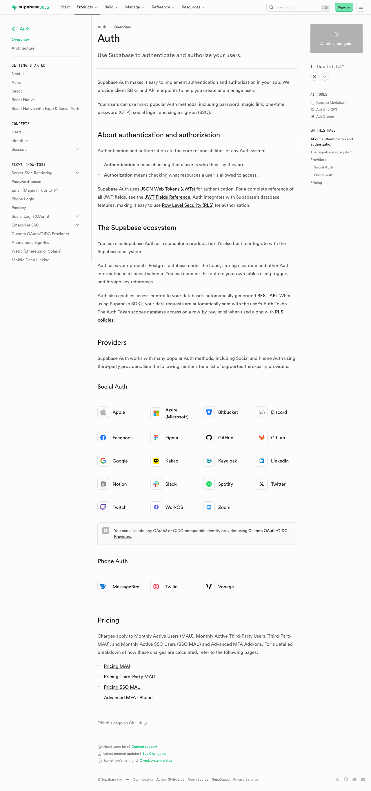 | 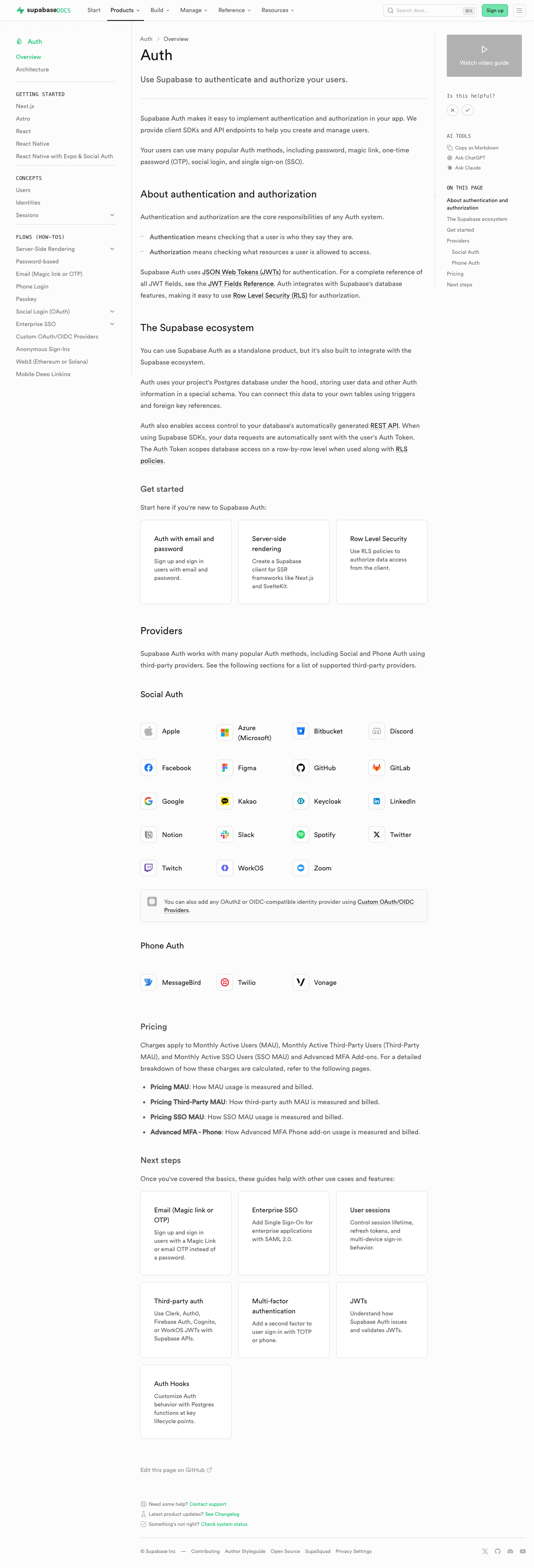 | #### Database overview | [Before (production)](https://supabase.com/docs/guides/database/overview) | [After (preview)](https://docs-git-fork-nrichers-nikrichers-docs-1032-sta-e2a8cb-supabase.vercel.app/docs/guides/database/overview) | | -------------------------------------------------------------------------------------------------------------------------------------------------- | -------------------------------------------------------------------------------------------------------------------------------------------------- | |  | 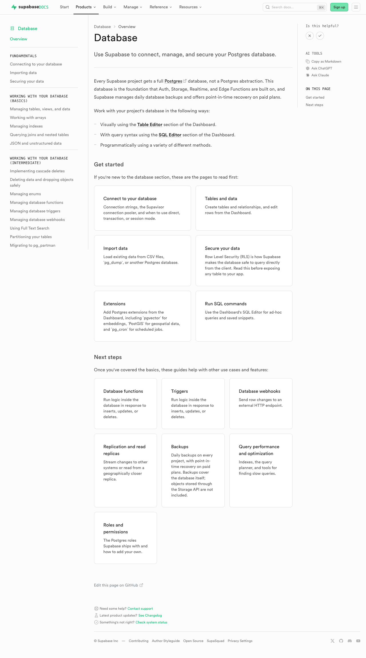 | #### Edge Functions | [Before (production)](https://supabase.com/docs/guides/functions) | [After (preview)](https://docs-git-fork-nrichers-nikrichers-docs-1032-sta-e2a8cb-supabase.vercel.app/docs/guides/functions) | | -------------------------------------------------------------------------------------------------------------------------------------------- | -------------------------------------------------------------------------------------------------------------------------------------------- | | 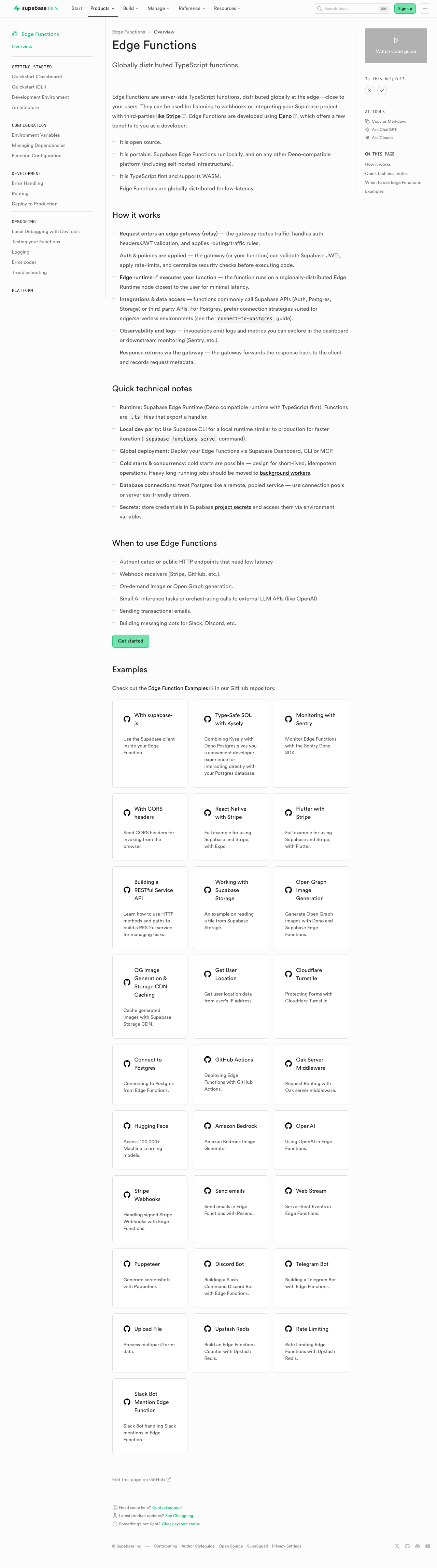 | 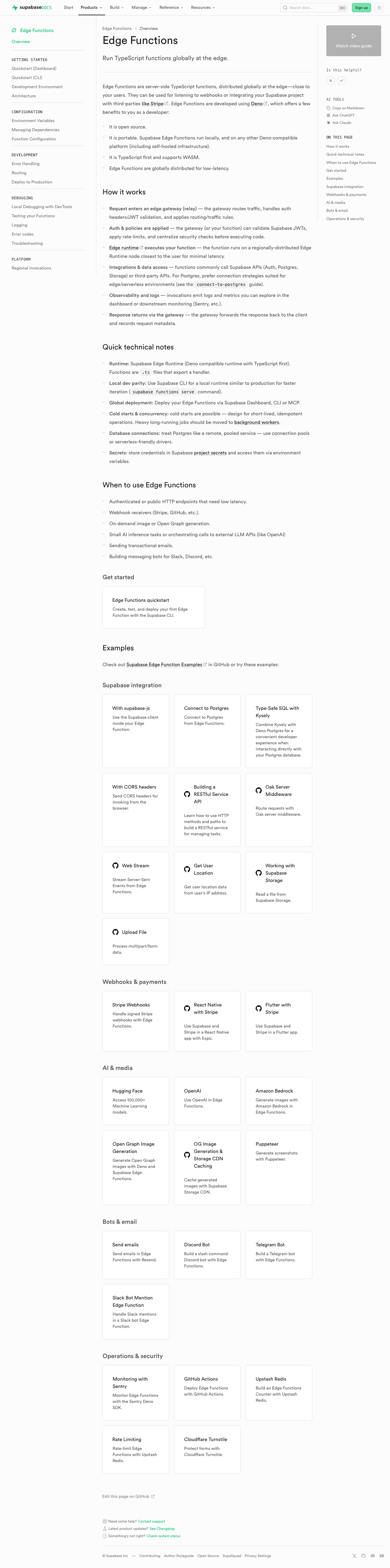 | #### Storage | [Before (production)](https://supabase.com/docs/guides/storage) | [After (preview)](https://docs-git-fork-nrichers-nikrichers-docs-1032-sta-e2a8cb-supabase.vercel.app/docs/guides/storage) | | ---------------------------------------------------------------------------------------------------------------------------------------- | ---------------------------------------------------------------------------------------------------------------------------------------- | | 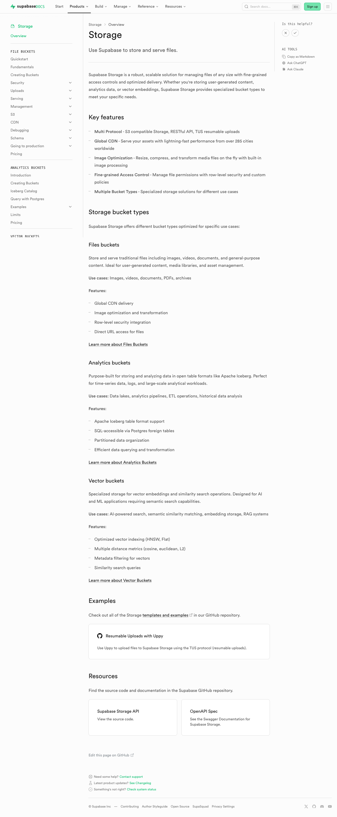 | 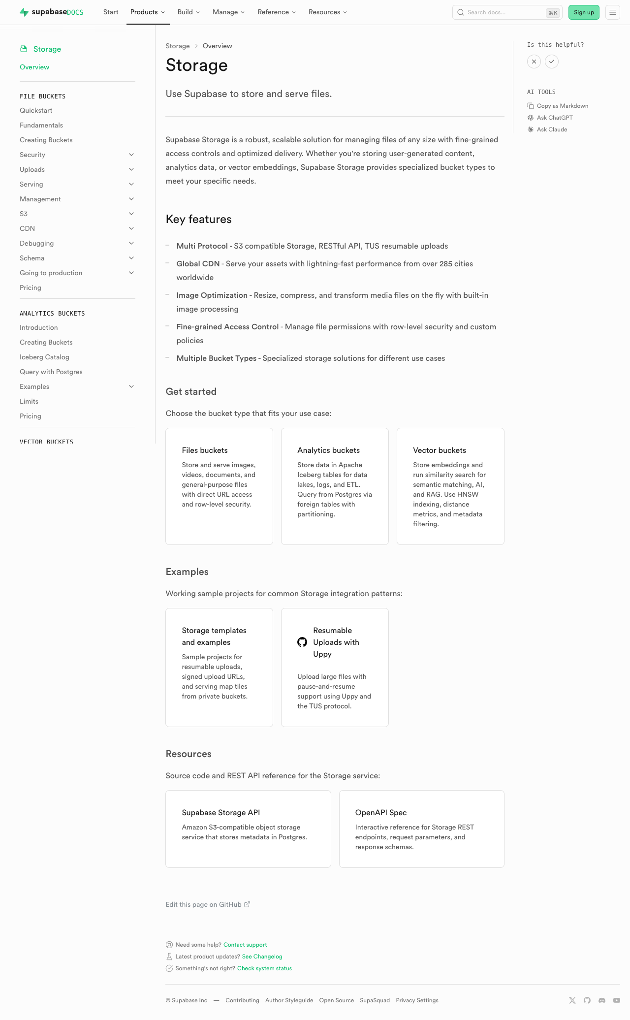 | #### Realtime | [Before (production)](https://supabase.com/docs/guides/realtime) | [After (preview)](https://docs-git-fork-nrichers-nikrichers-docs-1032-sta-e2a8cb-supabase.vercel.app/docs/guides/realtime) | | ------------------------------------------------------------------------------------------------------------------------------------------- | ------------------------------------------------------------------------------------------------------------------------------------------- | | 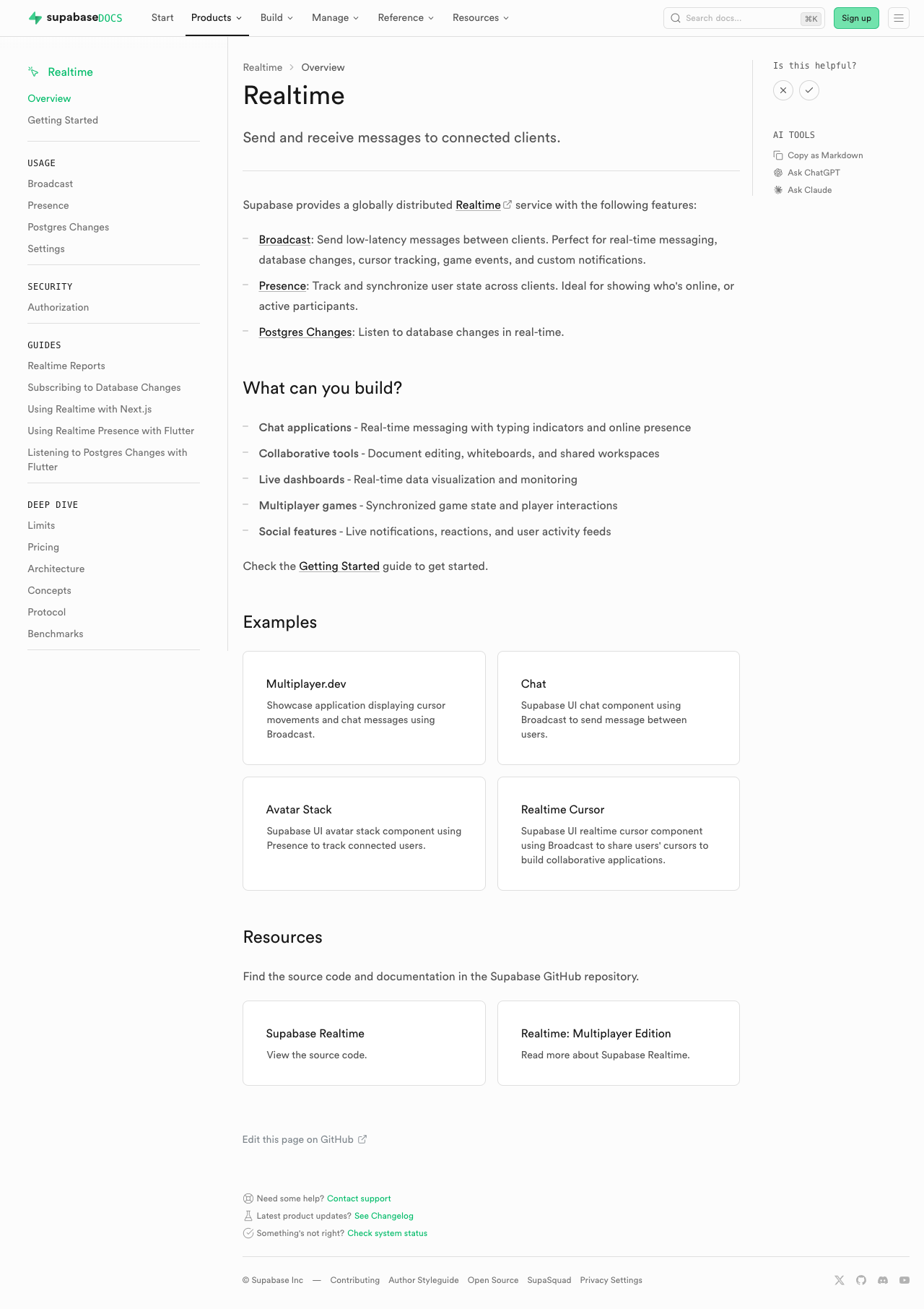 | 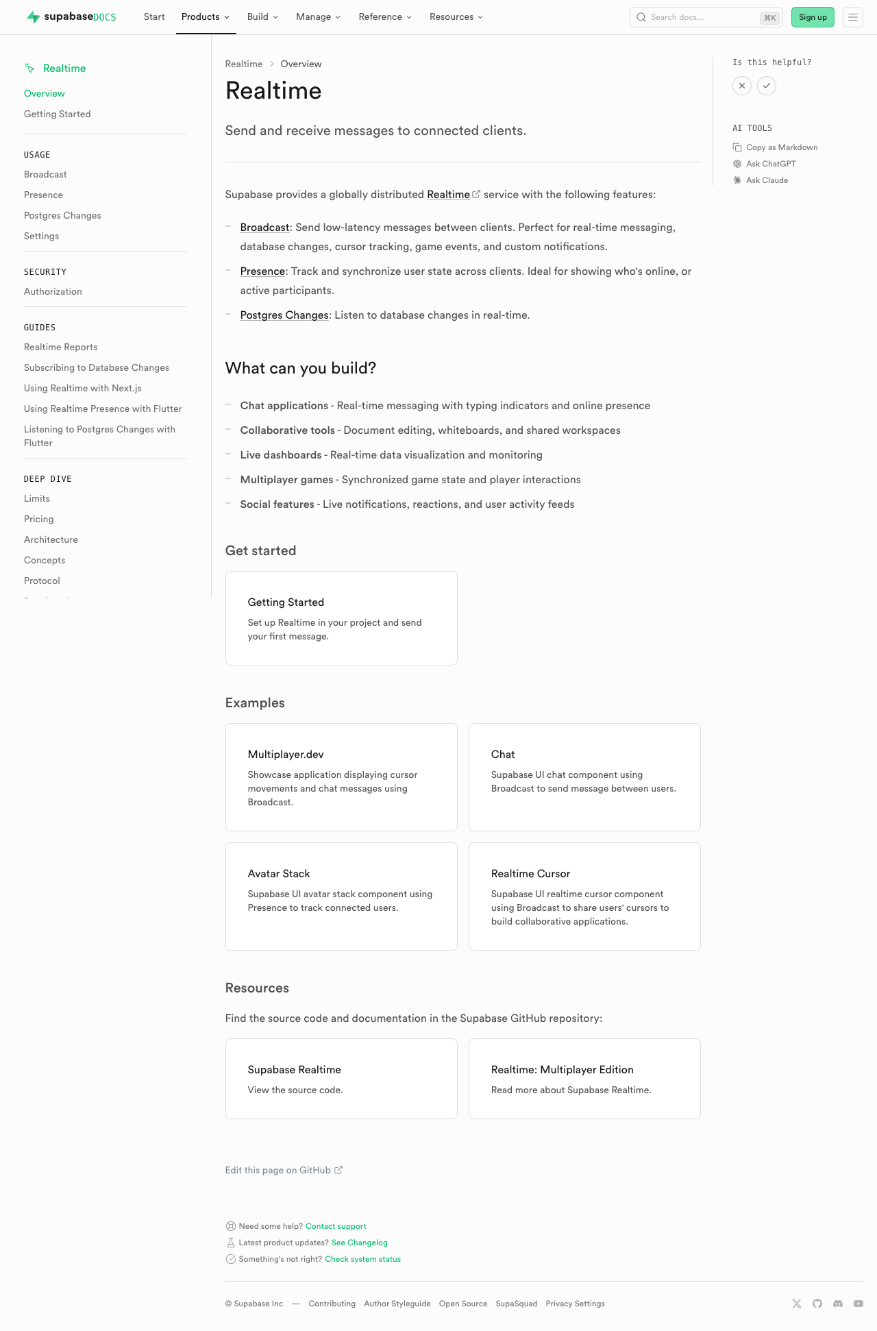 | #### Getting Started (partial migration for demoing) | [Before (production)](https://supabase.com/docs/guides/getting-started) | [After (preview)](https://docs-git-fork-nrichers-nikrichers-docs-1032-sta-e2a8cb-supabase.vercel.app/docs/guides/getting-started) | | ------------------------------------------------------------------------------------------------------------------------------------------------------ | ------------------------------------------------------------------------------------------------------------------------------------------------------ | | 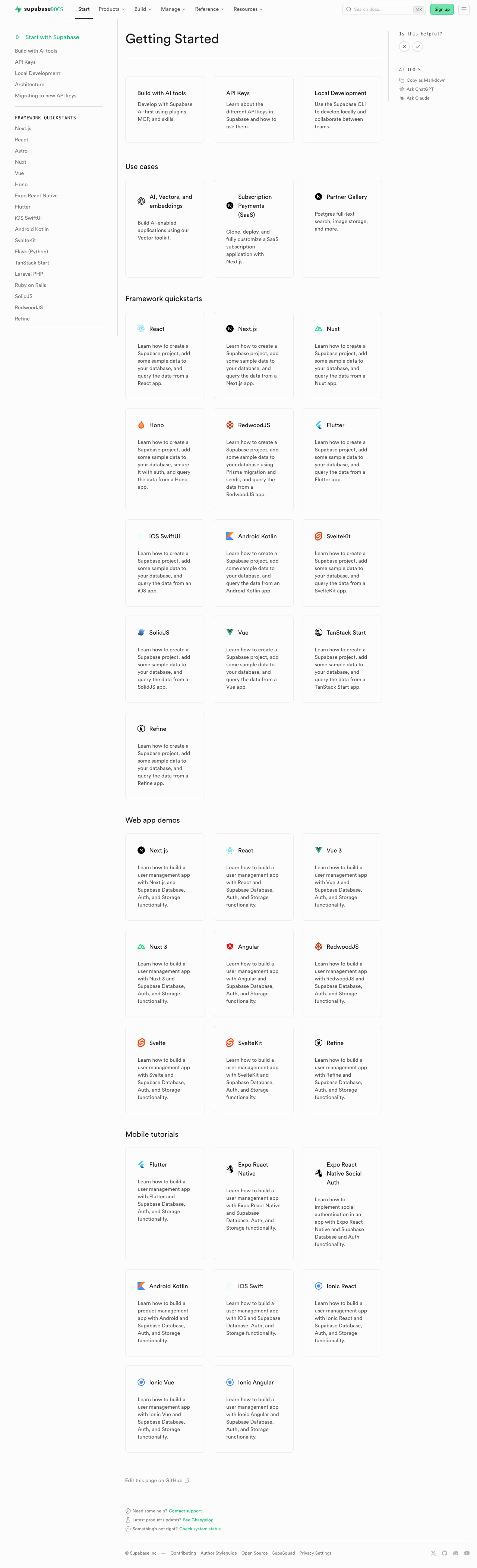 | 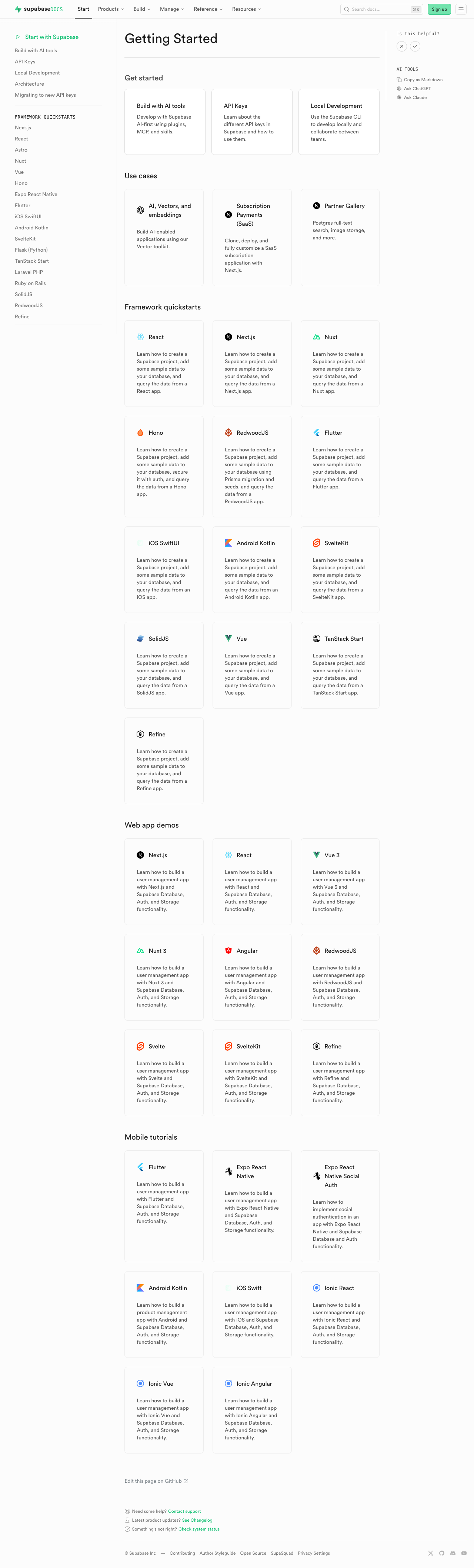 | ### Test plan - [ ] Visually verify migrated pages render correctly: - [ ] `/guides/auth` — grid "Get started", conditional pricing list, grid "Next steps" - [ ] `/guides/database/overview` — get started + next steps listings - [ ] `/guides/getting-started` — top 3-column grid - [ ] `/guides/functions` — get started + example listings - [ ] `/guides/storage` — get started, examples, resources listings - [ ] `/guides/realtime` — get started, examples, resources listings - [ ] Confirm listings render at explicit page positions - [ ] Click a content listing link and verify `docs_content_listing_clicked` fires in PostHog with expected properties (the new `listingId` is the namespaced kebab-case id, e.g. `storage-get-started`) - [ ] Build docs and confirm `.md` alternate output includes listing sections at component placement (e.g. `public/markdown/guides/storage.md`) - [ ] Run unit tests: `pnpm test:local lib/content-listings.test.ts` in `apps/docs` ## Summary by CodeRabbit ## Release Notes * **New Features** * Introduced a standardized content listings system for organizing related guides and resources. * Content listings now support both grid and list layouts for consistent presentation. * Added click telemetry for content listing interactions. * **Documentation** * Updated authentication, database, functions, getting started, realtime, and storage guide pages to use the new content listing components. * Improved MDX structure examples and listing markup formatting in contributor documentation. <!-- end of auto-generated comment: release notes by coderabbit.ai --> <!-- This is an auto-generated comment: release notes by coderabbit.ai --> ## Summary by CodeRabbit ## Release Notes * **New Features** * Introduced a new content listings component for displaying guide content in list and grid layouts across documentation pages. * Added telemetry tracking for content listing interactions to measure user engagement. * **Documentation** * Updated guide pages (Authentication, Database, Functions, Storage, Realtime, Getting Started) to use the new listings layout. * Added contribution guidelines for creating and managing content listings in documentation. * **Tests** * Added comprehensive test coverage for content listings validation, serialization, and rendering. <!-- end of auto-generated comment: release notes by coderabbit.ai --> --------- Co-authored-by: Nik Richers <nik@validmind.ai> Co-authored-by: Jeremias Menichelli <jmenichelli@gmail.com> |