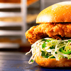
### Bootstrap Project Dependencies
Source: https://element-plus.org/en-US/guide/dev-guide
Installs all necessary project dependencies using pnpm. This is the first step required before starting development.
```shell
pnpm i
```
--------------------------------
### Install Element Plus via Package Manager
Source: https://element-plus.org/en-US/guide/installation
Commands to install the library using common Node.js package managers.
```shell
$ npm install element-plus --save
```
```shell
$ yarn add element-plus
```
```shell
$ pnpm install element-plus
```
--------------------------------
### Install @element-plus/icons-vue with npm
Source: https://element-plus.org/en-US/component/icon
Use this command to install the icons package using npm.
```shell
$ npm install @element-plus/icons-vue
```
--------------------------------
### Install @element-plus/icons-vue with pnpm
Source: https://element-plus.org/en-US/component/icon
Use this command to install the icons package using pnpm.
```shell
$ pnpm install @element-plus/icons-vue
```
--------------------------------
### Page Header - Complete Example
Source: https://element-plus.org/en-US/component/page-header.html
A comprehensive example demonstrating the full capabilities of the Page Header component, including breadcrumbs, content slots, extra actions, and descriptions.
```APIDOC
## Page Header - Complete Example
### Description
This example showcases a fully featured Page Header with breadcrumbs, custom content, action buttons, and detailed descriptions.
### Method
N/A (Component Usage)
### Endpoint
N/A (Component Usage)
### Parameters
N/A (Component Usage)
### Request Example
```vue
Element Plus team uses weekly release strategy under normal
circumstance, but critical bug fixes would require hotfix so the actual
release number could be more than 1 per week.
```
### Response
N/A (Component Usage)
```
--------------------------------
### Install Auto Import Dependencies
Source: https://element-plus.org/en-US/guide/quickstart
Install necessary packages for automatic component and API imports in your project.
```shell
$ npm install -D unplugin-vue-components unplugin-auto-import
```
```shell
$ yarn add -D unplugin-vue-components unplugin-auto-import
```
```shell
$ pnpm install -D unplugin-vue-components unplugin-auto-import
```
--------------------------------
### Launch Documentation Preview
Source: https://element-plus.org/en-US/guide/dev-guide
Starts the documentation development server to preview existing components in the browser.
```shell
pnpm docs:dev
```
--------------------------------
### Hello World with CDN
Source: https://element-plus.org/en-US/guide/installation
A complete HTML example demonstrating how to initialize Element Plus with Vue 3 via CDN.
```html
Element Plus demo
{{ message }}
```
--------------------------------
### Install @element-plus/icons-vue with yarn
Source: https://element-plus.org/en-US/component/icon
Use this command to install the icons package using yarn.
```shell
$ yarn add @element-plus/icons-vue
```
--------------------------------
### Basic Timeline Example
Source: https://element-plus.org/en-US/component/timeline
A basic example of the el-timeline component displaying a list of events with timestamps and card content.
```vue
Update Github template
Tom committed 2018/4/12 20:46
Update Github template
Tom committed 2018/4/3 20:46
Event start
Event end
```
--------------------------------
### Install Nuxt.js Module
Source: https://element-plus.org/en-US/guide/quickstart
Install the official Element Plus Nuxt.js module for seamless integration.
```shell
$ npm install -D @element-plus/nuxt
```
```shell
$ yarn add -D @element-plus/nuxt
```
```shell
$ pnpm install -D @element-plus/nuxt
```
--------------------------------
### Element Plus Descriptions with Sizes and Borders in Vue
Source: https://element-plus.org/en-US/component/descriptions
Illustrates advanced configurations of the Element Plus Descriptions component, including different size options (large, default, small) and bordered layouts. It also shows how to integrate icons and custom content within description items. This example utilizes Vue.js and its script setup syntax.
```vue
LargeDefaultSmallOperation
Username
kooriookami
Telephone
18100000000
Place
Suzhou
Remarks
School
Address
No.1188, Wuzhong Avenue, Wuzhong District, Suzhou, Jiangsu Province
Operationkooriookami18100000000SuzhouSchool
No.1188, Wuzhong Avenue, Wuzhong District, Suzhou, Jiangsu Province
```
--------------------------------
### Start Local Development Environment
Source: https://element-plus.org/en-US/guide/dev-guide
Initializes the local development environment for active component work. Requires manual registration of components in App.vue.
```shell
pnpm dev
```
--------------------------------
### Animated Tooltip Example
Source: https://element-plus.org/en-US/component/tooltip.html
Customize tooltip animations using the `transition` prop. This example uses a 'slide-fade' transition, with custom enter and leave animations defined in the CSS.
```vue
trigger me
```
--------------------------------
### Skeleton Component Usage
Source: https://element-plus.org/en-US/component/skeleton
Example of using the ElSkeleton component with throttle for smooth loading transitions. It demonstrates how to toggle the loading state and provides a template for the skeleton and the actual content.
```APIDOC
## Skeleton Component Usage Example
### Description
This example demonstrates how to use the `el-skeleton` component to create a smooth loading experience. It utilizes the `throttle` attribute to control the delay of the skeleton's appearance and disappearance, preventing UI bouncing. The example includes a switch to toggle the loading state and shows both the skeleton template and the actual content.
### Method
N/A (This is a UI component example, not an API endpoint)
### Endpoint
N/A
### Request Body
N/A
### Request Example
```vue
Delicious hamburger
{{ currentDate }}
operation button
```
### Response
N/A
```
--------------------------------
### Implement Complete PageHeader with Metadata
Source: https://element-plus.org/en-US/component/page-header.html
A complex example demonstrating the use of breadcrumbs, custom content, action buttons, and a descriptions component within a PageHeader.
```vue
Element Plus team uses weekly release strategy under normal
circumstance, but critical bug fixes would require hotfix so the actual
release number could be more than 1 per week.
```
--------------------------------
### Create Grouped Table Headers in Element Plus
Source: https://element-plus.org/en-US/component/table
This example demonstrates how to nest el-table-column components to create a multi-level header structure. It uses a Vue 3 setup script to define the table data and the template to render the hierarchical columns.
```vue
```
--------------------------------
### Striped Progress Example
Source: https://element-plus.org/en-US/component/progress
Example of using the striped attribute for progress bars, with options for flowing stripes and custom durations.
```APIDOC
## Striped progress
Use `striped` attribute to set striped progress. You can use `striped-flow` to get the stripes to flow, with `duration` to control the animation duration.
```vue
```
```
--------------------------------
### Tree Node Filtering Example
Source: https://element-plus.org/en-US/component/tree-v2
This example demonstrates how to use the `filter-method` prop with the `filter` method to filter tree nodes based on user input.
```APIDOC
## Tree node filtering
The `filter-method` prop allows you to customize the filtering logic for tree nodes. The `filter` method on the Tree instance can be invoked to trigger the filtering process.
### Usage
1. Define a `filter-method` function that takes a query string and a node object, returning `true` if the node should be visible, `false` otherwise.
2. Set the `filter-method` prop on the `el-tree-v2` component to your custom filtering function.
3. Call the `filter` method on the tree instance (e.g., `treeRef.value.filter(query)`) when the filter criteria changes (e.g., on input).
### Example Code
```vue
```
```
--------------------------------
### Image Preview in Table
Source: https://element-plus.org/en-US/component/table
Example demonstrating how to integrate an image preview within a table column using the scoped slot.
```APIDOC
## Usage: Image Preview
### Description
Use the `el-image` component inside an `el-table-column` template to enable image previews.
### Example
```vue
```
```
--------------------------------
### Form Size Control Example
Source: https://element-plus.org/en-US/component/form
This example demonstrates how to control the size of form components. It shows how to use radio buttons to change the global size of the form and the label position. The form includes various input fields, select dropdowns, date and time pickers, and radio/checkbox groups.
```vue
largedefaultsmallLeftRightTop
-
Online activities
Promotion activities
SponsorVenueCreateCancel
```
--------------------------------
### Local Import and Custom Icon
Source: https://element-plus.org/en-US/component/notification
Example of importing the ElNotification component and using a custom icon for the close action.
```javascript
import { ElNotification } from 'element-plus'
import { CloseBold } from '@element-plus/icons-vue'
ElNotification({
title: 'Title',
message: 'This is a message',
closeIcon: CloseBold,
})
```
--------------------------------
### Create a Basic Form with Element Plus
Source: https://element-plus.org/en-US/component/form
A comprehensive example demonstrating a form with various input types including text, select, date/time pickers, switches, checkboxes, and radio buttons.
```vue
-
Online activities
Promotion activities
Offline activities
Simple brand exposure
SponsorVenueCreateCancel
```
--------------------------------
### Pagination Examples
Source: https://element-plus.org/en-US/component/pagination
Demonstrates different configurations of the ElPagination component, including total item count, page size selection, jump to page functionality, and combined layouts. It also shows how to handle size change and current page change events.
```APIDOC
## ElPagination Component Examples
### Description
This section showcases various use cases for the Element Plus Pagination component, demonstrating its flexibility in handling different display and interaction requirements.
### Method
N/A (This is a UI component example)
### Endpoint
N/A (This is a UI component example)
### Parameters
#### Component Props
- **v-model:current-page** (number) - The current active page.
- **page-size** (number) - Items per page. Default is 10.
- **total** (number) - Total number of data items.
- **page-sizes** (array of numbers) - Options for the number of items per page. Example: `[100, 200, 300, 400]`.
- **layout** (string) - Which parts of the pagination component to display. Possible values: `total`, `sizes`, `prev`, `pager`, `next`, `jumper`.
- **size** (ComponentSize) - Size of the pagination component. Options: `default`, `large`, `small`.
- **background** (boolean) - Whether the pagination component has a background color.
- **disabled** (boolean) - Whether the pagination component is disabled.
### Events
- **@size-change** (val: number) - Triggered when the number of items per page changes.
- **@current-change** (val: number) - Triggered when the current page changes.
### Request Example
```vue
```
### Response
N/A (This is a UI component example)
#### Success Response (200)
N/A
#### Response Example
N/A
```
--------------------------------
### File List with Thumbnails
Source: https://element-plus.org/en-US/component/upload
Displays a list of uploaded files with thumbnails. This example uses the `picture` list type and configures `on-preview` and `on-remove` handlers.
```vue
Click to upload
jpg/png files with a size less than 500kb
```
--------------------------------
### Virtual Triggering Example
Source: https://element-plus.org/en-US/component/dropdown
This example demonstrates how to use the `virtual-triggering` and `virtual-ref` props to attach a dropdown to a separate trigger element. The dropdown is shown on a right-click event on a card component.
```APIDOC
## Virtual triggering 2.11.3
Sometimes we want to render the dropdown on some other trigger element, we can separate the trigger and the content.
Right click
```vue
Right click
Action 1 Action 2 Action 3Action 4Action 5
```
```
--------------------------------
### Basic Virtualized Table Usage
Source: https://element-plus.org/en-US/component/table-v2
Demonstrates rendering a table with 10 columns and 1000 rows using the `el-table-v2` component. Ensure the `columns` and `data` props are correctly defined. This example uses Vue.js.
```vue
```
--------------------------------
### Singleton Tooltip Example
Source: https://element-plus.org/en-US/component/tooltip.html
Implement a singleton tooltip using virtual triggering. This allows multiple triggers to share a single tooltip instance. Note the known issue with bouncing out from unexpected places.
```vue
(buttonRef = e.currentTarget)"
@click="visible = !visible"
>Click to open tooltip
Some content
```
--------------------------------
### Form Accessibility Example
Source: https://element-plus.org/en-US/component/form
Demonstrates how to manage form accessibility, particularly label association with inputs and ARIA roles for grouped inputs.
```APIDOC
## Accessibility
When only a single input (or related control such as select or checkbox) is inside of a `el-form-item`, the form item's label will automatically be attached to that input. However, if multiple inputs are inside of the `el-form-item`, the form item will be assigned the WAI-ARIA role of group instead. In this case, it is your responsibility to assign assistive labels to the individual inputs.
__
"Full Name" label is automatically attached to the input:
Full Name
__
"Your Information" serves as a label for the group of inputs.
You must specify labels on the individal inputs. Placeholders are not replacements for using the "label" attribute.
Your Information
TS
JS
________
```vue
"Full Name" label is automatically attached to the input:
"Your Information" serves as a label for the group of inputs.
You must specify labels on the individal inputs. Placeholders are not
replacements for using the "label" attribute.
```
```
--------------------------------
### Full Import in Vue.js
Source: https://element-plus.org/en-US/guide/quickstart
Use this method for convenient setup when bundle size is not a primary concern. Ensure Element Plus CSS is imported.
```typescript
import { createApp } from 'vue'
import ElementPlus from 'element-plus'
import 'element-plus/dist/index.css'
import App from './App.vue'
const app = createApp(App)
app.use(ElementPlus)
app.mount('#app')
```
--------------------------------
### Checkable Tag Examples
Source: https://element-plus.org/en-US/component/tag
Illustrates how to use the `el-check-tag` component for creating checkbox-like tags, including toggling states and disabled options.
```APIDOC
## Checkable Tag
Sometimes because of the business needs, we might need checkbox like tag, but **button like checkbox** cannot meet our needs, here comes `check-tag`. You can use `type` prop in 2.5.4.
### Basic Usage
```vue
CheckedToggle meDisabled
Tag 1
Tag 2
Tag 3
Tag 4
Tag 5
Tag 6
```
```
--------------------------------
### Element Plus Avatar Group - Default and Collapse Examples
Source: https://element-plus.org/en-US/component/avatar
Demonstrates the default usage of the el-avatar-group component, as well as examples using collapse-avatars, collapse-class, collapse-style, max-collapse-avatars, and collapse-avatars-tooltip. These examples showcase different ways to manage and display avatars within a group.
```vue
default
use collapse-avatars
use collapse-class and collapse-style
use max-collapse-avatars
use collapse-avatars-tooltip
```
--------------------------------
### Implement Table Summary Rows with Element Plus
Source: https://element-plus.org/en-US/component/table
Demonstrates how to enable default summary rows and how to provide a custom summary-method for advanced calculations. The example includes both a standard auto-summing table and a customized table with specific formatting.
```vue
```
--------------------------------
### Basic TreeSelect Usage
Source: https://element-plus.org/en-US/component/tree-select
Demonstrates the basic setup of the TreeSelect component with hierarchical data. Use this for simple tree-based selections.
```vue
show checkbox:
```
--------------------------------
### Prevent Switching
Source: https://element-plus.org/en-US/component/switch
Demonstrates how to use the `before-change` property to control whether a switch can be toggled. It shows examples of both successful and failed state changes using Promises.
```APIDOC
## Prevent switching
Set the `before-change` property. If `false` is returned or a `Promise` is returned and then is rejected, the switch will stop.
### Example Usage
```vue
```
```
--------------------------------
### Rounded Tag Examples
Source: https://element-plus.org/en-US/component/tag
Demonstrates how to create rounded tags with different effects (dark, light, plain) using the `round` attribute.
```APIDOC
## Rounded Tag
Tag can also be rounded like button.
### Usage
```vue
{{ item.label }}
{{ item.label }}
{{ item.label }}
```
```
--------------------------------
### Register Component in App.vue
Source: https://element-plus.org/en-US/guide/dev-guide
Example of how to import and register a component within the play/src/App.vue file for testing during development.
```vue
```
--------------------------------
### Element Plus Space Size Control Example
Source: https://element-plus.org/en-US/component/space
Illustrates how to control the spacing size between elements using the `size` attribute of the `el-space` component. It supports predefined sizes ('small', 'default', 'large') and dynamic adjustment via a radio group. This example is implemented in Vue.js.
```vue
LargeDefaultSmall
Card nameOperation button
{{ 'List item ' + o }}
```
--------------------------------
### Implement a fixed time picker
Source: https://element-plus.org/en-US/component/time-select
Configures a time selection dropdown with a defined start, end, and step interval.
```vue
```
--------------------------------
### Linear Progress Bar Examples
Source: https://element-plus.org/en-US/component/progress
Use the `percentage` attribute to set the progress, which is required and must be between 0-100. The `format` attribute can be used to customize the displayed text.
```vue
```
--------------------------------
### Element Plus Image Placeholder Customization
Source: https://element-plus.org/en-US/component/image
Shows how to customize the placeholder content for the Element Plus Image component using the 'placeholder' slot. It includes examples for both the default placeholder and a custom one with loading text. This example uses Vue.js.
```vue
Default
Custom
Loading...
```
--------------------------------
### Element Plus Tree Draggable Example
Source: https://element-plus.org/en-US/component/tree
Enable node dragging and dropping by adding the `draggable` attribute. This example includes custom logic for `allowDrop` and `allowDrag` to control drag behavior. It also logs various drag events.
```vue
```
--------------------------------
### Drawer with Nested Table and Form
Source: https://element-plus.org/en-US/component/drawer
Demonstrates how to open a drawer containing either a nested table or a nested form. Includes examples for handling form submission and closing the drawer.
```APIDOC
## Drawer with Nested Table and Form
### Description
This example shows how to use the `el-drawer` component to display either a nested table or a nested form. It includes functionality for opening the drawers, handling form input, and closing the drawers with confirmation.
### Method
N/A (This is a UI component example)
### Endpoint
N/A
### Parameters
#### Path Parameters
N/A
#### Query Parameters
N/A
#### Request Body
N/A
### Request Example
```vue
Open Drawer with nested table
Open Drawer with nested form
```
```
--------------------------------
### Element Plus Tree Accordion Example
Source: https://element-plus.org/en-US/component/tree
Use the `accordion` attribute to ensure only one node among the same level can be expanded at one time. This example demonstrates a basic tree structure with accordion enabled.
```vue
```
--------------------------------
### Inject App Context to Message in Vue
Source: https://element-plus.org/en-US/component/message
Illustrates how to inject the current application context into an Element Plus message instance. This is useful for ensuring messages inherit app properties. The example shows how to get the `appContext` using `getCurrentInstance` and pass it as the second argument to the `ElMessage` constructor.
```typescript
import { getCurrentInstance } from 'vue'
import { ElMessage } from 'element-plus'
// in your setup method
const { appContext } = getCurrentInstance()!
ElMessage({}, appContext)
```
--------------------------------
### Implement Remote Search in Autocomplete
Source: https://element-plus.org/en-US/component/autocomplete
This example demonstrates how to perform asynchronous searches from a server. It uses a debouncing mechanism with `setTimeout` to limit the number of requests made while the user is typing.
```vue
```
--------------------------------
### Implement Basic Tooltip Placements
Source: https://element-plus.org/en-US/component/tooltip.html
Demonstrates various tooltip placement options using the placement attribute and custom content templates.
```vue
top-starttoptop-end
Left Top
prompts info
left-start
Right Top
prompts info
right-start
Left Center
prompts info
left
Right Center
prompts info
right
Left Bottom
prompts info
left-end
Right Bottom
prompts info
right-end
bottom-startbottombottom-end
```
--------------------------------
### Implementing Advanced Pagination with Element Plus
Source: https://element-plus.org/en-US/component/pagination
A complete Vue 3 example showing how to configure multiple pagination layouts using the el-pagination component. It includes reactive state management for page sizes, current pages, and component styling.
```vue
defaultlargesmall
background:
disabled:
Total item count
Change page size
Jump to
All combined
```
--------------------------------
### Basic Tree Structure - Vue
Source: https://element-plus.org/en-US/component/tree-v2
Demonstrates the basic setup for the Tree V2 component with virtual scrolling. Ensure the data and props are correctly defined for your tree structure.
```vue
```
--------------------------------
### Nested Dialog
Source: https://element-plus.org/en-US/component/dialog
Explains the necessity of `append-to-body` when nesting dialogs and provides an example of how to implement it.
```APIDOC
## Nested Dialog
If a Dialog is nested in another Dialog, `append-to-body` is required. Normally we do not recommend using nested Dialog. If you need multiple Dialogs rendered on the page, you can simply flat them so that they're siblings to each other. If you must nest a Dialog inside another Dialog, set `append-to-body` of the nested Dialog to true, and it will append to body instead of its parent node, so both Dialogs can be correctly rendered.
### Code Example
```vue
Open the outer Dialog
This is the outer DialogThis is the inner Dialog
```
```
--------------------------------
### Implement Image Preview with el-image
Source: https://element-plus.org/en-US/component/image
Demonstrates how to enable a large image preview gallery using the preview-src-list prop. It includes configuration for zoom rates, scale limits, and setting the initial index of the previewed image.
```vue
```
--------------------------------
### Basic Usage of Steps
Source: https://element-plus.org/en-US/component/steps
Demonstrates a standard step bar with an active index and a button to navigate through steps.
```vue
Next step
```
--------------------------------
### Table Configurations
Source: https://element-plus.org/en-US/component/config-provider
Demonstrates how to configure table properties like `showOverflowTooltip` and `tooltipEffect` using `el-config-provider`.
```APIDOC
## Table Configurations
This section details the configuration options for the `el-table` component, particularly focusing on `showOverflowTooltip` and `tooltipEffect` which can be managed globally via `el-config-provider`.
### Endpoint
N/A (Component Configuration)
### Parameters
#### Request Body (for `el-config-provider`)
- **showOverflowTooltip** (boolean) - Optional - Controls whether to show overflow tooltips for table cells. Defaults to `true`.
- **tooltipEffect** (enum: 'dark', 'light') - Optional - Sets the effect of the tooltip. Defaults to `'dark'`.
### Request Example
```json
{
"showOverflowTooltip": true,
"tooltipEffect": "dark"
}
```
### Response
N/A (Configuration applied to component)
### Example Usage (Vue SFC)
```vue
showOverflowTooltip
{{ scope.row.date }}
```
--------------------------------
### Basic PageHeader Usage
Source: https://element-plus.org/en-US/component/page-header.html
Demonstrates the standard implementation of a PageHeader for simple navigation scenarios.
```vue
Title
```
--------------------------------
### Custom Watermark Configuration
Source: https://element-plus.org/en-US/component/watermark
Provides a comprehensive example of customizing watermark parameters such as z-index, rotation, gap, and offset using reactive data and form controls.
```vue
Element Plus
A Vue 3 based component library for designers and developers
```
--------------------------------
### Element Plus Mention with Remote Options Loading
Source: https://element-plus.org/en-US/component/mention
Provides an example of asynchronously loading mention options from a remote source. It uses the `@search` event and a `loading` state to handle user input and display suggestions after a delay, improving performance for large datasets.
```vue
```
--------------------------------
### Custom Clear Icon Example
Source: https://element-plus.org/en-US/component/cascader
Demonstrates how to set a custom clear icon for the `el-cascader` component using the `clear-icon` attribute and importing an icon from `@element-plus/icons-vue`.
```APIDOC
## Custom Clear Icon
You can customize the clear icon by setting the `clear-icon` attribute.
### Method
Not applicable (this is a configuration example, not an API endpoint).
### Endpoint
Not applicable.
### Parameters
#### Component Attribute
- **clear-icon** (Component) - Required - The custom icon component to use for clearing the input.
### Request Example
```vue
```
### Response
#### Success Response (200)
Not applicable (this is a UI component example).
#### Response Example
Not applicable.
```
--------------------------------
### Simple Card without Header - Vue
Source: https://element-plus.org/en-US/component/card
A simplified Element Plus card example where the header is omitted, showing only the body content.
```vue
{{ 'List item ' + o }}
```
--------------------------------
### Link Button Examples - Element Plus
Source: https://element-plus.org/en-US/component/button.html
Demonstrates basic and disabled link buttons. The `link` prop is used to style buttons as links. The `type` prop controls the color theme.
```vue
Basic link button
{{ button.text }}
Disabled link button
{{ button.text }}
```
--------------------------------
### Icon Button Examples - Element Plus
Source: https://element-plus.org/en-US/component/button.html
Demonstrates using icons with buttons. Icons can be used alone or with text. The `icon` attribute is used for icons, and `el-icon` component can be used for custom icon placement.
```vue
Search
Upload
```
--------------------------------
### Element Plus Statistic Card Example
Source: https://element-plus.org/en-US/component/statistic
Demonstrates the usage of ElStatistic components within ElRow and ElCol for displaying daily, monthly, and transactional user data. Includes tooltips for clarification and icons for trend indication.
```vue
Daily active users
Monthly Active Users
New transactions today
```
--------------------------------
### Implement before-collapse hook in Element Plus Collapse
Source: https://element-plus.org/en-US/component/collapse
Demonstrates how to use the before-collapse property to intercept collapse actions. The example uses a Promise to simulate an asynchronous operation that determines whether the collapse should proceed.
```vue
before collapse return:
Consistent with real life: in line with the process and logic of real life, and comply with languages and habits that the users are used to;
```
--------------------------------
### Autocomplete with Custom Header and Footer
Source: https://element-plus.org/en-US/component/autocomplete
This example demonstrates how to customize the header and footer of the Autocomplete component using the provided slots. It includes a custom header with text and a custom footer with a clear button.
```APIDOC
## Autocomplete Component API
### Description
Provides suggestions for input. It supports remote search and custom templates for suggestions, headers, and footers.
### Attributes
#### Basic Attributes
- **model-value / v-model** (string) - Binding value
- **placeholder** (string) - The placeholder of Autocomplete
- **clearable** (boolean) - Whether to show a clear button. Default: `false`
- **disabled** (boolean) - Whether Autocomplete is disabled. Default: `false`
- **value-key** (string) - Key name of the input suggestion object for display. Default: `value`
- **debounce** (number) - Debounce delay when typing, in milliseconds. Default: `300`
- **placement** (enum) - Placement of the popup menu. Options: `top`, `top-start`, `top-end`, `bottom`, `bottom-start`, `bottom-end`, `left`, `left-start`, `left-end`, `right`, `right-start`, `right-end`. Default: `bottom-start`
- **fetch-suggestions** (Array | Function) - A method to fetch input suggestions. When suggestions are ready, invoke `callback(data:[])` to return them to Autocomplete. Default: `—`
- **trigger-on-focus** (boolean) - Whether to show suggestions when input focuses. Default: `true`
- **select-when-unmatched** (boolean) - Whether to emit a `select` event on Enter when there is no autocomplete match. Default: `false`
- **name** (string) - Same as `name` in native input. Default: `—`
- **aria-label** (string) - Native `aria-label` attribute. Default: `—`
- **hide-loading** (boolean) - Whether to hide the loading icon in remote search. Default: `false`
- **popper-class** (string | object) - Custom class name for Autocomplete's dropdown. Default: `''`
- **popper-style** (string | object) - Custom style for Autocomplete's dropdown. Default: `—`
- **teleported** (boolean) - Whether the select dropdown is teleported to the body. Default: `true`
- **append-to** (CSSSelector | HTMLElement) - Which select dropdown appends to. Default: `—`
- **highlight-first-item** (boolean) - Whether to highlight the first item in remote search suggestions by default. Default: `false`
- **fit-input-width** (boolean) - Whether the width of the dropdown is the same as the input. Default: `false`
- **popper-append-to-body** (boolean) - Deprecated: Whether to append the dropdown to body. If the positioning of the dropdown is wrong, you can try to set this prop to `false`. Default: `false`
- **loop-navigation** (boolean) - Whether keyboard navigation loops from end to start. Default: `true`
#### Input Props
- (Specific input props are not detailed in the provided text, but are mentioned as a category.)
### Slots
- **header**: Customizes the header content of the dropdown.
- **footer**: Customizes the footer content of the dropdown.
### Example Usage (Vue SFC)
```vue
```
--------------------------------
### Create a fixed time range
Source: https://element-plus.org/en-US/component/time-select
Links two time pickers using max-time and min-time properties to ensure the end time is always after the start time.
```vue
```
--------------------------------
### Disable Checkboxes for Specific Nodes in Element Plus Tree
Source: https://element-plus.org/en-US/component/tree
The checkbox of a node can be set as disabled. In the example, 'disabled' property is declared in defaultProps, and some nodes are set as 'disabled:true'. The corresponding checkboxes are disabled and can't be clicked. This example uses Vue.
```vue
```
--------------------------------
### Custom SVG Loading Icon
Source: https://element-plus.org/en-US/component/autocomplete
Use a custom SVG to replace the default loading spinner. This example uses a circular path animation.
```vue
loading icon1
loading icon2
```
--------------------------------
### Set Default Time for Date Range Picker
Source: https://element-plus.org/en-US/component/date-picker
Configure the default time for the start and end dates in a daterange picker. The `default-time` prop accepts an array of two Date objects to set the start and end times respectively. By default, it's '00:00:00'.
```vue
Component value:{{ value }}
```
--------------------------------
### Global Configuration with Element Plus
Source: https://element-plus.org/en-US/guide/i18n
Configure Element Plus to use a specific locale globally during application setup. This involves importing the desired locale file and passing it to the ElementPlus plugin.
```typescript
import ElementPlus from 'element-plus'
import zhCn from 'element-plus/es/locale/lang/zh-cn'
app.use(ElementPlus, {
locale: zhCn,
})
```
--------------------------------
### Basic Virtualized Select Usage
Source: https://element-plus.org/en-US/component/select-v2
Demonstrates the simplest implementation of the virtualized select component. Ensure the `options` prop is correctly formatted with `value` and `label` for each item. This is suitable for single selection scenarios.
```vue
```
--------------------------------
### File List Control with on-change Hook
Source: https://element-plus.org/en-US/component/upload
Controls the upload file list using the `on-change` hook. This example limits the file list to the last 3 uploaded files.
```vue
Click to upload
jpg/png files with a size less than 500kb
```
--------------------------------
### Basic Pagination Usage - Vue
Source: https://element-plus.org/en-US/component/pagination
Demonstrates the basic usage of the ElPagination component in Vue. It shows how to set the layout with different pagination elements like prev, pager, and next buttons, and how to configure the total number of items. This example illustrates how the pagination adapts to having few or many pages.
```vue
When you have few pages
When you have more than 7 pages
```
--------------------------------
### Implement Loading via Directive and Service
Source: https://element-plus.org/en-US/component/loading
Demonstrates how to trigger a full-screen loading state using the v-loading directive with modifiers and the ElLoading service programmatically.
```vue
As a directive
As a service
```
--------------------------------
### Common Layout: Header, Main, and Footer
Source: https://element-plus.org/en-US/component/container
Illustrates a layout including header, main content, and footer.
```APIDOC
## Common Layout: Header, Main, and Footer
### Description
This layout features a header, a main content area, and a footer, all arranged vertically.
### Method
Component Usage
### Endpoint
N/A
### Request Body
N/A
### Request Example
```vue
HeaderMainFooter
```
### Response
N/A
```
--------------------------------
### Form Accessibility Example
Source: https://element-plus.org/en-US/component/form
Demonstrates automatic label attachment for single inputs and manual ARIA label assignment for grouped inputs within `el-form-item`. Use this when you need to ensure proper accessibility for form elements.
```vue
"Full Name" label is automatically attached to the input:
"Your Information" serves as a label for the group of inputs.
You must specify labels on the individal inputs. Placeholders are not
replacements for using the "label" attribute.
```
--------------------------------
### Global MessageBox Methods
Source: https://element-plus.org/en-US/component/message-box
Explains how to use MessageBox via global properties like `$msgbox`, `$alert`, `$confirm`, and `$prompt` when Element Plus is fully imported.
```APIDOC
## Global method
If Element Plus is fully imported, the following global methods are added to `app.config.globalProperties`:
- `$msgbox(options)`
- `$alert(message, title, options)` or `$alert(message, options)`
- `$confirm(message, title, options)` or `$confirm(message, options)`
- `$prompt(message, title, options)` or `$prompt(message, options)`
These methods allow you to invoke MessageBox functionalities directly from any Vue instance.
```
--------------------------------
### Element Plus Rate: Size Variations
Source: https://element-plus.org/en-US/component/rate
Illustrates how to control the size of the Element Plus Rate component using the `size` attribute. It shows examples for 'large', default, and 'small' sizes.
```vue
```
--------------------------------
### Configure Table Rowspan and Colspan in Element Plus
Source: https://element-plus.org/en-US/component/table
Demonstrates how to use the span-method attribute to merge table cells. The example provides two approaches: returning an array for simple spans and an object for explicit rowspan/colspan definitions.
```vue
```
--------------------------------
### Implement Checkable Tags in Element Plus
Source: https://element-plus.org/en-US/component/tag
Shows how to use the el-check-tag component for toggleable selection states. It includes examples of basic usage, disabled states, and typed check tags.
```vue
CheckedToggle meDisabled
Tag 1
Tag 2
Tag 3
Tag 4
Tag 5
Tag 6
```
--------------------------------
### Button Group Examples - Element Plus
Source: https://element-plus.org/en-US/component/button.html
Illustrates how to group buttons using ``. Supports horizontal and vertical layouts via the `direction` attribute. Icons can be included within grouped buttons.
```vue
Previous Page
Next Page HorizontalVertical
```
--------------------------------
### Steps with Description
Source: https://element-plus.org/en-US/component/steps
Includes a description field for each step to provide additional context.
```vue
```
--------------------------------
### Implement Resizable Drawer with Direction Control
Source: https://element-plus.org/en-US/component/drawer
Demonstrates how to create a resizable drawer using the resizable attribute. It allows users to toggle drawer direction via radio buttons and adjust the size dynamically.
```vue
toprightbottomleft
This is drawer content.
```
--------------------------------
### Integrate Mention Component with el-form
Source: https://element-plus.org/en-US/component/mention
Shows how to incorporate the el-mention component within an el-form for data entry and validation. This example includes form submission and reset functionality using the form instance.
```vue
Submit
Reset
```
--------------------------------
### Implement Rounded Tags in Element Plus
Source: https://element-plus.org/en-US/component/tag
Demonstrates how to create rounded tags using the 'round' attribute. It showcases different effects including dark, light, and plain styles using a Vue setup script.
```vue
{{ item.label }}
{{ item.label }}
{{ item.label }}
```
--------------------------------
### Basic Select Usage
Source: https://element-plus.org/en-US/component/select
Demonstrates the fundamental implementation of the Select component using v-model for data binding and v-for for rendering options.
```vue
```
--------------------------------
### Element Plus Space Vertical Layout Example
Source: https://element-plus.org/en-US/component/space
Shows how to implement a vertical layout using the `el-space` component by setting the `direction` attribute to 'vertical'. This is useful for stacking elements one below another. The code is in Vue.js.
```vue
Card nameOperation button
{{ 'List item ' + o }}
```
--------------------------------
### Basic Usage
Source: https://element-plus.org/en-US/component/popover
Demonstrates the basic usage of the Popover component with different trigger types (hover, click, focus, contextmenu) and manual control.
```APIDOC
## Basic Usage
Popover is built with `ElTooltip`. So for some duplicated attributes, please refer to the documentation of Tooltip.
The `trigger` attribute is used to define how popover is triggered: `hover`, `click`, `focus` or `contextmenu` . If you want to manually control it, you can set `:visible`.
### Request Example
```vue
Hover to activateClick to activateFocus to activatecontextmenu to activate
Manual to activate
```
```
--------------------------------
### Vue: Affix Mode Anchor Link
Source: https://element-plus.org/en-US/component/anchor
Demonstrates integrating the El-Anchor component with the El-Affix component to create a fixed anchor point on the page. This example includes setting offsets for both components and managing locale data.
```vue
{{ locale['Basic Usage'] }}
{{ locale['Horizontal Mode'] }}
{{ locale['Scroll Container'] }}
{{ locale['Anchor API'] }}
{{ locale['Anchor Attributes'] }}
{{ locale['Anchor Events'] }}
```
--------------------------------
### Element Plus Link Component: Icon Integration
Source: https://element-plus.org/en-US/component/link
Demonstrates how to add icons to the Element Plus Link component. It shows examples of using icons before or after the link text, utilizing Element Plus icons.
```vue
Edit
Check
```
--------------------------------
### Input Exposes
Source: https://element-plus.org/en-US/component/input
This section outlines the methods and properties exposed by the Input component's instance, allowing for programmatic control and access to internal states.
```APIDOC
## Input Exposes
### Description
Methods and properties exposed by the Input component instance.
### Exposes
- **blur** (Function) - Blur the input element.
- **clear** (Function) - Clear input value.
- **focus** (Function) - Focus the input element.
- **input** (object) - HTML input element.
- **ref** (object) - HTML element, input or textarea.
- **resizeTextarea** (Function) - Resize textarea.
- **select** (Function) - Select the text in input element.
- **textarea** (object) - HTML textarea element.
- **textareaStyle** (object) - Style of textarea.
- **isComposing** (object) - Is input composing.
- **passwordVisible** (object) - Whether the password is visible.
```
--------------------------------
### Element Plus Slider Sizes (Vue)
Source: https://element-plus.org/en-US/component/slider
Illustrates how to apply different sizes ('large', 'default', 'small') to the Element Plus slider component, including when used with an input box. This example is written in Vue.js.
```vue
```
--------------------------------
### Implement Colspan in Virtualized Table
Source: https://element-plus.org/en-US/component/table-v2
Use a custom row renderer to implement colspan. This example shows how to dynamically adjust cell widths and merge cells based on row index. Requires Vue and Element Plus.
```vue
```
--------------------------------
### Basic InputTag Implementation
Source: https://element-plus.org/en-US/component/input-tag
Demonstrates the standard usage of the InputTag component where users can add tags by pressing the Enter key.
```vue
```
--------------------------------
### Custom Thumbnail Template with Scoped Slot
Source: https://element-plus.org/en-US/component/upload
Use the scoped slot to customize the thumbnail template for uploaded files. This example shows how to display a thumbnail, preview, download, and delete actions.
```vue
```
--------------------------------
### Element Plus Image Basic Usage with Fit Modes
Source: https://element-plus.org/en-US/component/image
Demonstrates how to use the Element Plus Image component with different 'fit' modes (fill, contain, cover, none, scale-down) to control how the image is resized within its container. This example uses Vue.js.
```vue
{{ fit }}
```
--------------------------------
### Customize Table Tooltip Content with Formatter
Source: https://element-plus.org/en-US/component/table
This example shows how to use the tooltip-formatter property on el-table and el-table-column components. It demonstrates three approaches: a custom function, an inline arrow function, and a VNode renderer.
```vue
{{ tag }}
```
--------------------------------
### Show Checked Strategy
Source: https://element-plus.org/en-US/component/cascader
Demonstrates how to use the `show-checked-strategy` attribute in the ElCascader component to control the display of selected values in multiple selection mode. It shows examples for both 'child' and 'parent' strategies.
```APIDOC
## Show Checked Strategy
Control how selected values are displayed in multiple selection mode.
In multiple selection mode, you can use `show-checked-strategy` to control how selected values are displayed. The default strategy is `child`, which shows all selected child nodes. The `parent` strategy only shows parent nodes when all their children are selected.
### Example 1: Child Strategy (Default)
This example uses the `child` strategy, which displays all selected child nodes.
```vue
Strategy: child (default, show all selected child nodes)
```
### Example 2: Parent Strategy
This example uses the `parent` strategy, which only shows parent nodes when all their children are selected.
```vue
Strategy: parent (show only parent nodes when all children are selected)
```
### Component Properties
- **show-checked-strategy** (string) - Optional - Controls how selected values are displayed in multiple selection mode. Can be 'child' (default) or 'parent'.
```
--------------------------------
### Basic Tour Usage in Vue
Source: https://element-plus.org/en-US/component/tour
Demonstrates the fundamental implementation of the ElTour component with multiple steps targeting different elements. Ensure all referenced elements are correctly defined and available.
```vue
Begin TourUploadSave
Put you files here.
```
--------------------------------
### Import Icons via CDN (unpkg)
Source: https://element-plus.org/en-US/component/icon
Import Element Plus Icons directly into your HTML using a CDN link. This method makes icons available globally via the `ElementPlusIconsVue` variable.
```html
```
--------------------------------
### Configure Popover Placements in Vue
Source: https://element-plus.org/en-US/component/popover
This example demonstrates how to implement various Popover placements using the el-popover component. It utilizes the placement attribute to define the orientation and alignment of the popover relative to the trigger button.
```vue
top-starttoptop-end
left-startright-start
leftright
left-endright-end
bottom-startbottombottom-end
```
--------------------------------
### Element Plus Space Basic Usage Example
Source: https://element-plus.org/en-US/component/space
Demonstrates the basic usage of the `el-space` component to provide unified spacing between card elements. It utilizes the `wrap` attribute to allow elements to wrap to the next line if necessary. This snippet is written in Vue.js.
```vue
Card nameOperation button
{{ 'List item ' + o }}
```
--------------------------------
### Select Component Configuration
Source: https://element-plus.org/en-US/component/select-v2
Documentation for the Select component attributes, including accessibility, data mapping, and tooltip configuration.
```APIDOC
## Select Component Props
### Accessibility & Configuration
- **aria-label** (string) - Optional - Same as aria-label in native input (2.5.0)
- **empty-values** (array) - Optional - Empty values of component (2.7.0)
- **value-on-clear** (string/number/boolean/Function) - Optional - Clear return value (2.7.0)
- **tabindex** (string/number) - Optional - Tabindex for input (2.9.0)
### Data Mapping
- **value** (string) - Optional - Specify which key of node object is used as the node's value
- **label** (string) - Optional - Specify which key of node object is used as the node's label
- **options** (string) - Optional - Specify which key of node object is used as the node's children
- **disabled** (string) - Optional - Specify which key of node object is used as the node's disabled
```
--------------------------------
### Circular Progress Bar Examples
Source: https://element-plus.org/en-US/component/progress
Set the `type` attribute to `circle` for a circular progress bar. The `width` attribute can be used to adjust the size of the circle.
```vue
```
--------------------------------
### Customize Transfer with render-content
Source: https://element-plus.org/en-US/component/transfer
Use the `render-content` prop to customize how data items are rendered in the transfer list. This example also shows customization of titles, button texts, and footer content, along with the `change` event.
```vue
```
--------------------------------
### Add and Remove Tabs in Element Plus Tabs
Source: https://element-plus.org/en-US/component/tabs
Demonstrates how to dynamically add and remove tabs in the Element Plus Tabs component. Includes setup for tab management and event handling for closing tabs.
```vue
add tab
{{ item.content }}
```
--------------------------------
### Implement Virtual Triggering for Context Menu
Source: https://element-plus.org/en-US/component/dropdown
This example demonstrates how to use the virtual-triggering property to display an Element Plus dropdown at the location of a right-click event. It uses a custom virtual reference object that provides a getBoundingClientRect method to position the popper correctly.
```vue
Right click
Action 1 Action 2 Action 3Action 4Action 5
```
--------------------------------
### Import via CDN
Source: https://element-plus.org/en-US/guide/installation
Include Element Plus directly in HTML using unpkg or jsDelivr.
```html
```
```html
```
--------------------------------
### Basic Link Usage
Source: https://element-plus.org/en-US/component/link
Demonstrates the basic usage of the Link component with various type options.
```APIDOC
## Basic Link Usage
### Description
Displays basic text links with different type styles: default, primary, success, warning, danger, and info.
### Method
N/A (Component Usage)
### Endpoint
N/A (Component Usage)
### Parameters
#### Path Parameters
N/A
#### Query Parameters
N/A
#### Request Body
N/A
### Request Example
```vue
defaultprimarysuccesswarningdangerinfo
```
### Response
#### Success Response (200)
N/A (Component Rendering)
#### Response Example
N/A (Component Rendering)
```
--------------------------------
### Customize Select Dropdown Footer
Source: https://element-plus.org/en-US/component/select
Shows how to implement a custom footer in a Select component using the #footer slot. This example allows users to dynamically add new options to the list via an input field.
```vue
Add an option
confirm
cancel
```
--------------------------------
### Element Plus Dropdown Placement Options (Vue)
Source: https://element-plus.org/en-US/component/dropdown
Illustrates how to control the placement of an Element Plus dropdown menu using the `placement` property. This example shows six different positioning options: top-start, top, top-end, bottom-start, bottom, and bottom-end, relative to the trigger button.
```vue
topStart The Action 1stThe Action 2ndThe Action 3rd top The Action 1stThe Action 2ndThe Action 3rd topEnd The Action 1stThe Action 2ndThe Action 3rd bottomStart The Action 1stThe Action 2ndThe Action 3rd bottom The Action 1stThe Action 2ndThe Action 3rd bottomEnd The Action 1stThe Action 2ndThe Action 3rd
```
--------------------------------
### Manually Open Preview
Source: https://element-plus.org/en-US/component/image
Demonstrates how to trigger the image previewer manually using the component instance method or by controlling the visibility of the el-image-viewer component.
```APIDOC
## Method: showPreview
### Description
Allows developers to trigger the image previewer programmatically via the component reference or by toggling the visibility of the standalone el-image-viewer component.
### Methods
- **showPreview()** - Invoked on the el-image instance to open the previewer.
### Component: el-image-viewer
- **url-list** (Array) - Required - List of images to display.
- **show-progress** (boolean) - Optional - Show progress indicator.
- **@close** (event) - Required - Callback triggered when the viewer is closed.
### Usage Example
const imageRef = ref();
imageRef.value!.showPreview();
```
--------------------------------
### Implement Tree Data and Lazy Loading in Element Plus Table
Source: https://element-plus.org/en-US/component/table
This example demonstrates two table configurations: one with static nested tree data and another with asynchronous lazy loading. It utilizes the 'row-key' property for identification and 'tree-props' to define the structure.
```vue
```
--------------------------------
### Custom SVG Loading Icon for Select
Source: https://element-plus.org/en-US/component/select-v2
Use the #loading slot to replace the default loading indicator with a custom SVG. This example shows a circular progress indicator.
```vue
loading icon1
loading icon2
```
--------------------------------
### CDN Usage for Element Plus Localization
Source: https://element-plus.org/en-US/guide/i18n
When using Element Plus via CDN, load the locale file separately and then configure the application to use it. This example demonstrates using unpkg to load the Chinese locale.
```html
```
--------------------------------
### Global Configuration with Full Import
Source: https://element-plus.org/en-US/guide/quickstart
Configure global settings like size and zIndex when using the full import method in your main application file.
```typescript
import { createApp } from 'vue'
import ElementPlus from 'element-plus'
import App from './App.vue'
const app = createApp(App)
app.use(ElementPlus, { size: 'small', zIndex: 3000 })
```
--------------------------------
### Implement Vertical Sidebar Menu with Element Plus
Source: https://element-plus.org/en-US/component/menu
This example demonstrates a vertical navigation menu with nested sub-menus and item groups. It includes both default styling and a custom color scheme using the el-menu component.
```vue
Default colors
Navigator Oneitem oneitem twoitem three
item four
item oneNavigator TwoNavigator ThreeNavigator Four
Custom colors
Navigator Oneitem oneitem twoitem three
item four
item oneNavigator TwoNavigator ThreeNavigator Four
```
--------------------------------
### Text Button Examples - Element Plus
Source: https://element-plus.org/en-US/component/button.html
Showcases basic, background-on, and disabled text buttons. The `text` prop is used for text button styling. The `bg` prop keeps the background color always on.
```vue
Basic text button
{{ button.text }}
Background color always on
{{ button.text }}
Disabled text button
{{ button.text }}
```
--------------------------------
### Customize Cascader Header and Footer with Slots
Source: https://element-plus.org/en-US/component/cascader
This example shows how to use the #header and #footer slots in an Element Plus Cascader. It implements a 'Select All' checkbox in the header and a 'Clear' button in the footer to manage cascader values.
```vue
```
--------------------------------
### Implement Dialog Lifecycle Events
Source: https://element-plus.org/en-US/component/dialog
Demonstrates how to hook into various Dialog lifecycle events like open, opened, close, and closed using Vue 3. The example uses the el-dialog component with event listeners to log status changes to the console.
```vue
Open the event Dialog
It's a event Dialog
```
--------------------------------
### Customizing Suggestion Item
Source: https://element-plus.org/en-US/component/cascader
This example demonstrates how to use the `suggestion-item` slot to customize the display of suggestion items in the `el-cascader` component. The `item` object is available in the scope, allowing access to properties like `pathLabels` for display.
```APIDOC
## Custom Suggestion Item
### Description
Allows customization of the filter suggestion item using the `suggestion-item` slot. The `item` object, representing the suggestion item, is accessible within the slot scope.
### Method
N/A (Component Slot)
### Endpoint
N/A (Component Slot)
### Parameters
#### Slot Scope
- **item** (object) - The suggestion item object. Contains properties like `pathLabels`.
### Request Example
```html
🔍 {{ item.pathLabels.join(' > ') }}
```
### Response
N/A (Component Rendering)
#### Success Response (200)
N/A
#### Response Example
N/A
```
--------------------------------
### Input Number Sizes
Source: https://element-plus.org/en-US/component/input-number
Demonstrates different component sizes including large, default, and small.
```vue
```
--------------------------------
### Configure Button Global Styles
Source: https://element-plus.org/en-US/component/config-provider
Shows how to apply global button configurations like auto-insert space, plain, round, and type settings using the Config Provider.
```vue
autoInsertSpace
plain round dashed text
中文
```
--------------------------------
### Configure On-demand Imports for Transitions
Source: https://element-plus.org/en-US/guide/transitions
Shows how to import the CollapseTransition component and base CSS styles for transitions in a main entry file.
```typescript
import { ElCollapseTransition } from 'element-plus'
import 'element-plus/theme-chalk/base.css'
import App from './App.vue'
const app = createApp(App)
app.component(ElCollapseTransition.name, ElCollapseTransition)
```
--------------------------------
### Controlled Tooltip Example
Source: https://element-plus.org/en-US/component/tooltip.html
Control the tooltip's visibility from the parent component using the `:visible` prop for two-way binding. The tooltip appears on hover and disappears when the mouse leaves.
```vue
Content
Hover me
```
--------------------------------
### Element Plus Dialog with Modal Disabled
Source: https://element-plus.org/en-US/component/dialog
This example demonstrates how to disable the modal overlay for the Element Plus Dialog component by setting the `modal` attribute to `false`. It also shows how to enable modal penetration using `modal-penetrable`.
```APIDOC
## Dialog Component with Modal Disabled
### Description
This section details how to configure the Element Plus Dialog component to disable its modal overlay and enable penetration. The `modal` attribute controls the overlay, and `modal-penetrable` allows interaction with elements behind the dialog.
### Method
N/A (Component Usage)
### Endpoint
N/A (Component Usage)
### Parameters
#### Component Attributes
- **`v-model`** (boolean) - Controls the visibility of the dialog.
- **`modal`** (boolean) - Optional. Defaults to `true`. Setting to `false` hides the modal overlay.
- **`modal-penetrable`** (boolean) - Optional. Added in version 2.10.5. Allows the modal to be penetrable.
### Request Example
```html
Open the modal Dialog
It's a modal Dialog
```
### Response
#### Success Response (Component Render)
- The dialog will render without a modal overlay, and interactions behind the dialog will be possible if `modal-penetrable` is also set.
```
--------------------------------
### Basic Usage of Backtop Component
Source: https://element-plus.org/en-US/component/backtop
Demonstrates the simplest implementation of the Backtop component. It uses the default icon and positioning properties to trigger a scroll-to-top action.
```vue
Scroll down to see the bottom-right button.
```
--------------------------------
### Customize ColorPickerPanel Border
Source: https://element-plus.org/en-US/component/color-picker-panel
Shows how to remove the default border from the ColorPickerPanel by setting the border attribute to false. This example also demonstrates responsive layout handling using VueUse.
```vue
No border:
```
--------------------------------
### Generate Component Template
Source: https://element-plus.org/en-US/guide/dev-guide
Scaffolds a new component directory structure based on the provided name. It creates the necessary files in the packages/components directory.
```shell
pnpm gen
```
--------------------------------
### Vue Table with Fixed Columns and Sorting
Source: https://element-plus.org/en-US/component/table-v2
Use this Vue component to create a table with fixed columns on the left and right, and enable column sorting. Ensure `element-plus` is installed and imported.
```vue
```
--------------------------------
### Responsive Layout API
Source: https://element-plus.org/en-US/component/layout
Configuring responsive column spans based on preset breakpoints.
```APIDOC
## Component: el-col
### Description
Responsive layout configuration based on Bootstrap-style breakpoints.
### Attributes
- **xs** (number) - Optional - Column span for extra small viewports.
- **sm** (number) - Optional - Column span for small viewports.
- **md** (number) - Optional - Column span for medium viewports.
- **lg** (number) - Optional - Column span for large viewports.
- **xl** (number) - Optional - Column span for extra large viewports.
```
--------------------------------
### Equivalent ElButton Usage After Default Customization
Source: https://element-plus.org/en-US/guide/custom-defaults
This example shows two equivalent ways to use the `el-button` component in a Vue template after the default props have been customized. The first usage relies on the globally set defaults, while the second explicitly declares the same props.
```vue
HelloHello
```
--------------------------------
### Basic Cascader Panel Usage in Vue
Source: https://element-plus.org/en-US/component/cascader
Demonstrates the basic implementation of the ElCascaderPanel component in a Vue.js application. It shows how to bind options to the component for displaying hierarchical data. This snippet requires the Element Plus library to be installed and configured.
```vue
```
### Response
N/A (Component Usage)
```
--------------------------------
### Element Plus Link Component: Disabled State
Source: https://element-plus.org/en-US/component/link
Illustrates how to disable the Element Plus Link component. This example shows disabled links for all available types, preventing user interaction.
```vue
defaultprimarysuccesswarningdangerinfo
```
--------------------------------
### Element Plus Anchor Basic Usage
Source: https://element-plus.org/en-US/component/anchor
Demonstrates the fundamental implementation of the Element Plus Anchor component. It showcases how to create anchor links that navigate to different sections of the page, including nested sub-links. The example utilizes Vue's composition API and locale management for dynamic text.
```vue
{{ locale['Basic Usage'] }}
{{ locale['Horizontal Mode'] }}
{{ locale['Scroll Container'] }}
{{ locale['Anchor API'] }}
{{ locale['Anchor Attributes'] }}
{{ locale['Anchor Events'] }}
```
--------------------------------
### Local Import of MessageBox
Source: https://element-plus.org/en-US/component/message-box
Shows how to import and use MessageBox components locally on demand.
```APIDOC
## Local import
If you prefer importing `MessageBox` on demand:
```typescript
import { ElMessageBox } from 'element-plus'
```
The corresponding methods are: `ElMessageBox`, `ElMessageBox.alert`, `ElMessageBox.confirm` and `ElMessageBox.prompt`. The parameters are the same as described for the global methods.
```
--------------------------------
### Remove and Reinstall Dependencies
Source: https://element-plus.org/en-US/guide/dev-faq
Use this command to resolve dependency-related issues by clearing the node_modules folder and reinstalling packages with pnpm.
```shell
rm -rf node_modules
pnpm i
```
--------------------------------
### Implement Table Filtering in Element Plus
Source: https://element-plus.org/en-US/component/table
This example demonstrates how to add filterable columns to an el-table. It uses the filters property to define filter options and a filter-method function to determine which rows should be visible based on the selected filter value.
```vue
reset date filterreset all filters{{ scope.row.tag }}
```
--------------------------------
### Vue: Column Alignment with ElRow Justify
Source: https://element-plus.org/en-US/component/layout
Shows how to align columns within an `el-row` using the `justify` attribute. Supported values include 'start', 'center', 'end', 'space-between', 'space-around', and 'space-evenly', leveraging flex layout for flexible alignment.
```vue
```
--------------------------------
### Implement Multiple Row Selection in Element Plus Table
Source: https://element-plus.org/en-US/component/table
This example demonstrates how to configure an el-table for multiple selection. It includes a custom selectable function to restrict selection and buttons to programmatically toggle or clear row selections.
```vue
{{ scope.row.date }}
Toggle selection status of second and third rows
Toggle selection status based on selectable
Clear selection
```
--------------------------------
### Customize Table V2 Cell Rendering
Source: https://element-plus.org/en-US/component/table-v2
Customize table cell content using the cellRenderer prop. This example demonstrates rendering dates with tooltips and icons, names with tags, and operation buttons.
```vue
```
--------------------------------
### Basic Button Usage
Source: https://element-plus.org/en-US/component/button.html
Demonstrates how to use type, plain, round, dashed, and circle attributes to style buttons.
```vue
DefaultPrimarySuccessInfoWarningDanger
PlainPrimarySuccessInfoWarningDanger
RoundPrimarySuccessInfoWarningDanger
DashedPrimarySuccessInfoWarningDanger
```
--------------------------------
### Basic ColorPicker Usage
Source: https://element-plus.org/en-US/component/color-picker
Demonstrates the fundamental implementation of the ColorPicker component using v-model for data binding. It shows both initialized and uninitialized states.
```vue
With default value
With no default value
```
--------------------------------
### Element Plus Slider Tooltip Placement (Vue)
Source: https://element-plus.org/en-US/component/slider
Demonstrates how to customize the placement of the tooltip in the Element Plus slider component using the 'placement' attribute. Available options include 'top', 'bottom', 'left', and 'right'. This example uses Vue.js.
```vue
```
--------------------------------
### Programmatic Loading Service Usage
Source: https://element-plus.org/en-US/component/loading
Shows how to invoke the Loading service, manage instances, and ensure proper asynchronous closing of the loading overlay.
```typescript
import { ElLoading } from 'element-plus'
// Basic invocation
const loadingInstance = ElLoading.service(options)
// Closing the instance
nextTick(() => {
loadingInstance.close()
})
// Singleton behavior check
const loadingInstance1 = ElLoading.service({ fullscreen: true })
const loadingInstance2 = ElLoading.service({ fullscreen: true })
console.log(loadingInstance1 === loadingInstance2) // true
```
--------------------------------
### Customize Tree Node Class with Vue
Source: https://element-plus.org/en-US/component/tree
Use `props.class` to define custom class names for tree nodes. This example demonstrates how to apply a class to nodes based on their properties, affecting their styling.
```vue
```
--------------------------------
### Vue InputNumber with Prefix/Suffix Slots
Source: https://element-plus.org/en-US/component/input-number
Demonstrates how to use the prefix and suffix named slots in the ElInputNumber component to display currency symbols or units. This example uses Vue 3 with the Composition API and Element Plus UI library. The input number is bound to a ref and has min/max constraints.
```vue
¥RMB
```
--------------------------------
### Card Configurations
Source: https://element-plus.org/en-US/component/config-provider
Configure global card properties, specifically the shadow effect.
```APIDOC
## Card Configurations
Configure global card properties, specifically the shadow effect.
### Method
N/A (Component Usage)
### Endpoint
N/A (Component Usage)
### Parameters
#### Request Body
- **card** (Object) - Required - Configuration object for cards.
- **shadow** (String) - Optional - The shadow effect of the card ('always', 'hover', 'never').
### Request Example
```vue
Shadow:
alwayshoverneverCard desu!
```
### Response
#### Success Response (200)
N/A (Component Usage)
#### Response Example
N/A (Component Usage)
```
--------------------------------
### Element Plus Space: Alignment Control
Source: https://element-plus.org/en-US/component/space
Demonstrates how to control the alignment of child nodes within the ElSpace component using the 'alignment' attribute. It shows examples of default, 'flex-start', and 'flex-end' alignments.
```vue
string
button
header
body
string
button
header
body
string
button
header
body
```
--------------------------------
### Input with Icons using Attributes and Slots
Source: https://element-plus.org/en-US/component/input
Demonstrates adding icons to the Input component using either the `prefix-icon` and `suffix-icon` attributes or by using the `prefix` and `suffix` named slots. Requires importing icon components.
```vue
Using attributes
Using slots
```
--------------------------------
### Element Plus Splitter: Managing Panel Size with v-model:size
Source: https://element-plus.org/en-US/component/splitter
Demonstrates how to control the size of an Element Plus splitter panel using the `v-model:size` directive. It shows how to bind a reactive variable to the panel's size and includes event handlers for resize actions. The example utilizes Vue's Composition API with TypeScript.
```vue
1
{{ size }}px
3
```
--------------------------------
### Trigger Popconfirm Events (Vue)
Source: https://element-plus.org/en-US/component/popconfirm
This example shows how to trigger and handle confirm and cancel events from the Element Plus Popconfirm component in Vue.js. It includes custom button text for confirmation and cancellation.
```vue
Delete
```
--------------------------------
### Drawer Exposes
Source: https://element-plus.org/en-US/component/drawer
Methods exposed by the Drawer component.
```APIDOC
## Drawer Exposes
### Description
Methods exposed by the Drawer component.
### Exposes
- **handleClose**: In order to close Drawer, this method will call `before-close`.
```
--------------------------------
### Implement Infinite Scroll with Element Plus Scrollbar
Source: https://element-plus.org/en-US/component/scrollbar
This example demonstrates how to use the el-scrollbar component with the @end-reached event to dynamically load more content when the user reaches the bottom of the scroll container. It uses Vue 3 Composition API with TypeScript.
```vue
{{ item }}
```
--------------------------------
### Import Icons via CDN (jsDelivr)
Source: https://element-plus.org/en-US/component/icon
Import Element Plus Icons directly into your HTML using a CDN link. This method makes icons available globally via the `ElementPlusIconsVue` variable.
```html
```
--------------------------------
### Year Range Picker with Custom Navigation
Source: https://element-plus.org/en-US/component/date-picker
Configure a year range picker with custom placeholders and a range separator. This example also demonstrates using custom SVG icons for year navigation.
```vue
year range
```
--------------------------------
### Basic Usage of Space
Source: https://element-plus.org/en-US/component/space
Demonstrates the basic usage of the `el-space` component to provide unified spacing between elements, with a wrap-around behavior.
```APIDOC
## Basic Usage of Space
### Description
This section shows how to use the `el-space` component for basic horizontal spacing with wrapping.
### Method
N/A (Component usage)
### Endpoint
N/A (Component usage)
### Parameters
#### Props
- **wrap** (boolean) - Optional - Whether the space can wrap to the next line.
### Request Example
```vue
Card nameOperation button
{{ 'List item ' + o }}
```
### Response
N/A (Component usage)
```
--------------------------------
### Configure default time values for date range
Source: https://element-plus.org/en-US/component/datetime-picker
Uses the 'default-time' attribute to set specific start and end times for the date range picker. Accepts an array of up to two Date objects.
```vue
Start and end date time 12:00:00
Start date time 12:00:00, end date time 08:00:00
```
--------------------------------
### Link Local Element Plus Dependencies
Source: https://element-plus.org/en-US/guide/dev-faq
Commands to build Element Plus locally and link it globally to your project's node_modules, useful for development and testing local changes. Ensure you are in the correct directories before running.
```shell
# get dist
pnpm build
cd dist/element-plus
# set cur element-plus to global `node_modules`
pnpm link --global
# for esm we also need link element-plus for dist
pnpm link --global element-plus
# go to your project, link to `element-plus`
cd your-project
pnpm link --global element-plus
```
--------------------------------
### Simple Steps
Source: https://element-plus.org/en-US/component/steps
A simplified version of the step bar where certain layout attributes are ignored.
```vue
```
--------------------------------
### Customize Select Dropdown Header
Source: https://element-plus.org/en-US/component/select
Demonstrates how to add a custom header to an Element Plus Select component using the #header slot. This example includes a 'Select All' checkbox functionality to manage multiple selections.
```vue
All
```
--------------------------------
### Global Configuration with On-demand Import
Source: https://element-plus.org/en-US/guide/quickstart
Apply global configuration for size and zIndex using ElConfigProvider when using on-demand component imports.
```vue
```
--------------------------------
### Configure DateTime Input and Binding Formats
Source: https://element-plus.org/en-US/component/datetime-picker
Demonstrates using 'format' for display and 'value-format' for binding data, including support for timestamps.
```vue
Emits Date object
Value: {{ value1 }}
Use value-format
Value:{{ value2 }}
Timestamp
Value:{{ value3 }}
```
--------------------------------
### Implement Rowspan in Element Plus Table V2
Source: https://element-plus.org/en-US/component/table-v2
This example shows how to use the `rowSpan` property on columns and a custom `Row` component to achieve row spanning. Ensure the `rowSpan` function returns the correct span value and the custom `Row` component correctly adjusts cell styles.
```vue
```
--------------------------------
### Common Layout: Nested Container (Header, Aside, Main)
Source: https://element-plus.org/en-US/component/container
Demonstrates a nested container structure with a header, followed by a container holding an aside and main content.
```APIDOC
## Common Layout: Nested Container (Header, Aside, Main)
### Description
This layout uses a nested container. The outer container has a header, and the inner container holds an aside section and the main content.
### Method
Component Usage
### Endpoint
N/A
### Request Body
N/A
### Request Example
```vue
HeaderAsideMain
```
### Response
N/A
```
--------------------------------
### Vue: Underline Type Anchor Link
Source: https://element-plus.org/en-US/component/anchor
Shows how to configure the El-Anchor component to use an underline type by setting the 'type' attribute to 'underline'. This example also includes nested links and locale management.
```vue
{{ locale['Basic Usage'] }}
{{ locale['Horizontal Mode'] }}
{{ locale['Scroll Container'] }}
{{ locale['Anchor API'] }}
{{ locale['Anchor Attributes'] }}
{{ locale['Anchor Events'] }}
```
--------------------------------
### Steps with Icons
Source: https://element-plus.org/en-US/component/steps
Uses the icon property to display custom icons for each step.
```vue
```
--------------------------------
### Displaying Alerts with Icons and Descriptions
Source: https://element-plus.org/en-US/component/alert
Shows how to combine the 'show-icon' attribute with the 'description' attribute to create visually distinct alerts for different severity levels like primary, success, info, warning, and error.
```vue
```
--------------------------------
### Configure Skeleton Throttle with Object for Initial Loading
Source: https://element-plus.org/en-US/component/skeleton
Use the `throttle` attribute with an object including `initVal: true` to display the initial skeleton screen immediately without throttling. Other properties like `leading` can still be configured.
```vue
Delicious hamburger
{{ currentDate }}
operation button
```
--------------------------------
### Configure Empty Values for Select Components
Source: https://element-plus.org/en-US/component/config-provider
This snippet illustrates how to configure empty value handling for ElSelect and ElSelectV2 components using ElConfigProvider. It demonstrates setting custom empty values and defining the return value when a component is cleared. The example includes a change handler to display the cleared value.
```vue
```
--------------------------------
### Striped Progress Bar with Flow Animation
Source: https://element-plus.org/en-US/component/progress
Use the `striped` attribute for a striped effect and `striped-flow` for animating the stripes. Control animation duration with the `duration` prop. This example showcases different statuses and interactive controls.
```vue
```
--------------------------------
### Common Layout: Header and Main
Source: https://element-plus.org/en-US/component/container
Demonstrates a common layout with a header and main content area.
```APIDOC
## Common Layout: Header and Main
### Description
This layout includes a header and a main content area, arranged vertically.
### Method
Component Usage
### Endpoint
N/A
### Request Body
N/A
### Request Example
```vue
HeaderMain
```
### Response
N/A
```
--------------------------------
### Using VNode as Spacer
Source: https://element-plus.org/en-US/component/space
Illustrates how to use a Vue VNode (e.g., ElDivider) as a spacer for more complex spacing.
```APIDOC
## Spacer can also be VNode
### Description
Allows using a Vue VNode, such as `ElDivider`, as a spacer for custom visual separation.
### Example
```vue
button {{ i }}
```
```
--------------------------------
### Autocomplete Basic Usage
Source: https://element-plus.org/en-US/component/autocomplete
Demonstrates two ways to use the Autocomplete component: listing suggestions when activated and listing suggestions as the user types. The `fetch-suggestions` attribute is a method that returns suggested inputs, and it uses a callback function `cb(data)` to provide these suggestions.
```vue
list suggestions when activated
list suggestions on input
```
--------------------------------
### Form API Exposes
Source: https://element-plus.org/en-US/component/form
Lists and describes the methods that can be called on the Element Plus Form component instance.
```APIDOC
### Form Exposes
Name| Description| Type
---|---|---
validate| Validate the whole form. Receives a callback or returns `Promise`.| `Function`__
validateField| Validate specified fields.| `Function`__
resetFields| Reset specified fields and remove validation result.| `Function`__
scrollToField| Scroll to the specified fields.| `Function`__
clearValidate| Clear validation messages for all or specified fields.| `Function`__
fields 2.7.3| Get all fields context.| `array`__
getField 2.10.2| Get a field context.| `Function`__
setInitialValues 2.13.1| Set initial values for form fields. When `resetFields` is called, fields will reset to these values.| `Function`__
```
--------------------------------
### Hiding Pagination on Single Page - Vue
Source: https://element-plus.org/en-US/component/pagination
Explains how to automatically hide the pagination component when there is only one page of data available. This is achieved by setting the `hide-on-single-page` attribute to `true`. The example uses a switch to toggle this behavior.
```vue
```
--------------------------------
### Implement Responsive Layout with Element Plus
Source: https://element-plus.org/en-US/component/container
This component demonstrates a complex layout using el-container, el-aside, and el-main. It features a nested navigation menu, a header with a dropdown menu, and a scrollable table populated with mock data.
```vue
Navigator One
Group 1
Option 1Option 2Option 3
Option4
Option 4-1Navigator Two
Group 1
Option 1Option 2Option 3
Option 4
Option 4-1Navigator Three
Group 1
Option 1Option 2Option 3
Option 4
Option 4-1
ViewAddDeleteTom
```
--------------------------------
### Implement basic TimePicker
Source: https://element-plus.org/en-US/component/time-picker
Displays standard time pickers with optional arrow controls for navigation.
```vue
```
--------------------------------
### Element Plus Rate: Custom Icons and Void Icon
Source: https://element-plus.org/en-US/component/rate
Demonstrates how to use custom icons for the Element Plus Rate component with the `icons` attribute and how to set a specific icon for unselected states using `void-icon`. It also shows how to combine custom icons with color thresholds.
```vue
```
--------------------------------
### Build Hybrid Grid Layouts
Source: https://element-plus.org/en-US/component/layout
Illustrates how to combine columns of different spans to create complex, non-uniform grid layouts. This is useful for dashboards or side-bar based content structures.
```vue
```
--------------------------------
### Configure Selectable Tree with checkStrictly in Vue
Source: https://element-plus.org/en-US/component/table
This example demonstrates how to toggle the checkStrictly property to control node selection association in an Element Plus table. It includes a custom selectable function to restrict selection for specific rows.
```vue
```
--------------------------------
### Statistic Component Usage
Source: https://element-plus.org/en-US/component/statistic
Demonstrates how to use the Statistic component to display daily active users, monthly active users, and new transactions.
```APIDOC
## Card usage
Card usage display, can be freely combined
Daily active users __
98,500
than yesterday 24% __
Monthly Active Users __
693,700
month on month 12% __
New transactions today
72,000
than yesterday 16% __
__
TS
JS
________
vue```
Daily active users
Monthly Active Users
New transactions today
```
```
--------------------------------
### Element Plus Slider Discrete Values (Vue)
Source: https://element-plus.org/en-US/component/slider
Shows how to configure the Element Plus slider to display discrete values using the 'step' attribute and control the visibility of breakpoints with the 'show-stops' attribute. This example is implemented in Vue.js.
```vue
Breakpoints not displayed
Breakpoints displayed
```
--------------------------------
### Customize Cascader Suggestion Item via Slot
Source: https://element-plus.org/en-US/component/cascader
This example demonstrates how to use the #suggestion-item slot in an Element Plus Cascader to prepend a search icon to the filtered path labels. It requires the component to be set to filterable mode.
```vue
🔍 {{ item.pathLabels.join(' > ') }}
```
--------------------------------
### Basic Affix Usage with Offset
Source: https://element-plus.org/en-US/component/affix
Demonstrates how to use the Affix component to fix an element at a specified offset from the top of the page. The default behavior is to affix at the top.
```vue
Offset top 120px
```
--------------------------------
### Basic Input Number Usage
Source: https://element-plus.org/en-US/component/input-number
Demonstrates the basic implementation of the Input Number component with min/max constraints and a change event handler.
```vue
```
--------------------------------
### Scroll Table V2 by Pixels or Rows
Source: https://element-plus.org/en-US/component/table-v2
Use `scrollToTop` to scroll by pixels or `scrollToRow` to scroll by row count. The `scrollToRow` method accepts an optional scrolling strategy like 'auto', 'center', 'end', 'start', or 'smart'.
```vue
Scroll by pixels Scroll by rows
```
--------------------------------
### Basic Timeline Usage
Source: https://element-plus.org/en-US/component/timeline
Displays a simple list of activities with timestamps using the el-timeline component.
```vue
{{ activity.content }}
```
--------------------------------
### Set Table Layout in Element Plus Table
Source: https://element-plus.org/en-US/component/table
Explains how to control the table layout algorithm using the `table-layout` property in `el-table`. It can be set to 'fixed' or 'auto', affecting how column widths are calculated. This example uses Vue.js and TypeScript.
```vue
fixedauto
```
--------------------------------
### Configure Link Global Properties
Source: https://element-plus.org/en-US/component/config-provider
Demonstrates setting global link properties such as type and underline behavior via the Config Provider.
```vue
Type:
Underline:
Link desu!
```
--------------------------------
### Common Layout: Nested Container (Aside, Header, Main)
Source: https://element-plus.org/en-US/component/container
Demonstrates a layout where an aside section is followed by a nested container holding a header and main content.
```APIDOC
## Common Layout: Nested Container (Aside, Header, Main)
### Description
This layout starts with an aside section, followed by a nested container that includes a header and the main content area.
### Method
Component Usage
### Endpoint
N/A
### Request Body
N/A
### Request Example
```vue
AsideHeaderMain
```
### Response
N/A
```
--------------------------------
### Set Custom Prefix Icon for Date Picker
Source: https://element-plus.org/en-US/component/date-picker
Customize the prefix icon of a date picker component by providing a custom component or a render function to the `prefix-icon` prop. This example uses a render function to display 'pre' as the prefix.
```vue
set prefix-icon
```
--------------------------------
### Button Configurations
Source: https://element-plus.org/en-US/component/config-provider
Configure global button properties like type, plain, round, dashed, and text appearance.
```APIDOC
## Button Configurations
Configure global button properties.
### Method
N/A (Component Usage)
### Endpoint
N/A (Component Usage)
### Parameters
#### Request Body
- **button** (Object) - Required - Configuration object for buttons.
- **autoInsertSpace** (Boolean) - Optional - Whether to automatically insert space.
- **type** (String) - Optional - The type of the button (e.g., 'default', 'primary').
- **plain** (Boolean) - Optional - Whether the button is plain.
- **round** (Boolean) - Optional - Whether the button is round.
- **dashed** (Boolean) - Optional - Whether the button is dashed.
- **text** (Boolean) - Optional - Whether the button is text-only.
### Request Example
```vue
autoInsertSpace
plain round dashed text
中文
```
### Response
#### Success Response (200)
N/A (Component Usage)
#### Response Example
N/A (Component Usage)
```
--------------------------------
### Element Plus Checkbox Group with Value and Disabled Options (Vue)
Source: https://element-plus.org/en-US/component/checkbox
Demonstrates the usage of el-checkbox-group for multiple selections. It binds an array to v-model and uses the 'value' attribute for each checkbox. Includes examples of disabled and pre-selected disabled checkboxes.
```vue
```
--------------------------------
### Vue Table V2 with Custom Filter Header
Source: https://element-plus.org/en-US/component/table-v2
This snippet shows how to configure a Table V2 component with a custom header renderer for filtering. It includes setup for data generation, locale handling, and the logic for applying and resetting filters.
```vue
```
--------------------------------
### Element Plus Carousel Vertical Direction Configuration
Source: https://element-plus.org/en-US/component/carousel
Demonstrates how to display the Element Plus carousel in a vertical direction by setting the `direction` attribute to 'vertical'. This example shows both normal and card vertical layouts. Requires Vue and Element Plus.
```vue
normal vertical layout
{{ item }}
card vertical layout
{{ item }}
```
--------------------------------
### Steps Component API
Source: https://element-plus.org/en-US/component/steps
Configuration attributes, events, and slots for the main Steps container.
```APIDOC
## Steps Attributes
- **space** (number/string) - Optional - The spacing of each step, will be responsive if omitted. Supports percentage.
- **direction** (enum) - Optional - Display direction. Default: horizontal.
- **active** (number) - Optional - Current activation step. Default: 0.
- **process-status** (enum) - Optional - Status of current step. Default: process.
- **finish-status** (enum) - Optional - Status of end step. Default: finish.
- **align-center** (boolean) - Optional - Center title and description.
- **simple** (boolean) - Optional - Whether to apply simple theme.
### Steps Events
- **change** - Triggers when the active step changes. Parameters: Function.
### Steps Slots
- **default** - Customize default content. Subtags: Step.
```
--------------------------------
### Create Basic Grid Layouts with Element Plus
Source: https://element-plus.org/en-US/component/layout
Demonstrates how to use 'el-row' and 'el-col' components to create basic grid structures. The 'span' attribute defines the width of each column based on a 24-column scale.
```vue
```
--------------------------------
### Element Plus Tabs with Default Active Tab
Source: https://element-plus.org/en-US/component/tabs
Configures the Element Plus Tabs component to display a specific tab as active on initial render using the `default-value` prop. Includes setup for tab data and click event handling.
```vue
default-value: third
active: {{ activeName }}
```
--------------------------------
### Customize Autocomplete Suggestions with Scoped Slot
Source: https://element-plus.org/en-US/component/autocomplete
Use the scoped slot to customize how suggestion items are displayed. Access suggestion data via the 'item' key within the slot scope. This example also includes a suffix icon for triggering an action.
```vue
{{ item.value }}
{{ item.link }}
```
--------------------------------
### Configure Predefined Colors
Source: https://element-plus.org/en-US/component/color-picker-panel
Demonstrates how to provide a list of predefined color options to the ColorPickerPanel using the predefine attribute. This is useful for offering quick-select color swatches to the user.
```vue
```
--------------------------------
### Customize Dropdown Footer with Slot
Source: https://element-plus.org/en-US/component/select-v2
Use the `#footer` slot to add custom content, such as buttons for adding options, to the dropdown's footer. This example shows how to conditionally display an 'Add an option' button or an input field for creating new options.
```vue
Add an option
```
--------------------------------
### Basic Usage of Empty Component
Source: https://element-plus.org/en-US/component/empty
Displays a standard empty state with a custom description text. This is the simplest implementation of the component.
```vue
```
--------------------------------
### Common Layout: Aside, Main, and Aside
Source: https://element-plus.org/en-US/component/container
Shows a layout with sidebars on both the left and right of the main content.
```APIDOC
## Common Layout: Aside, Main, and Aside
### Description
This layout includes two sidebars (left and right) flanking a central main content area.
### Method
Component Usage
### Endpoint
N/A
### Request Body
N/A
### Request Example
```vue
AsideMainAside
```
### Response
N/A
```
--------------------------------
### Menu Exposes API
Source: https://element-plus.org/en-US/component/menu
This section details the methods that can be exposed and called on the Menu component instance.
```APIDOC
## Menu Exposes API
### Description
Details the methods that can be exposed and called on the Menu component instance.
### Exposes
- **open** - Open a specific sub-menu. The parameter is the index of the sub-menu to open. Type: `Function`.
- **close** - Close a specific sub-menu. The parameter is the index of the sub-menu to close. Type: `Function`.
- **handleResize** - Manually trigger menu width recalculation. Type: `Function`.
- **updateActiveIndex** - Set index of active menu. Available since 2.9.8. Type: `Function`.
```
--------------------------------
### Inherit App Context in Loading Service
Source: https://element-plus.org/en-US/component/loading
Demonstrates how to inject the current application context into the Loading service to ensure access to global properties and plugins.
```typescript
import { getCurrentInstance } from 'vue'
import { ElLoading } from 'element-plus'
// in your setup method
const { appContext } = getCurrentInstance()!
ElLoading.service({}, appContext)
```
--------------------------------
### Controlling Dropdown Visibility via Methods
Source: https://element-plus.org/en-US/component/dropdown
Shows how to manually open or close a dropdown menu using the handleOpen and handleClose methods accessed through a template ref. This is useful for synchronizing multiple dropdown states.
```vue
show Dropdown List1 Action 1
```
--------------------------------
### Customize Date Picker Cell Content
Source: https://element-plus.org/en-US/component/date-picker
Use the default scoped slot to access cell data and customize the appearance of each date cell. Ensure the custom structure matches the default to avoid style issues. This example shows how to highlight holidays.
```vue
{{ cell.text }}
{{ cell.text + 1 }}期
{{ cell.text + 1 }}y
```
--------------------------------
### Customize Table Row Classes with row-class-name
Source: https://element-plus.org/en-US/component/table-v2
Use the `row-class` prop to dynamically assign CSS classes to table rows. This example highlights every 5th row with 'bg-red-100' and every 10th row with 'bg-blue-200'. Ensure the CSS classes are defined in your project.
```vue
```
--------------------------------
### Link with Icon
Source: https://element-plus.org/en-US/component/link
Demonstrates how to add icons to the Link component, either before or after the text.
```APIDOC
## Link with Icon
### Description
Adds icons to the Link component. Icons can be placed before or after the link text using the `icon` attribute or by placing an `el-icon` component within the slot.
### Method
N/A (Component Usage)
### Endpoint
N/A (Component Usage)
### Parameters
#### Path Parameters
N/A
#### Query Parameters
N/A
#### Request Body
N/A
### Request Example
```vue
Edit
Check
```
### Response
#### Success Response (200)
N/A (Component Rendering)
#### Response Example
N/A (Component Rendering)
```
--------------------------------
### Implement Basic Dialog with Close Confirmation
Source: https://element-plus.org/en-US/component/dialog
Demonstrates the basic implementation of a Dialog using v-model for visibility control. It includes a custom title, a footer slot for action buttons, and a before-close hook to trigger a confirmation message.
```vue
Click to open the Dialog
This is a message
```
--------------------------------
### Basic Radio Usage and API Migration
Source: https://element-plus.org/en-US/component/radio
Demonstrates the basic implementation of the Radio component and highlights the migration from the deprecated label attribute to the new value attribute.
```vue
Option 1Option 2
```
--------------------------------
### Common Layout: Nested Container (Header, Aside, Main, Footer)
Source: https://element-plus.org/en-US/component/container
Shows a complex nested layout with a header, an aside, main content, and a footer.
```APIDOC
## Common Layout: Nested Container (Header, Aside, Main, Footer)
### Description
This layout features a nested container structure. It includes a header, an aside section, the main content area, and a footer.
### Method
Component Usage
### Endpoint
N/A
### Request Body
N/A
### Request Example
```vue
HeaderAsideMainFooter
```
### Response
N/A
```
--------------------------------
### Set Default Expanded and Checked Nodes in Element Plus Tree
Source: https://element-plus.org/en-US/component/tree
Tree nodes can be initially expanded or checked using `default-expanded-keys` and `default-checked-keys`. Note that for these properties to work, `node-key` is required and its value must be unique across the whole tree. This example uses Vue.
```vue
```
--------------------------------
### Inject Teleport Markup into HTML
Source: https://element-plus.org/en-US/guide/ssr
Prepare your final HTML structure to include a placeholder for teleported content, typically placed near the `` tag.
```html
Element Plus
```
--------------------------------
### Customizing Select Tags in Vue
Source: https://element-plus.org/en-US/component/select
Allows for custom rendering of selected tags within the Element Plus Select component. This example shows how to use slots to display custom tag elements, including color swatches and labels, overriding default tag behavior.
```vue
```
--------------------------------
### Element Plus Space: Customize Fill Ratio with 'fillRatio' Prop (Vue)
Source: https://element-plus.org/en-US/component/space
Illustrates how to use the `fillRatio` attribute in the `el-space` component to customize the filling proportion of child elements. It allows for fine-grained control over how much space each item occupies, with examples for both horizontal and vertical directions.
```vue
direction:
horizontalvertical
fillRatio:
Card nameOperation button
{{ 'List item ' + o }}
```
--------------------------------
### Basic Usage of Anchor Component
Source: https://element-plus.org/en-US/component/anchor
Demonstrates the fundamental usage of the el-anchor component to create navigation links that point to different sections of a page. It includes nested links for hierarchical navigation.
```APIDOC
## Basic Usage of Anchor Component
### Description
This section showcases the most basic implementation of the Anchor component, allowing users to navigate to different sections of the current page. It supports nested links for creating hierarchical navigation structures.
### Method
N/A (Component Usage)
### Endpoint
N/A (Component Usage)
### Parameters
#### Anchor Attributes
- **offset** (number) - Optional - Sets the scroll offset for the anchor.
#### Anchor Link Attributes
- **href** (string) - Required - The URL or fragment identifier the link points to.
- **title** (string) - Optional - The title displayed for the anchor link.
### Request Example
```html
Basic Usage
Horizontal Mode
Scroll Container
Anchor API
Anchor Attributes
Anchor Events
```
### Response
#### Success Response (200)
N/A (Component Rendering)
#### Response Example
N/A (Component Rendering)
```
--------------------------------
### Element Plus Space Customized Size Example
Source: https://element-plus.org/en-US/component/space
Demonstrates how to use a custom numerical value for the `size` attribute in the `el-space` component to define precise spacing between elements, overriding the default or predefined sizes. This Vue.js snippet includes a slider to dynamically adjust the custom size.
```vue
Card nameOperation button
{{ 'List item ' + o }}
```
--------------------------------
### Local Import of MessageBox
Source: https://element-plus.org/en-US/component/message-box
Demonstrates the on-demand import syntax for the MessageBox component and its variants.
```typescript
import { ElMessageBox } from 'element-plus'
```
--------------------------------
### Countdown Component Exposes
Source: https://element-plus.org/en-US/component/statistic
Properties exposed by the Countdown component instance.
```APIDOC
## Countdown Exposes
### Description
Properties exposed by the Countdown component instance.
### Exposes
- **displayValue** (`object`) - The current display value of the countdown.
```
--------------------------------
### Vue Popover for Nested Confirmation Dialog
Source: https://element-plus.org/en-US/component/popover
Illustrates how to use the Element Plus Popover component to create a nested confirmation dialog for actions like deletion. It manages the visibility of the popover and provides cancel and confirm buttons. This example uses Vue.js with TypeScript and the Composition API.
```vue
Are you sure to delete this?
cancel
confirm
Delete
```
--------------------------------
### Vue Popover with Nested Table and Rich Content
Source: https://element-plus.org/en-US/component/popover
Demonstrates using the Element Plus Popover component to display a nested table and rich content including an avatar and user details. The popover is triggered by a button or an avatar. This example uses Vue.js with TypeScript and the Composition API.
```vue
Click to activate
Element Plus
@element-plus
Element Plus, a Vue 3 based component library for developers,
designers and product managers
```
--------------------------------
### Implement Basic ColorPickerPanel
Source: https://element-plus.org/en-US/component/color-picker-panel
Demonstrates the basic usage of the ColorPickerPanel component by binding a string variable to v-model. This requires the component to be imported and used within a Vue template.
```vue
```
--------------------------------
### Customizing Pager Count - Vue
Source: https://element-plus.org/en-US/component/pagination
Shows how to customize the number of visible pager buttons in the Element Plus Pagination component using the `pager-count` attribute. This is useful when you need to display more or fewer page numbers directly. The example sets `pager-count` to 11 for a total of 1000 items.
```vue
```
--------------------------------
### Link Configurations
Source: https://element-plus.org/en-US/component/config-provider
Configure global link properties such as type and underline behavior.
```APIDOC
## Link Configurations
Configure global link properties.
### Method
N/A (Component Usage)
### Endpoint
N/A (Component Usage)
### Parameters
#### Request Body
- **link** (Object) - Required - Configuration object for links.
- **type** (String) - Optional - The type of the link (e.g., 'primary', 'success').
- **underline** (String) - Optional - The underline behavior ('always', 'never', 'hover').
### Request Example
```vue
Type:
Underline:
Link desu!
```
### Response
#### Success Response (200)
N/A (Component Usage)
#### Response Example
N/A (Component Usage)
```
--------------------------------
### Vue Tree Component for Node Checking
Source: https://element-plus.org/en-US/component/tree
This component utilizes the Element Plus tree component to manage checked nodes. It provides buttons to get nodes by object or key, set nodes by object or key, and reset selections. Ensure `node-key` is configured for key-based operations.
```vue
get by nodeget by keyset by nodeset by keyreset
```
--------------------------------
### Handling Dropdown Command Events
Source: https://element-plus.org/en-US/component/dropdown
Demonstrates how to capture selection events from dropdown items using the @command listener. Each item is assigned a command value which is passed to the handler function when clicked.
```vue
Dropdown ListAction 1Action 2Action 3Action 4Action 5
```
--------------------------------
### Vue Table with Row Selection
Source: https://element-plus.org/en-US/component/table-v2
This component renders a table with selectable rows using Element Plus's `el-auto-resizer` and `el-table-v2`. It includes custom cell renderers for row selection checkboxes and a header cell renderer for a 'select all' option. Ensure you have Vue.js and Element Plus installed.
```vue
```
--------------------------------
### Manually Trigger Image Preview
Source: https://element-plus.org/en-US/component/image
Shows how to trigger the image preview programmatically using the showPreview method on the el-image instance or by manually controlling the el-image-viewer component visibility.
```vue
openPreview with showPreview method
preview controlled
```
--------------------------------
### Configure Vite for Auto Import
Source: https://element-plus.org/en-US/guide/quickstart
Set up Vite configuration to enable automatic importing of Element Plus components and APIs using ElementPlusResolver.
```typescript
import { defineConfig } from 'vite'
import AutoImport from 'unplugin-auto-import/vite'
import Components from 'unplugin-vue-components/vite'
import { ElementPlusResolver } from 'unplugin-vue-components/resolvers'
export default defineConfig({
// ...
plugins: [
// ...
AutoImport({
resolvers: [ElementPlusResolver()],
}),
Components({
resolvers: [ElementPlusResolver()],
}),
],
})
```
--------------------------------
### Handle Lazy Loading Failures in Element Plus Tree
Source: https://element-plus.org/en-US/component/tree
When lazily loading node data remotely, lazy loading may sometimes fail. In this case, you can call reject to keep the node status as is and allow remote loading to continue. This example shows how to implement this with a Vue component.
```vue
```
--------------------------------
### Element Plus Table Overflow Tooltip with show-overflow-tooltip
Source: https://element-plus.org/en-US/component/table
This snippet demonstrates how to enable tooltips for overflowing content in `el-table` cells using the `show-overflow-tooltip` attribute. When set to `true`, any text that exceeds the cell's width will be displayed in a tooltip upon hovering. This example is implemented in Vue with TypeScript.
```vue
{{ scope.row.date }}
```
--------------------------------
### Vue: Configure Table Overflow Tooltip with Element Plus
Source: https://element-plus.org/en-US/component/config-provider
This Vue.js snippet demonstrates how to configure the `showOverflowTooltip` property for `el-table-column` in Element Plus. It shows how to enable/disable the tooltip globally via `el-config-provider` and individually for columns. The example includes a table with data and controls to toggle the tooltip behavior.
```vue
showOverflowTooltip
{{ scope.row.date }}
```
--------------------------------
### Prop Aliases for Data Source
Source: https://element-plus.org/en-US/component/transfer
Explains how to use the `props` attribute to define aliases for `key`, `label`, and `disabled` when data items have different key names.
```APIDOC
## Prop aliases
By default, Transfer looks for `key`, `label` and `disabled` in a data item. If your data items have different key names, you can use the `props` attribute to define aliases.
```vue
```
```
--------------------------------
### Vue Popover with Directive and Virtual Triggering
Source: https://element-plus.org/en-US/component/popover
Shows how to use the Element Plus Popover component with a directive (`v-popover`) and virtual triggering. This method is less recommended but useful for specific scenarios. It also includes a `v-click-outside` directive to close the popover when clicking outside. This example uses Vue.js with TypeScript.
```vue
Click me
Some content
```
--------------------------------
### Basic Collapse Usage with Vue
Source: https://element-plus.org/en-US/component/collapse
Demonstrates the basic implementation of the Element Plus Collapse component in a Vue.js application. It shows how to define collapsible items, manage active panels, and handle change events. This snippet requires Vue.js and Element Plus.
```vue
Consistent with real life: in line with the process and logic of real
life, and comply with languages and habits that the users are used to;
Consistent within interface: all elements should be consistent, such
as: design style, icons and texts, position of elements, etc.
Operation feedback: enable the users to clearly perceive their
operations by style updates and interactive effects;
Visual feedback: reflect current state by updating or rearranging
elements of the page.
Simplify the process: keep operating process simple and intuitive;
Definite and clear: enunciate your intentions clearly so that the
users can quickly understand and make decisions;
Easy to identify: the interface should be straightforward, which helps
the users to identify and frees them from memorizing and recalling.
Decision making: giving advice about operations is acceptable, but do
not make decisions for the users;
Controlled consequences: users should be granted the freedom to
operate, including canceling, aborting or terminating current
operation.
```
--------------------------------
### Vue Table V2 with Grouped Headers
Source: https://element-plus.org/en-US/component/table-v2
This Vue component demonstrates how to implement grouped headers in Element Plus Table V2. It utilizes a custom header renderer defined in JSX and configures fixed columns for left and right sides. Ensure you have Element Plus installed and configured in your Vue project.
```vue
```
--------------------------------
### Element Plus Splitter: Enabling Lazy Resizing Mode
Source: https://element-plus.org/en-US/component/splitter
Illustrates the 'lazy' mode for the Element Plus splitter component. When enabled, panel sizes are updated only after the drag operation ends, providing a smoother experience for complex layouts. This example uses Vue's template syntax and scoped CSS.
```vue
1
2
3
```
--------------------------------
### Element Plus Table Row Styling with row-class-name
Source: https://element-plus.org/en-US/component/table
This snippet demonstrates how to dynamically assign CSS classes to table rows based on conditions using the `row-class-name` prop in `el-table`. It allows for visual highlighting of rows, such as 'warning-row' and 'success-row', by returning specific class names from a function. The provided example uses TypeScript and Vue.
```vue
```
--------------------------------
### InputTag Sizes
Source: https://element-plus.org/en-US/component/input-tag
Demonstrates how to change the size of the InputTag component using the `size` attribute. Available sizes are `large`, `default`, and `small`.
```APIDOC
## Sizes
Add `size` attribute to change the size of InputTag. In addition to the default size, there are two other options: `large`, `small`.
```vue
```
```
--------------------------------
### Element Plus Slider: Restricting Values with Marks
Source: https://element-plus.org/en-US/component/slider
Demonstrates how to restrict slider values to specific marks using `step="mark"`. This example shows multiple sliders: a vertical range slider with temperature marks, a horizontal slider with distance marks, and another horizontal range slider with numerical marks.
```vue
```
--------------------------------
### i18n Configurations
Source: https://element-plus.org/en-US/component/config-provider
Configure i18n related properties via Config Provider for language switching.
```APIDOC
## i18n Configurations
Configure i18n related properties via Config Provider, to get language switching feature. Use two attributes to provide i18n related config.
### Method
N/A (Component Usage)
### Endpoint
N/A (Component Usage)
### Parameters
#### Request Body
- **locale** (Object) - Required - The locale object for the current language.
### Request Example
```vue
Switch Language
```
### Response
#### Success Response (200)
N/A (Component Usage)
#### Response Example
N/A (Component Usage)
```
--------------------------------
### Align Center Dialog
Source: https://element-plus.org/en-US/component/dialog
Demonstrates how to center the dialog both horizontally and vertically on the screen using the `align-center` prop.
```APIDOC
## Align Center dialog
Open dialog from the center of the screen. Setting `align-center` to `true` will center the dialog both horizontally and vertically. The prop `top` will not work at the same time because the dialog is vertically centered in a flexbox.
### Code Example
```vue
Click to open the Dialog
Open the dialog from the center from the screen
```
```
--------------------------------
### Element Plus Cascader: Click and Hover Expansion (Vue)
Source: https://element-plus.org/en-US/component/cascader
This snippet showcases two ways to use the Element Plus Cascader component in Vue. The first example uses the default click-to-expand behavior, while the second configures the `expandTrigger` prop to expand child options on hover. It includes template and script sections for a complete Vue component.
```vue
Child options expand when clicked (default)
Child options expand when hovered
```
--------------------------------
### Component API: el-color-picker-panel
Source: https://element-plus.org/en-US/component/color-picker-panel
Detailed API reference for the el-color-picker-panel component attributes and configuration.
```APIDOC
## Component: el-color-picker-panel
### Description
The ColorPickerPanel is the core component used for selecting colors within the Element Plus framework.
### Attributes
- **model-value / v-model** (string) - Required - Binding value for the selected color.
- **border** (boolean) - Optional - Whether the panel has a border (Default: true).
- **disabled** (boolean) - Optional - Whether the color picker is disabled (Default: false).
- **show-alpha** (boolean) - Optional - Whether to display the alpha slider (Default: false).
- **color-format** (enum) - Optional - The color format for the v-model.
- **predefine** (array) - Optional - List of predefined color options.
- **validate-event** (boolean) - Optional - Whether to trigger form validation (Default: true).
- **hue-slider-class** (object) - Optional - Custom class names for the hue slider.
- **hue-slider-style** (string/object) - Optional - Custom styles for the hue slider.
### Slots
- **footer** - Content to append after the input area.
### Exposes
- **color** (object) - The current color object instance.
- **inputRef** (object) - Reference to the custom input element.
- **update** (Function) - Method to manually update sub-components.
```
--------------------------------
### Customize Collapse Expand Icon Position with Vue
Source: https://element-plus.org/en-US/component/collapse
This snippet shows how to dynamically change the expand icon's position in an Element Plus Collapse component using a Vue.js setup. It utilizes `el-switch` to toggle between 'left' and 'right' positions, controlled by a ref variable. The `expand-icon-position` attribute on the `el-collapse` component accepts 'left' or 'right' as values.
```vue
expand icon position:
Consistent with real life: in line with the process and logic of real
life, and comply with languages and habits that the users are used to;
Consistent within interface: all elements should be consistent, such
as: design style, icons and texts, position of elements, etc.
Operation feedback: enable the users to clearly perceive their
operations by style updates and interactive effects;
Visual feedback: reflect current state by updating or rearranging
elements of the page.
Simplify the process: keep operating process simple and intuitive;
Definite and clear: enunciate your intentions clearly so that the
users can quickly understand and make decisions;
Easy to identify: the interface should be straightforward, which helps
the users to identify and frees them from memorizing and recalling.
```
--------------------------------
### Toggle Skeleton Loading with Throttle
Source: https://element-plus.org/en-US/component/skeleton
Demonstrates how to use the `el-skeleton` component with throttle options to control the loading state and smooth transitions. The `throttle` attribute is configured with `leading`, `trailing`, and `initVal` to manage the display delay and initial state.
```vue
Delicious hamburger
{{ currentDate }}
operation button
```
--------------------------------
### Configure Modal-less Drawer with Penetrable Overlay
Source: https://element-plus.org/en-US/component/drawer
Configures a drawer without a modal overlay using the modal attribute and enables interaction through the overlay using modal-penetrable.
```vue
Open the modal Drawer
It's a modal Drawer
```
--------------------------------
### Implement Cross Hovering in Element Plus Table V2
Source: https://element-plus.org/en-US/component/table-v2
Use el-auto-resizer to get table dimensions and el-table-v2 for rendering. The cellProps function is crucial for attaching mouse event listeners to each cell to manage the hovering effect. The kls ref stores the class name for the currently hovered column, which is then used in CSS to apply the background color.
```vue
```
--------------------------------
### SplitterPanel Component API
Source: https://element-plus.org/en-US/component/splitter
Configuration and event documentation for individual el-splitter-panel components.
```APIDOC
## SplitterPanel Attributes
- **size / v-model:size** (string/number) - Optional - Size of the panel
- **min** (string/number) - Optional - Minimum size of the panel
- **max** (string/number) - Optional - Maximum size of the panel
- **resizable** (boolean) - Optional - Whether the panel can be resized (default: true)
- **collapsible** (boolean) - Optional - Whether the panel can be collapsed (default: false)
## SplitterPanel Events
- **update:size** (Function) - Triggered when panel size changes
## SplitterPanel Slots
- **default** - Default content of the panel
- **start-collapsible** - Custom content for the start collapsible button
- **end-collapsible** - Custom content for the end collapsible button
```